I’d like to say it’s standard that a skateboard ramp forms part of our standard design briefs but sadly that’s not the case. This office fit out for Element, skate and lifestyle brand, was needless to say, quirky. Every good office space needs a skateboard ramp, right? How otherwise do you get those creative juices flowing if not to squeeze in a few smith grinds in the day?

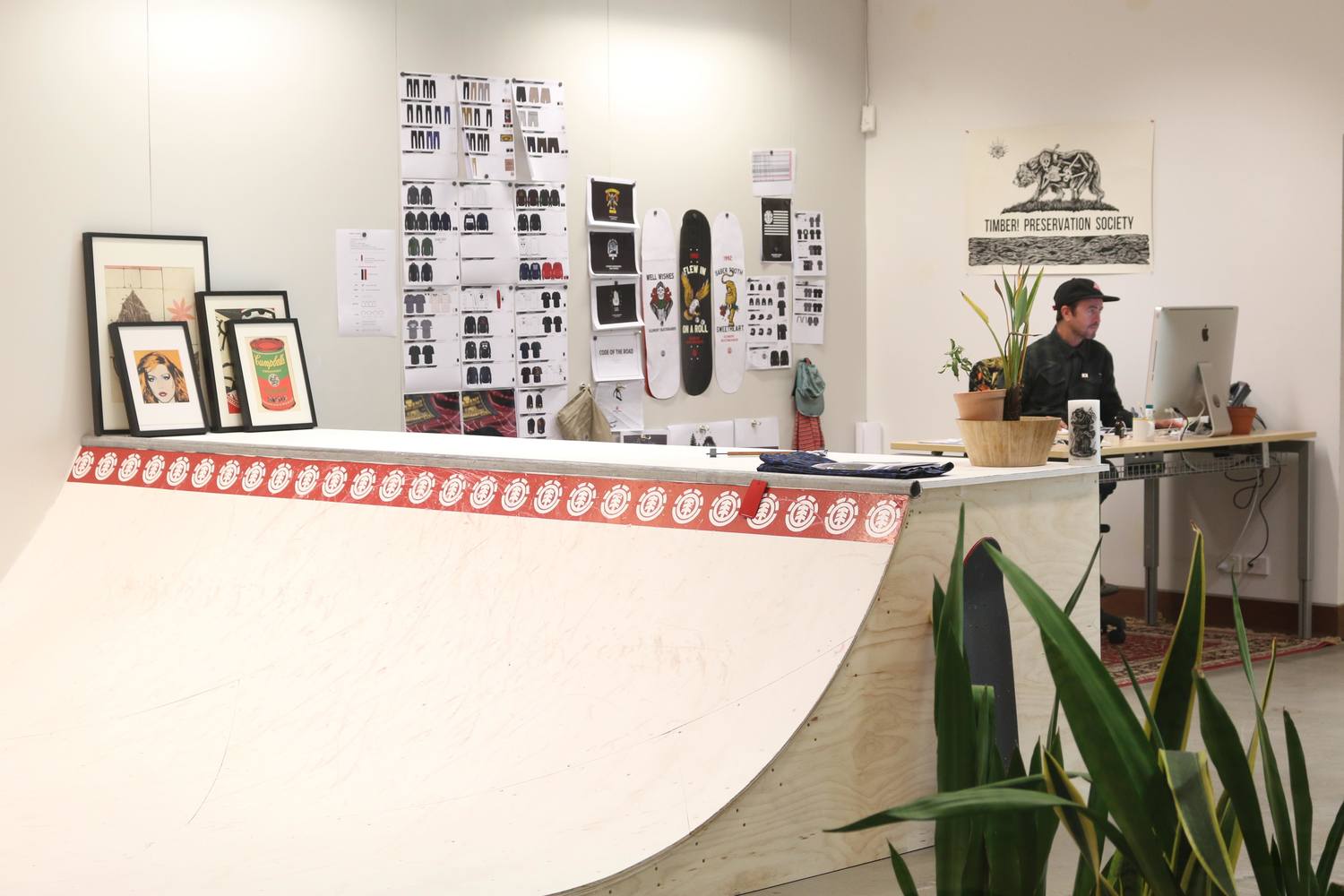
In fairness, there was more to this fit out than the staff just needing a good skate to let off steam. The brand’s clothing designers required zoning to distinguish the men’s range, Element from Eden, the women’s range of the brand. They also required organisational solutions, areas to display and view their product, and workspaces inviting staff to congregate and brainstorm.
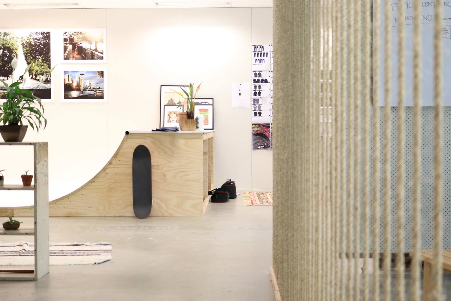
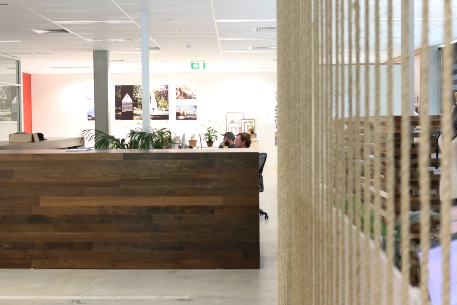
Like their approach to their product line, these guys wanted a raw, earthy, edgy aesthetic but with some clean lines. There was no getting around the warehouse feel of this office in all it’s vastness and concrete glory but we were able to add some sense of refinement by constructing an 1100mm high counter clad in dark, smoked oak timber flooring, which served as both hanging storage for sample clothes and a functional working top to deliberate designs.

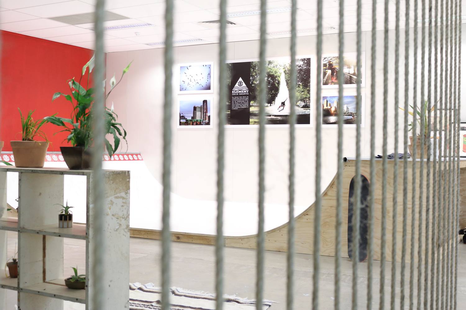
The two rope walls worked to create visual interest and softly sectioned off a dedicated meeting room and the Eden working zone.
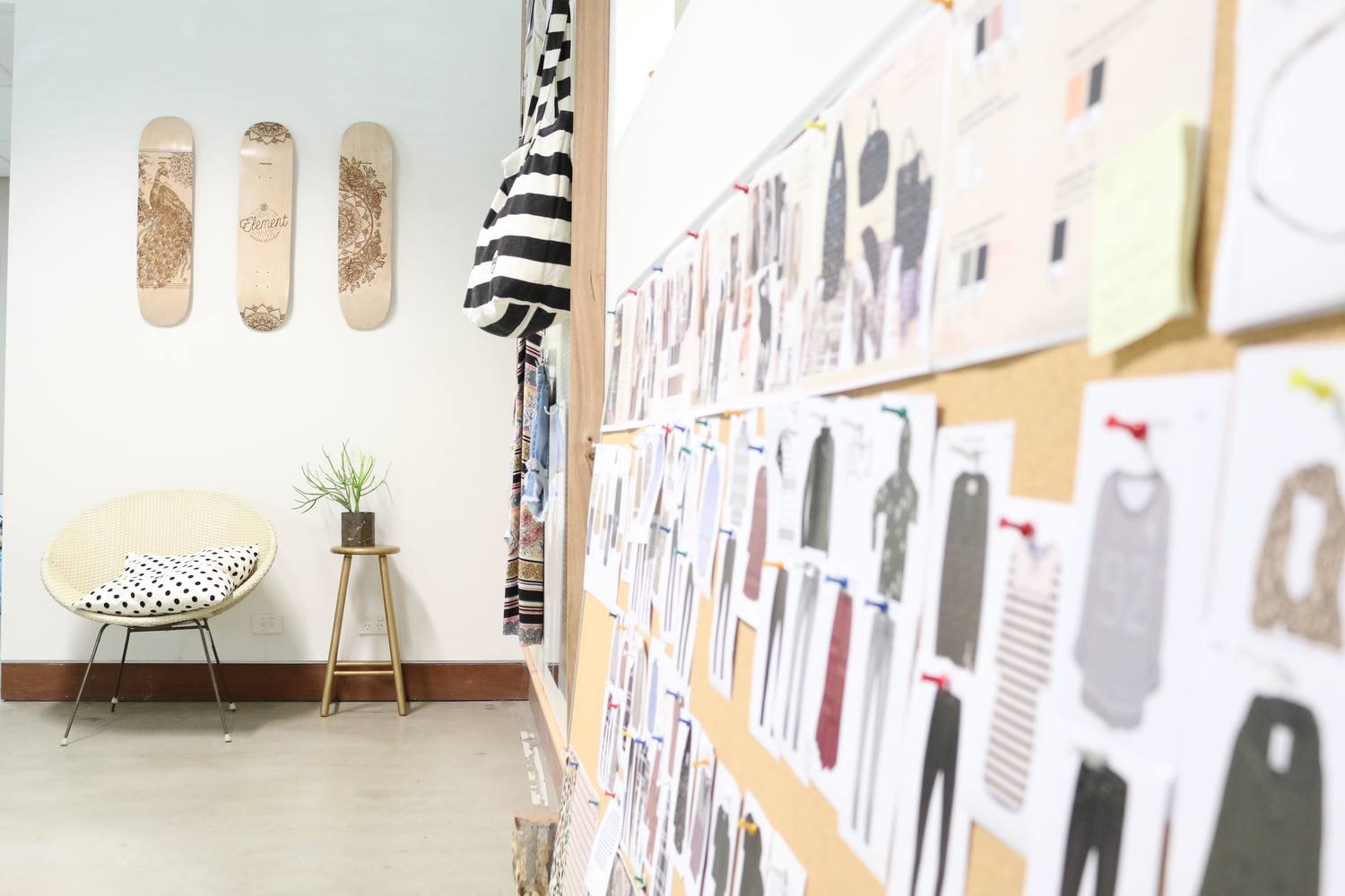

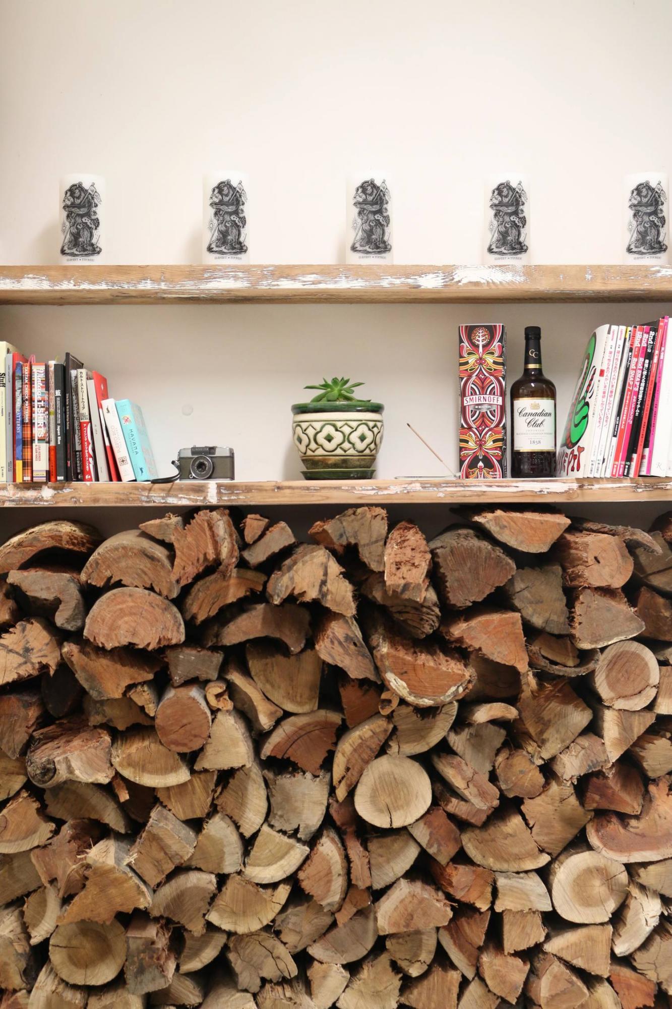
Michael framed and installed peg boards for the Element designers to hang and view their range, and the log wall adds depth, dimension and warmth to break up a concrete-heavy landscape.

I suggested they paint the large concrete columns matt black to frame the space and to break up all the grey but the owner/founder of Element recently visited from The States and graffitied one of those said posts. I’m certainly not going to argue with that, if we have a graffiti artist among us, bonus.
This enthusiastic, hands-on approach of the staff was, in fact, the only way to get this job over the line within the tight budget and timeframe. Michael had the Element crew painting walls, hanging their own art, moving furniture, and styling and they did like it was all in a day’s work.

The result of the fit out is as urban cool as its occupants….in that skater boy sort of way. Nice collaborative effort team!
Carlene xx
Click on the Element logo to watch the transformation.


