I’ve said it before……. I LOVE making over children’s spaces for the simple fact that more than in any other space of the home, updating a kids’ space is your opportunity to let go of inhibitions, tap into your inner child, and have some fun.
Think about your wall treatment
I love nothing more in a kids’ space than a whimsical, highly graphic wallpaper but I can concede that this can be costly to keep changing up along with your child’s tastes so unless you are motivated to redecorate every few years, you might be more inclined to paint the room a wall colour that is adaptable to different looks as your child grows. We used a “greige” (grey/beige? In Stella’s bedroom because I knew it would work with the different shades of pink accessories I planned in there but I also love the idea of a bold hue like a rich sea green or sapphire blue (which I will most likely be applying in my kids’ next bedroom – stay tuned for that).
Think widely with your art
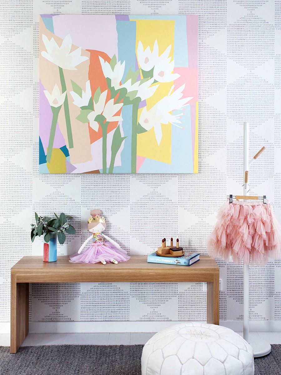
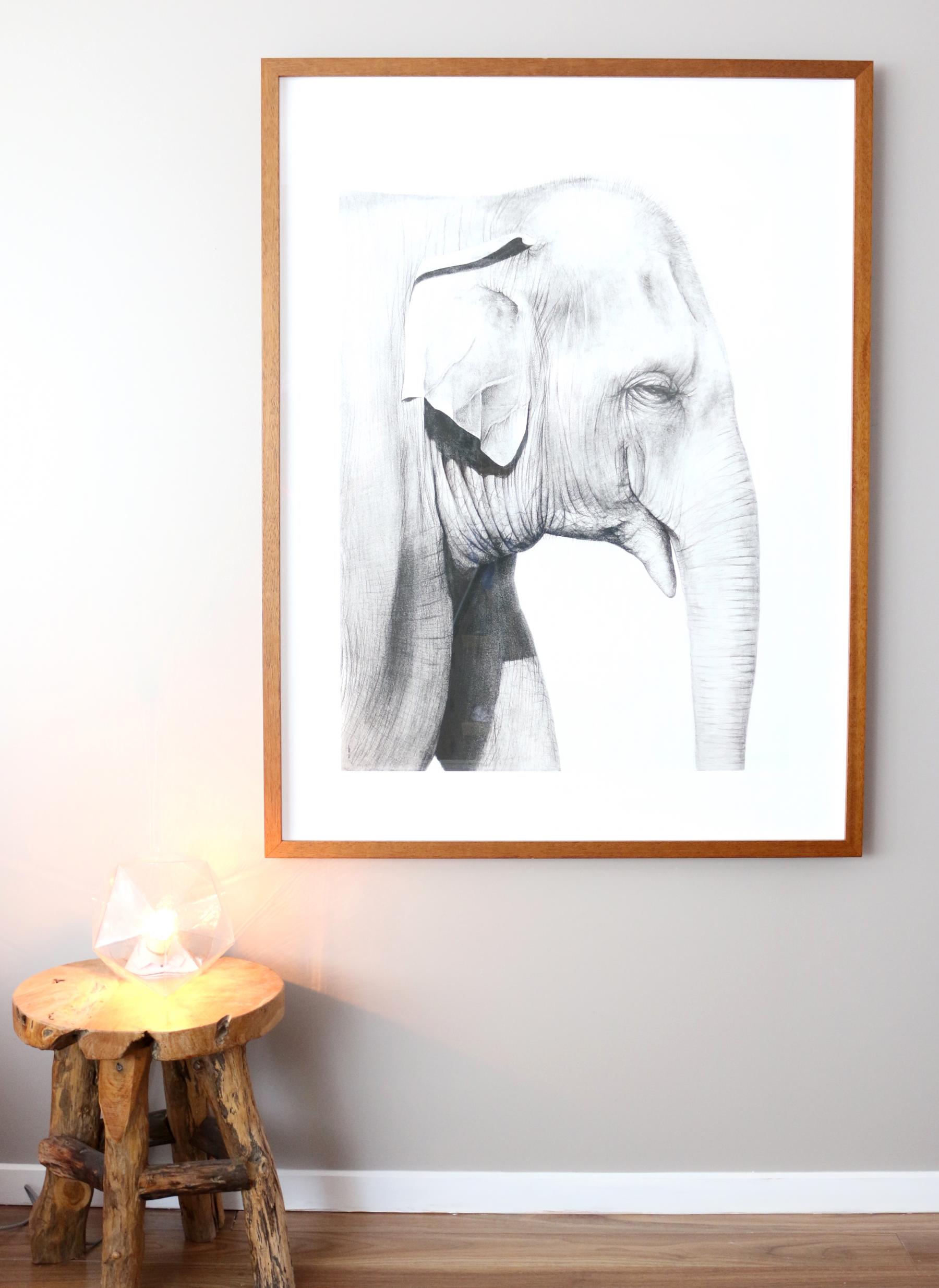
I feel, if done right, nearly anything goes when it comes to art in kids’ bedrooms. While it does need to be child appropriate, it doesn’t necessarily have to be child specific so opt for something that firstly, you love, that is in child appropriate colours or/and that depicts a child appropriate subject matter. In the case of Stella’s bedroom, she has a beautiful large print of an elephant hanging on her wall that I can see being a staple in her room for many years to come. It is also a piece that I would very happily hang in any room in my house without any risk of it appearing juvenile.
Be frivolous with patterns and prints
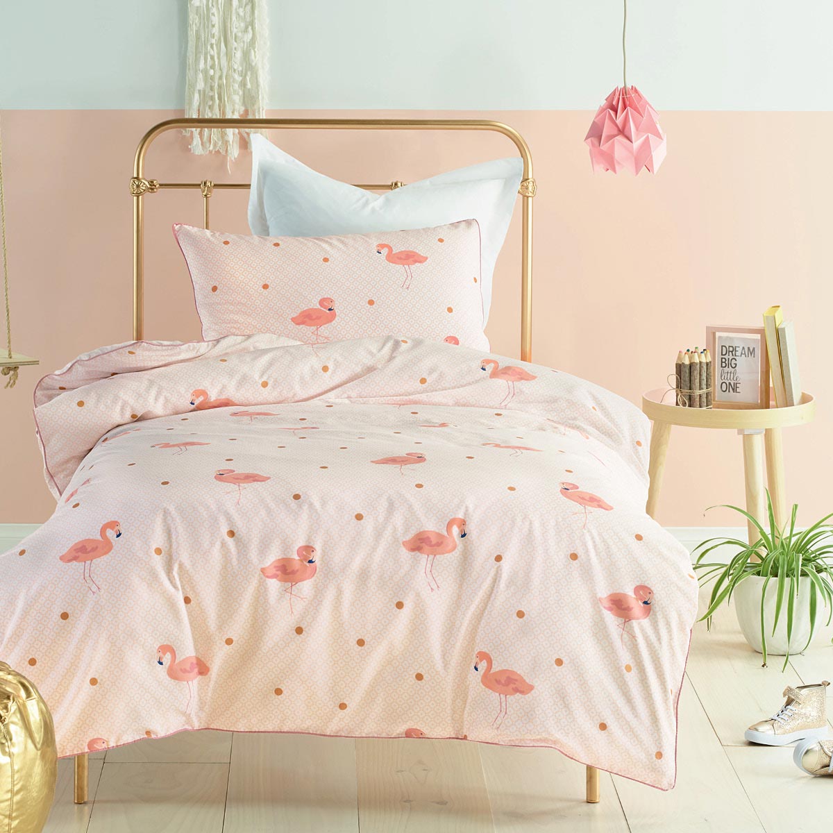
If you are going to do a kid’s room do it all the way. I wanted Stella’s bedroom to be a real girls space and the Lorraine Lea, Sophie quilt cover seen in the video above and the image below is spot on in here with its super cute flamingo print and metallic polka dots. Stripes are also always a winner in any context and are never impacted by the ebb and flow of trends like some patterns inevitably are.
Get crazy with lighting
It just doesn’t get any better than kids lighting. There is so much amazing product out there that caters to igniting kids’ imaginations and promoting fun. I’ve seen lamps in the shape of pineapples, dogs, watermelons, toadstools, you name it….
Be practical
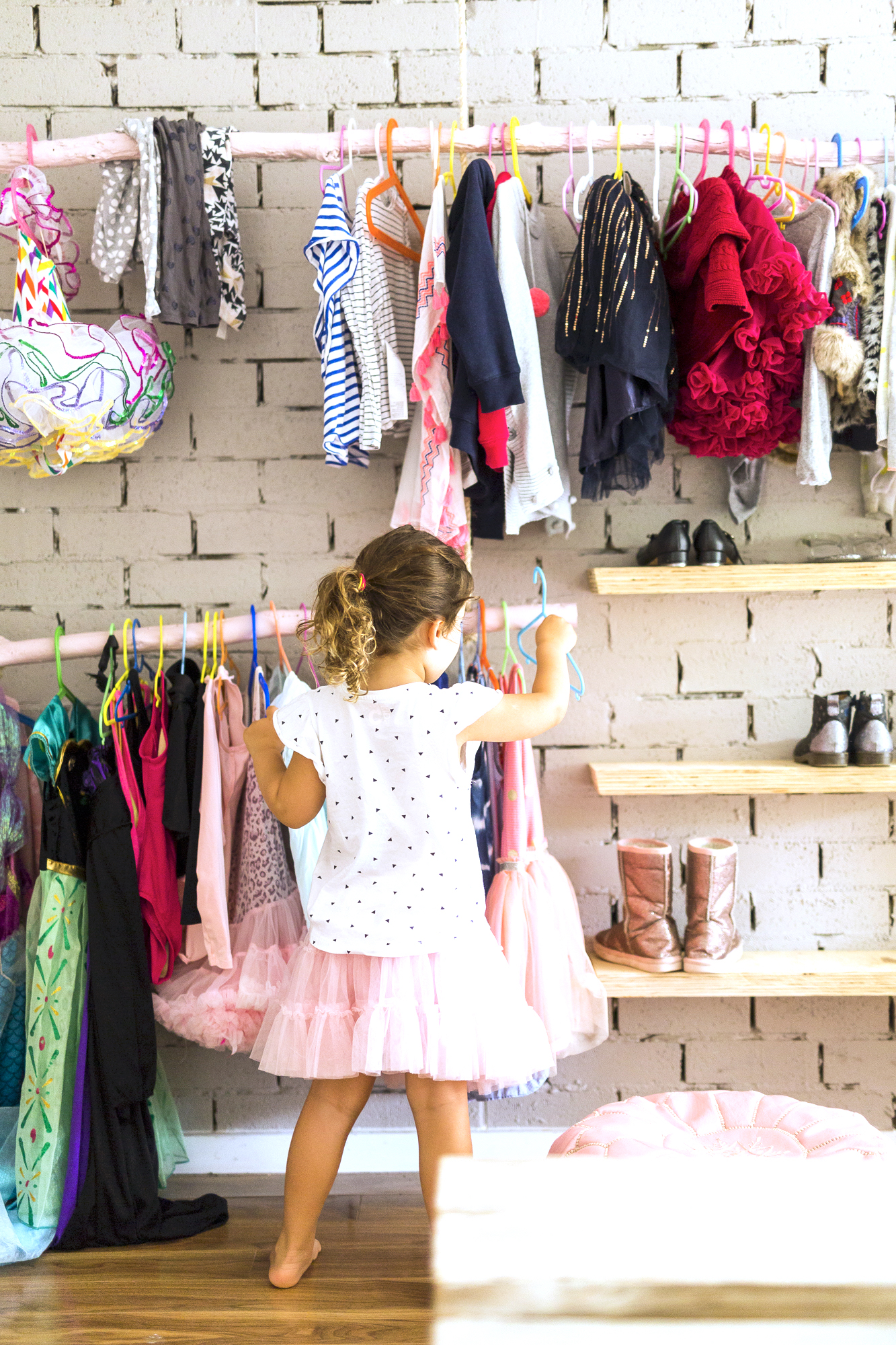
I hate to be all boring and talk about functionality but open shelving and is a big one, especially in kids’ spaces because they seem to accumulate so much ‘stuff’ and any parent will tell you that if the kids can see it they are more likely to access it themselves. This goes for things like clothes and shoes but also books and toys.
Display meaningful items
My kids’ rooms are filled with items that hold some sentiment to them and me (as well as plenty of items with absolutely no meaning). I’ve framed and hung some of their own artworks, I’ve hung pieces of clothing laboriously crotched for them by my late Grandmother; and also on display are family heirlooms that have been passed down the generations.
This post is brought to you by Lorraine Lea.
Carlene xx


