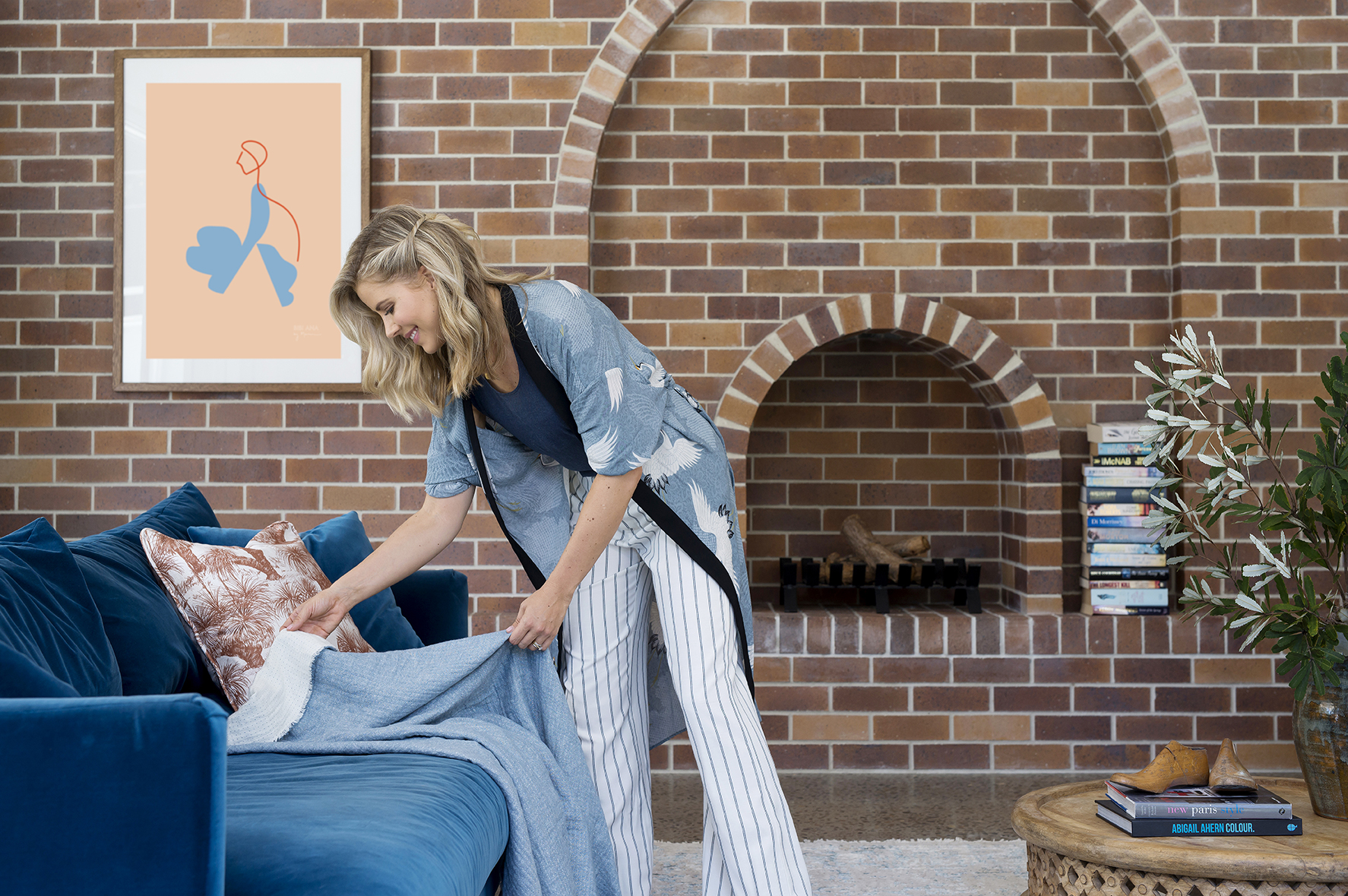
New Year, new living room. OK, as you know we finished this project at the end of last year but it’s still new enough to feel new and exciting. This is our first home renovation since our major reno 18 months ago. We had it photographed for PGH Bricks and then again, styled slightly differently for Plush (just tweaked) so I figured I’d show you the space styled two ways.
This for first look (look one) was for Plush….. Interestingly, since shooting these spaces I’ve realised there is so much more I want to do here. And since these shoots, I’ve introduced many more layers and moved things around and I’m right now in the process of sourcing some sort of interesting mirror for above the fireplace but let me talk you through what you see.
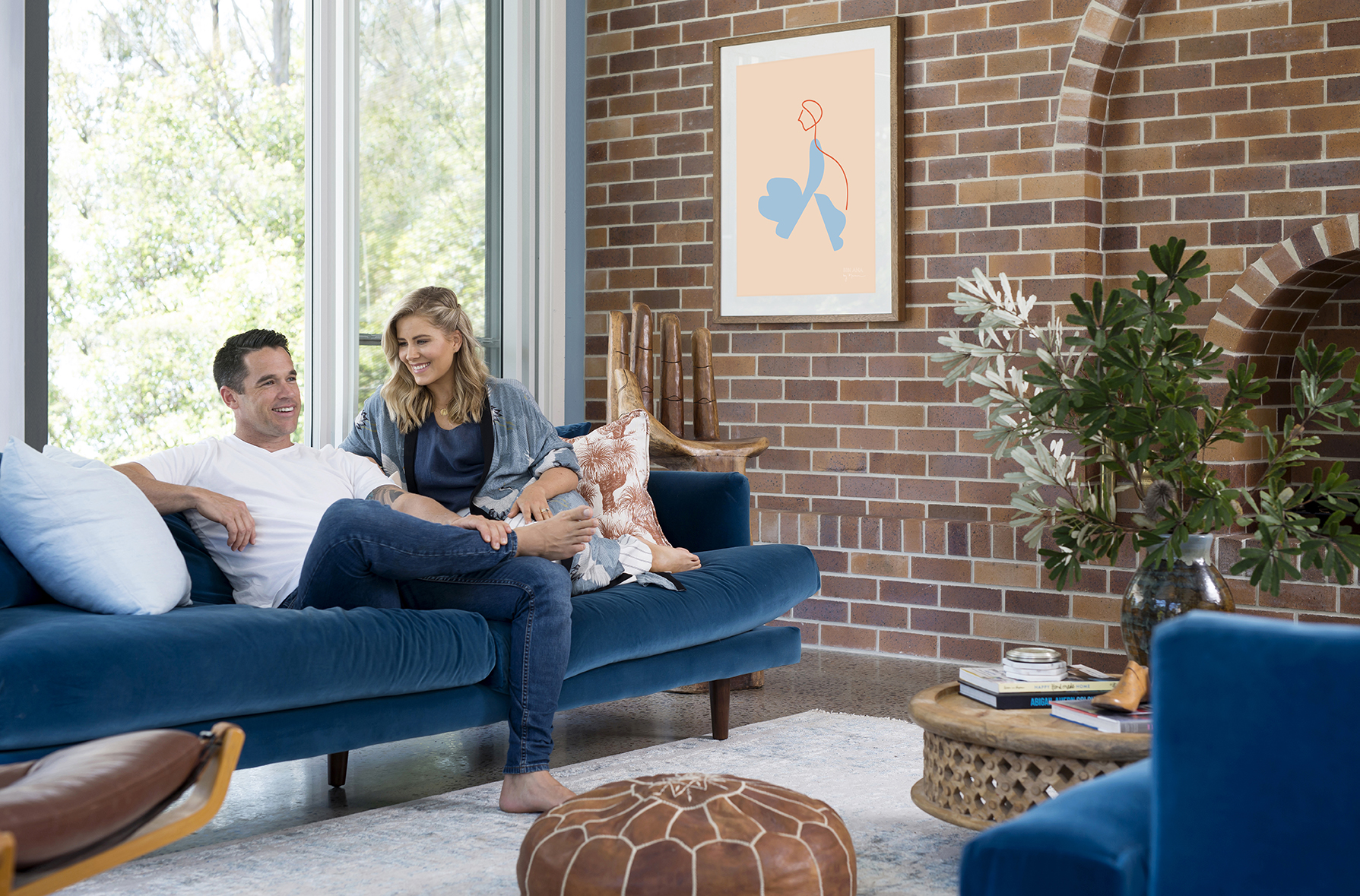
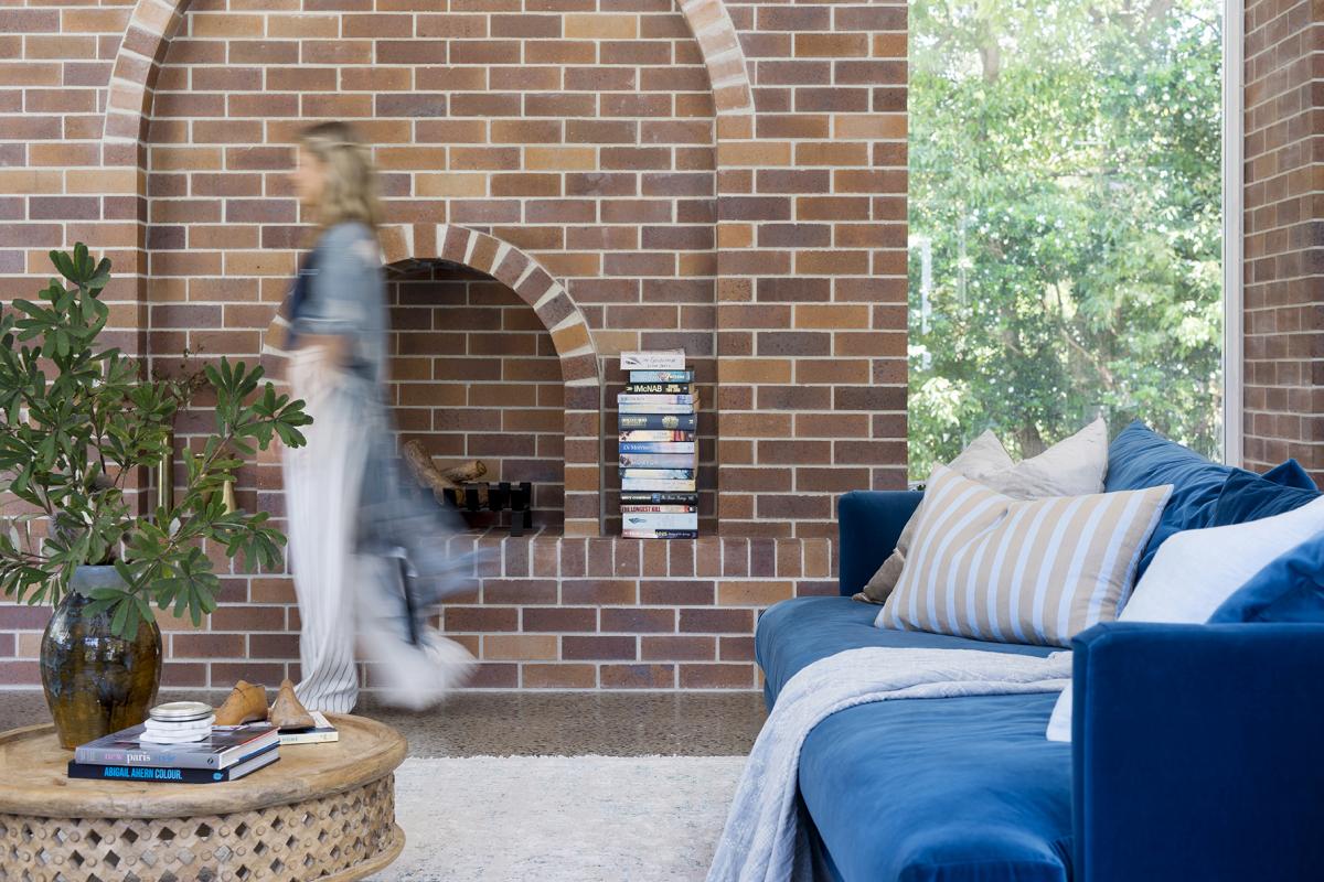
The first step in this transformation was the brick wall. We liked the idea of incorporating brick in this part of the house as it formed a major design feature in the part of our initial house reno but I’ll take you through the design process of the wall in the next blog.
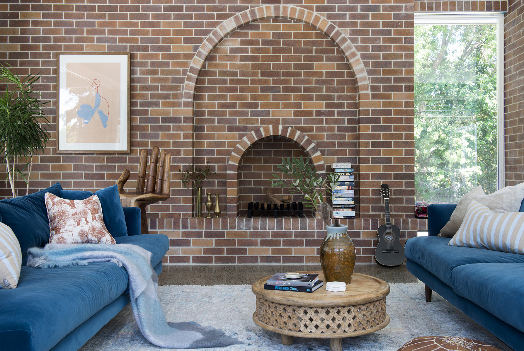
The second design decision was the sofas, which would set the tone and colour scheme for the room. At the time, I was torn between a very neutral linen/grey sort of colour and the blue velvet you see here. I was swinging between two extremes but I’m a maximalist at heart so the heart one this debate. The sofas are the Santa Monica in colour Jetty and they’re pretty darn fab. They are a no fuss clean-lined mid-century style of sofa that could really be applied to any style of home and provides me some scope to be able to move them around the house when I get restless.
I was adamant I wanted two sofas that would face each other to create a real conversation zone and by now you’re probably wondering where the TV is. I banished it to the rumpus room and it’s been life changing. I’m not a TV watcher and I can’t stand the sound of it in the background so having the TV in our busiest space was causing me stress. It had to go and it’s changed the vibe of this part of the house for the better. Now, if you want to watch TV in our house you have a dedicated space for it and it doesn’t disturb conversation or Michael’s music or my podcasts. Whilst we still have access to the other side of that brick wall, we’re going to run a TV cable behind the artwork so that the next owner has the option of a TV or not. We’re thoughtful like that!
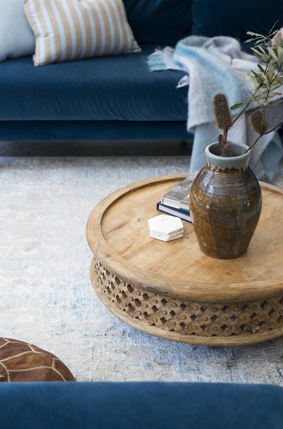
The next big decision was the rug. It had to have some blue in it to keep the space tonal but it couldn’t be too blue or the space would have all been a bit too blue.I went with the Hypnose from Decorug. This is the forth of this rug that I have in our house (2 x green and 2 x blue) but sadly, it’s no longer available. Many distressed Persian look rugs out there aren’t very soft underfoot but this one is so beautifully soft. I’ve decided I need/want a larger rug (4×5) here because I want all my furniture sitting on the rug to really anchor the space. This will likely mean I’ll need to have a piece of carpet cut and edged (stay tuned for that) so my Hypnose rug will be repurposed to the office when I get it up and running but right now it does the job.
The carved timber coffee table I’ve had for years. It’s from West Elm and it’s served us well but it’s actually a bit small for this space. I’ve just repurposed it to the rumpus room, which is sort of like the third child that inherits all the hand me downs.
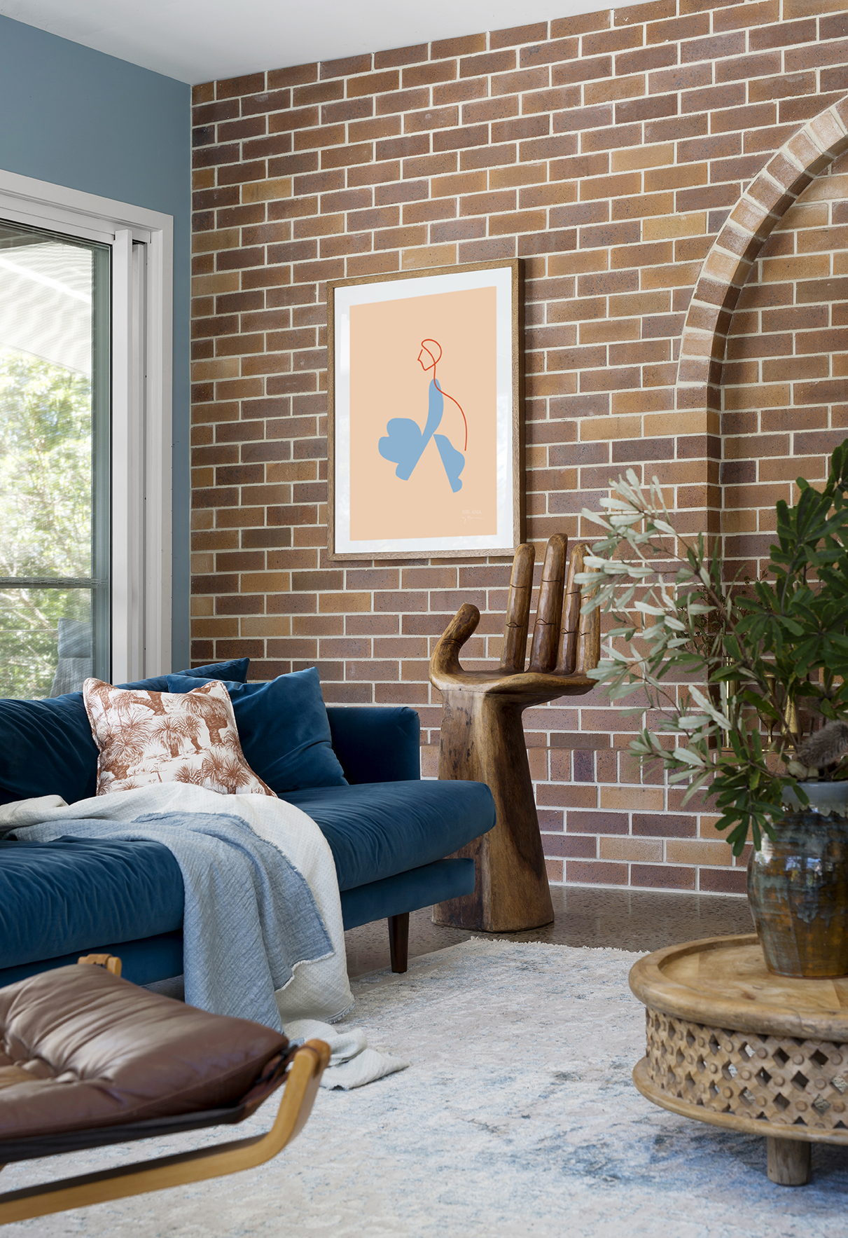
I know, you want a solid teak hand stool too. You should because it’s bloody marvellous and you know I like to share all my furniture finds because as my nephew so eloquently points out “sharing is caring and caring is kind” but this is where it gets awkward….. I purchased it from a Salvos store years ago and I haven’t seen another since. It was sitting so proudly out the front and as drove by I couldn’t believe my eyes. I pulled up fast, walked inside, bought it and fist pumped the whole way home. It weighs an absolute ton and it’s may favourite thing ever. I hate when I’m coveting something of someone else’s and they tell me it’s vintage because you know you can’t run out and grab one of your own.
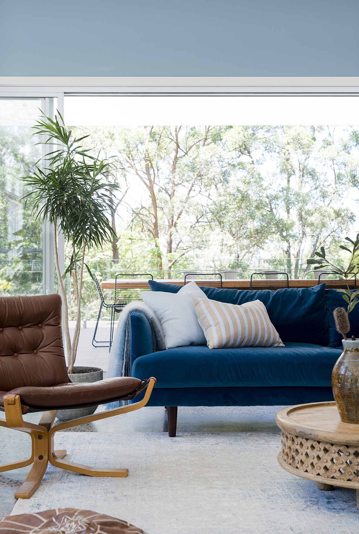
Seriously, I know I’m a broken record, but regardless of your home style, everyone should second-hand shop. There is SO much goodness to be found and my vintage and antiques are always my most loved items, like the things I’d grab in a fire after my family. Although, that teak hand stool is solid (heavy) so it would probably have to stay and burn. That leather vintage chair on the other hand….. I don’t own this (YET). I borrowed it for the shoot because I really wanted some tan leather up against that delicious velvet blue. It’s from a local Found Furniture on the Gold Coast which sells a beautiful collection of vintage Australian and European mid century furniture.
The vase atop the coffee table is also a vintage find that I cherish so it’s probably dangerous to be sitting where it’s sitting but this way I get to enjoy it every day. The brass vases are also vintage (you’ve probably seen them before in my house because I shuffle them around as I please). I need more of these because they’re oddly so versatile as a styling product.
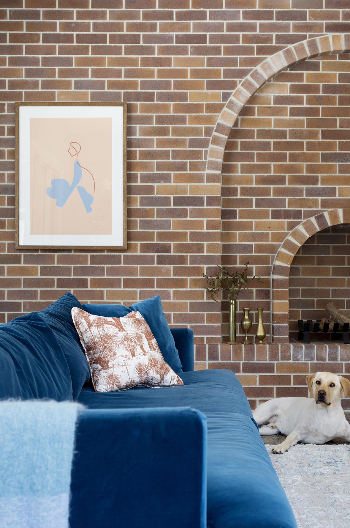
I used some leftover grasstree fabric from These Walls to make some cushions. I love the rust colour of these because I can move them all over the house and they always work with the different colour ways we’ve got going on.
The artwork threw a spanner in this space. It’s called Abbey Road from Bibiana and Co. and it’s fab! I mean, c’mon the coral colour backdrop (yum)……. It threw a spanner because I knew I wanted to use it in this space but like I said, I had planned to keep this space tonal. When pulling together a space this is a lesson in just rolling with it and being guided by what you love. I suppose if you don’t let your space be an evolution it’s at risk of appearing a bit contrived and possibly too ‘done’ but more than that, being rigid in your design process really just sucks all the fun out of it. So the art took it’s place on the brick wall and I bloody love it in this space contrasting the blue of the sofa.
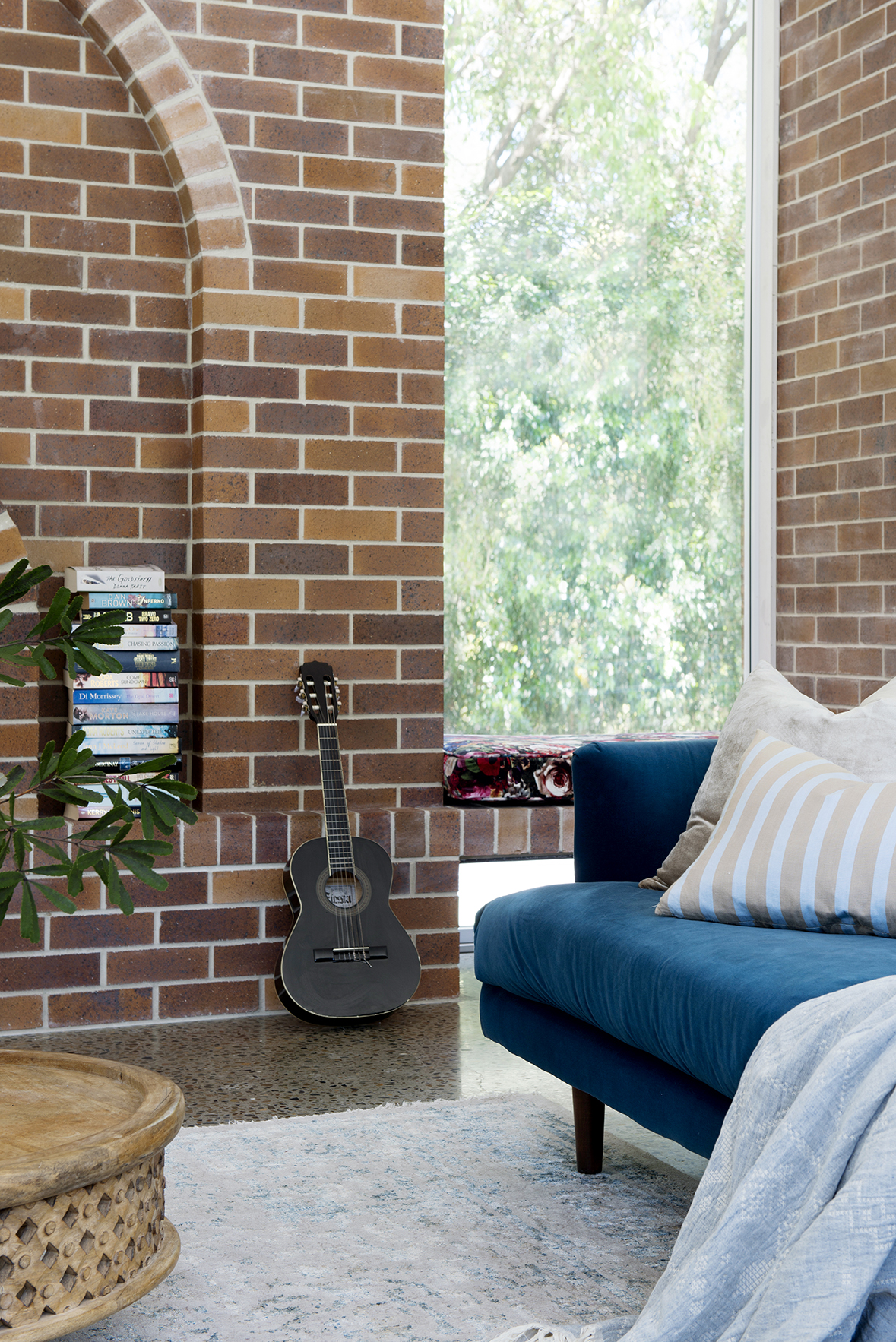
The powder blue striped cushions are from Eadie Lifestyle who do fabulous cushions although I looked on their site and these ones are no longer available. I’ve had them for a few years I’ve just been shuffling them around the house as I please but I think they’ve found a permanent home on these sofas. The soft gold velvet cushion (behind the striped cushion) is actually also from Eadie Lifestyle but is a more recent purchase. I like that it breaks up the blue but doesn’t add another strong colour to the mix.
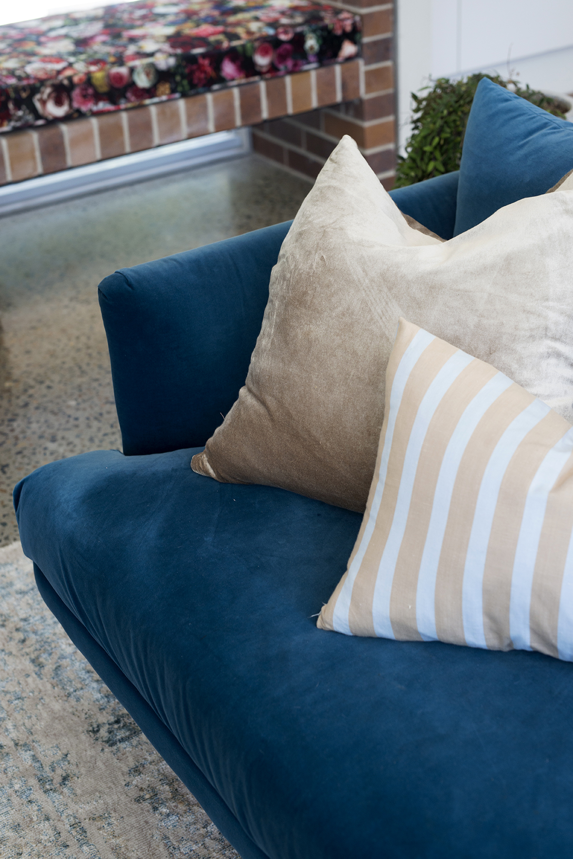
My upholstered bench cushion I had made to order. It’s the Flowerbomb fabric in Scarlet from Warwick Fabrics and I use Tony at Foamworld for my foam and sewing (for locals). Like I said, I planned to limit my colour contrasting in here but I really fell in love with this fabric so the heart won this round once again.
Shop the look below…….
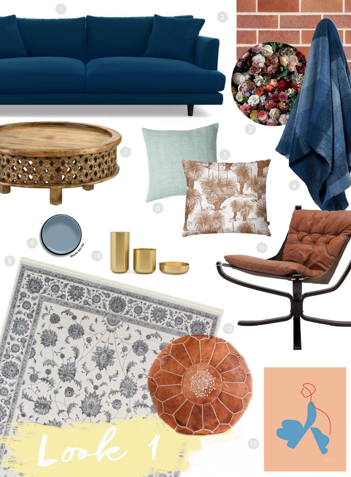
2. Black and Tan Bricks from PGH Bricks
3. Bench Seat Cushion Flowerbomb Fabric from Warwick Fabrics
4. St Alban’s Coastal Mohair Throw
5. These Walls Grasstree Cushion
7. West Elm Carved Wood Coffee Table
10. Brass Vases (Similar Item)
11. Found Furniture Leather Chair


August 5, 2020 at 8:43 pm
Absolutely LOVE this room!!
Do you mind me asking if you bought the deep SantaMonica sofa or the petite?
I am looking at buying one myself and found the deep less comfortable but am concerned that the shallow doesn’t look as good.
August 5, 2020 at 9:00 pm
Thank you. This is the deep but I recommend getting the low legs. We have the shallow in our rumpus because it’s a smaller space but the deeper is ideal if you can.