HNY y’all! This marks our first blog post for 2018 and I’m not going to lie, it’s been harder than usual getting back into the swing of things this year. I’m blaming the fact that the kids are still on school holidays so we don’t have a routine and productivity is down because we’re doing much more important things such as going to the beach and theme parks and catching up with friends. Next year, I’ve decided we’re going to officially take off the first 3 weeks of January so there’s none of this trying to work, trying to play business. I’m even going to set an Out Of Office which I’ve NEVER done. Anywho, just before Christmas we revealed Paddy’s bedroom so now it’s Stella’s turn. Let’s get into it.
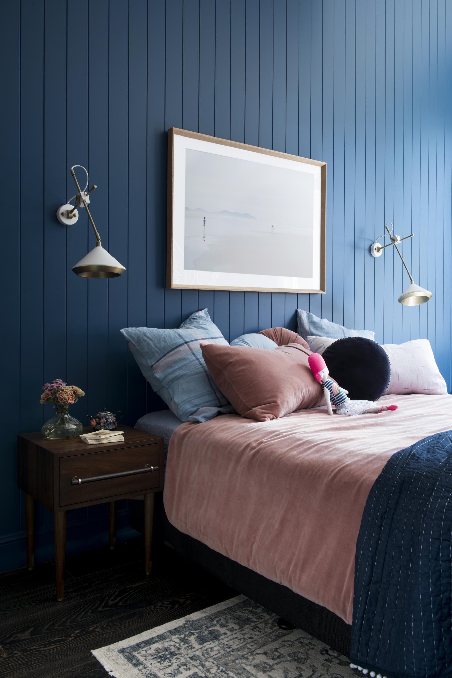
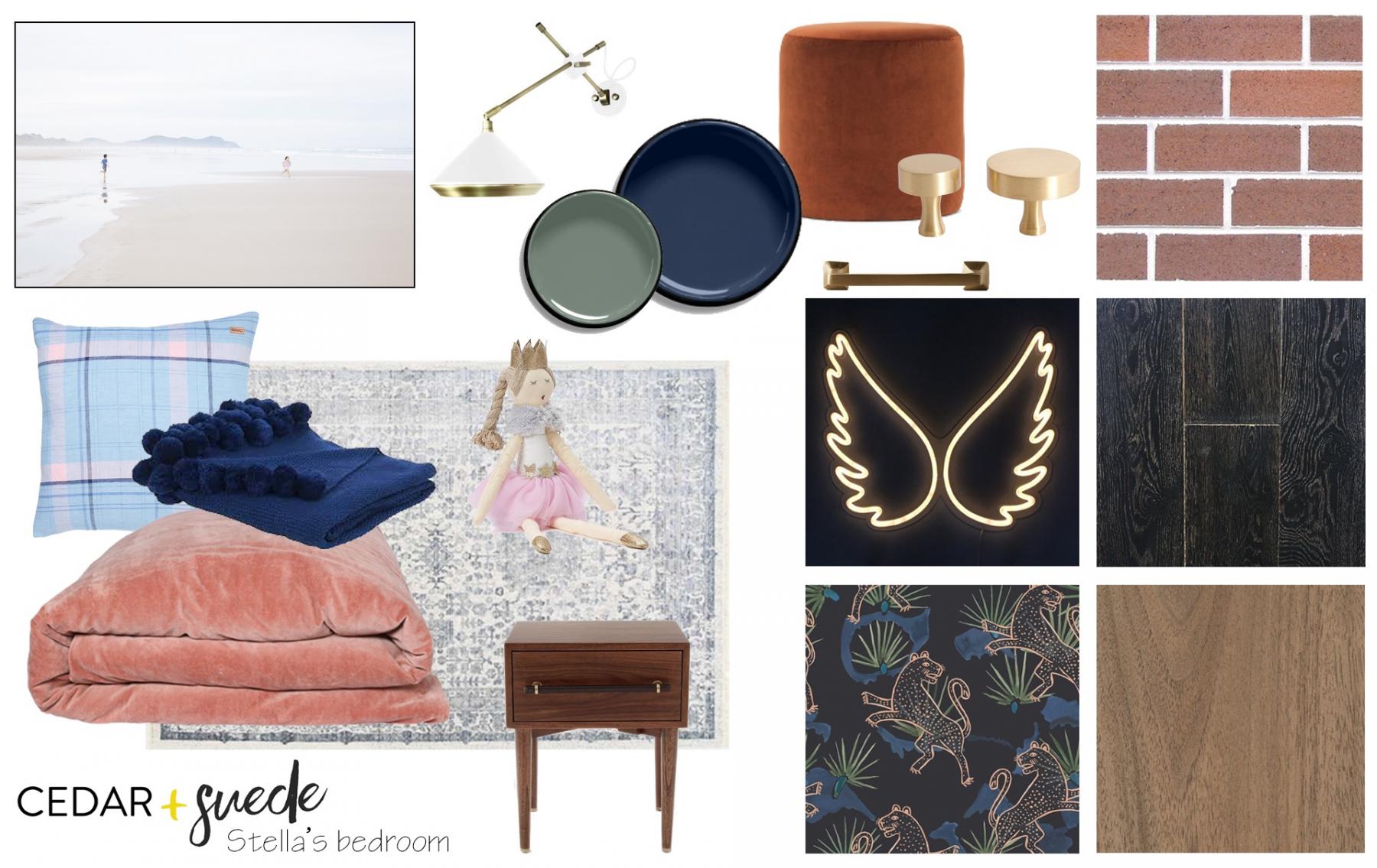
Sometimes I legitimately couldn’t tell you why I make the decisions I make. I’ve really had to think about WHY I decided the kids (Paddy, 8 and Stella, 6) bedrooms would be the same wall colour. I think a major motivator was the fact that their rooms backed onto each other and are mirrored layouts of each other so the symmetry influenced consistent foundation colours. I also wanted to leave room for the bathrooms to be a different colour and for the master bedroom to be another colour again but didn’t want the house to be overstimulating. So like, Paddy’s room we painted the Easycraft VJ cladding in Stella’s bedroom in Resene Madison and then used different accent colours to create a very different look.
Like Paddy’s room, we’ve created a bedroom that will grow with Stella because whilst renovating is our jam, renovating the same space over and over feels a bit reckless. This way in a few years we could literally change up the bedding only and create a completely different look despite the bold colour of the walls.
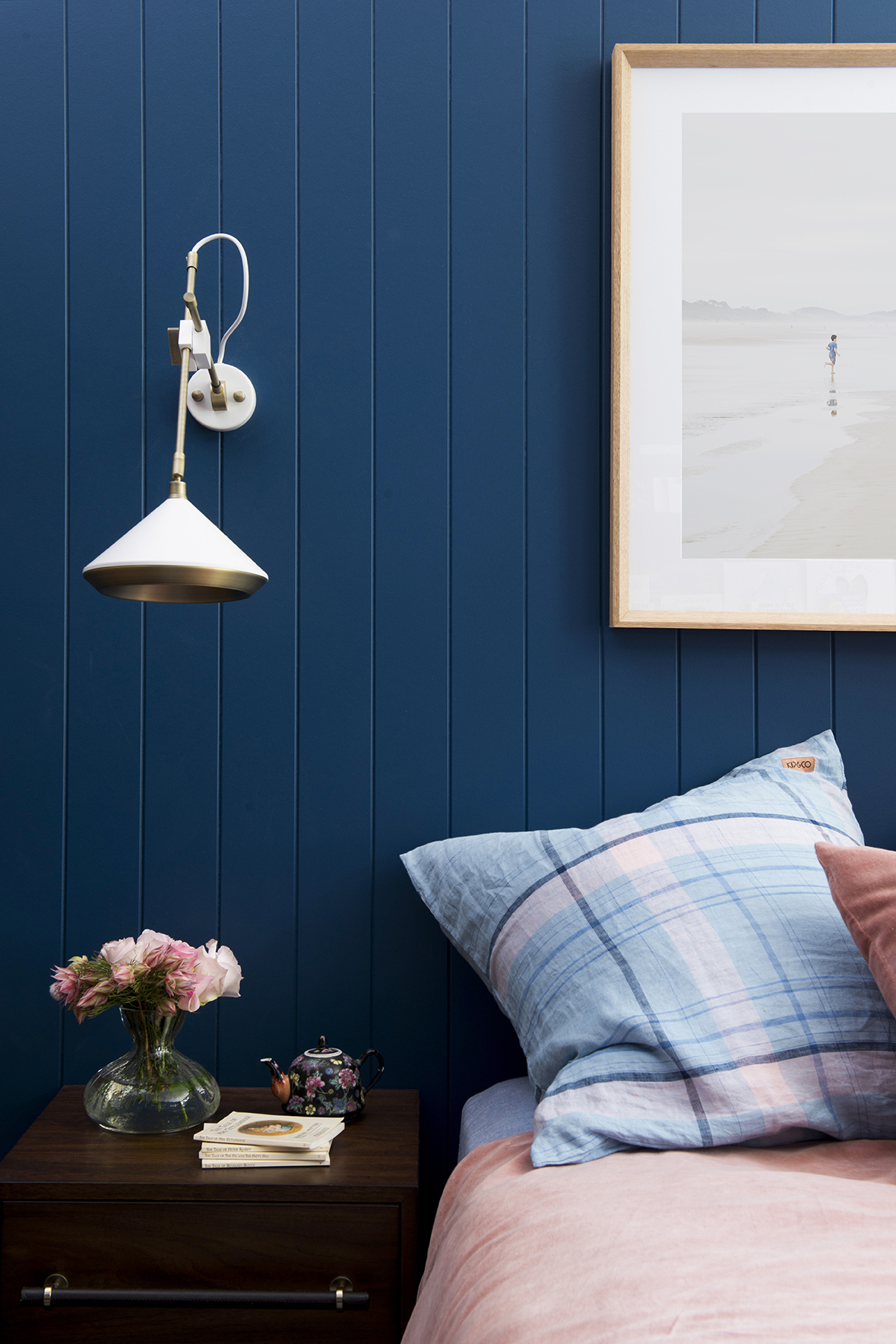
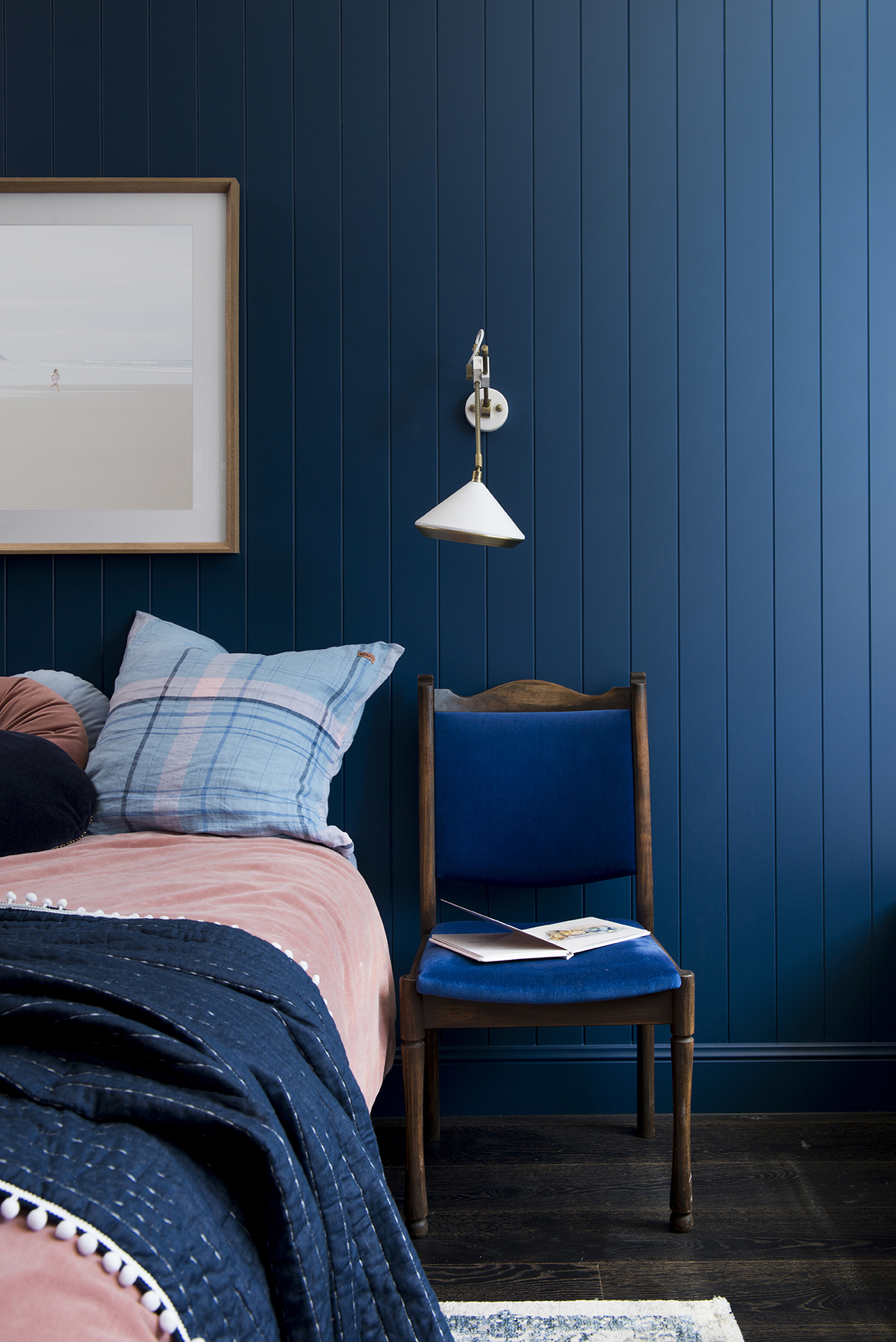
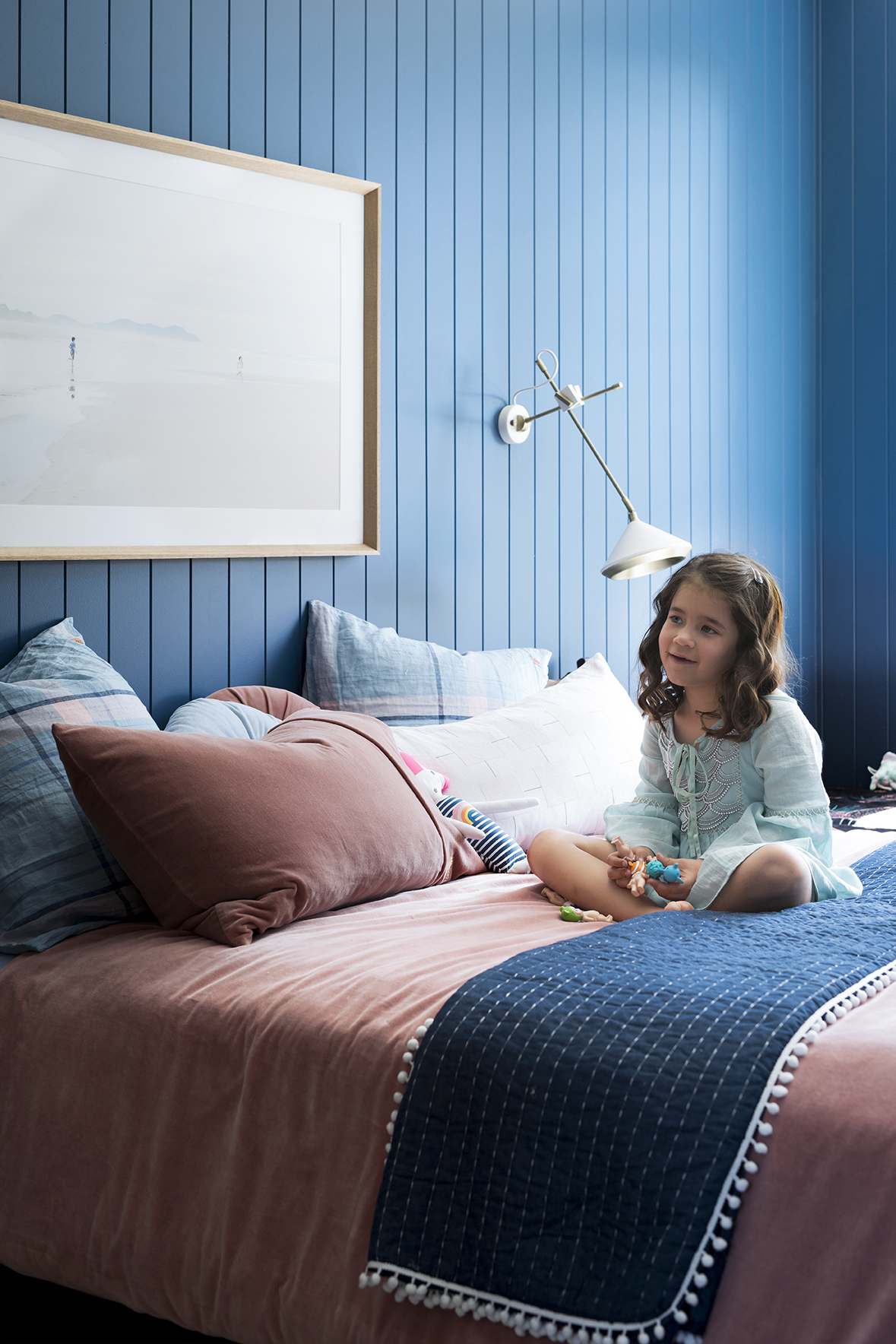
The bedding in Stella’s bedroom is from Kip and Co. I was just drawn to the dusty shade of this velvet pink quilt cover because it worked with the boldness of the wall colour. A brighter pink would have looked fairy floss (eek) and more pale pink would have been overpowered by the richness blue.
The artwork is a photo from a session we did a couple of years ago with Tess Leopold. I feel very chuffed with myself for being resourceful and utilising what we had. Of course I had to pay to have it printed and framed but it’s oh so worth it and oh so much more cost effective than buying a new print. I think the reason this image is so effective in this space is because it has so much it has so much white space and because it’s largely a landscape image with the two kids just mere dots in the background. Had this been a portrait image of the kids it just would have been a bit tacky. And what are the chances that the kids happen to be wearing pink and blue?! The stars aligned on this one.
Y’all want this rug don’t you? You should because it’s amazing. It’s called Hypnose and it’s a machine made distressed look from Decorug. It comes in Blue, Green (which we have in the master bedroom) and Cherry. It’s soft, durable and doesn’t show dirt. It also doesn’t shed. I’ve learnt; a thing or too about shedding rugs in the past few years and what I’ve learnt is that they drive me loopy. This rug has a beautiful subtle sheen to it and its colour changes slightly according to which way you’re looking at it which I love! The wall light is from Sokol. I was simply drawn to it’s industrial design and it’s affordability for a kids bedroom.
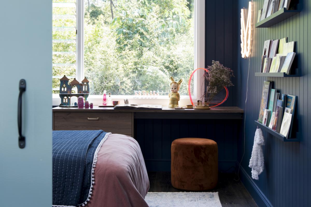
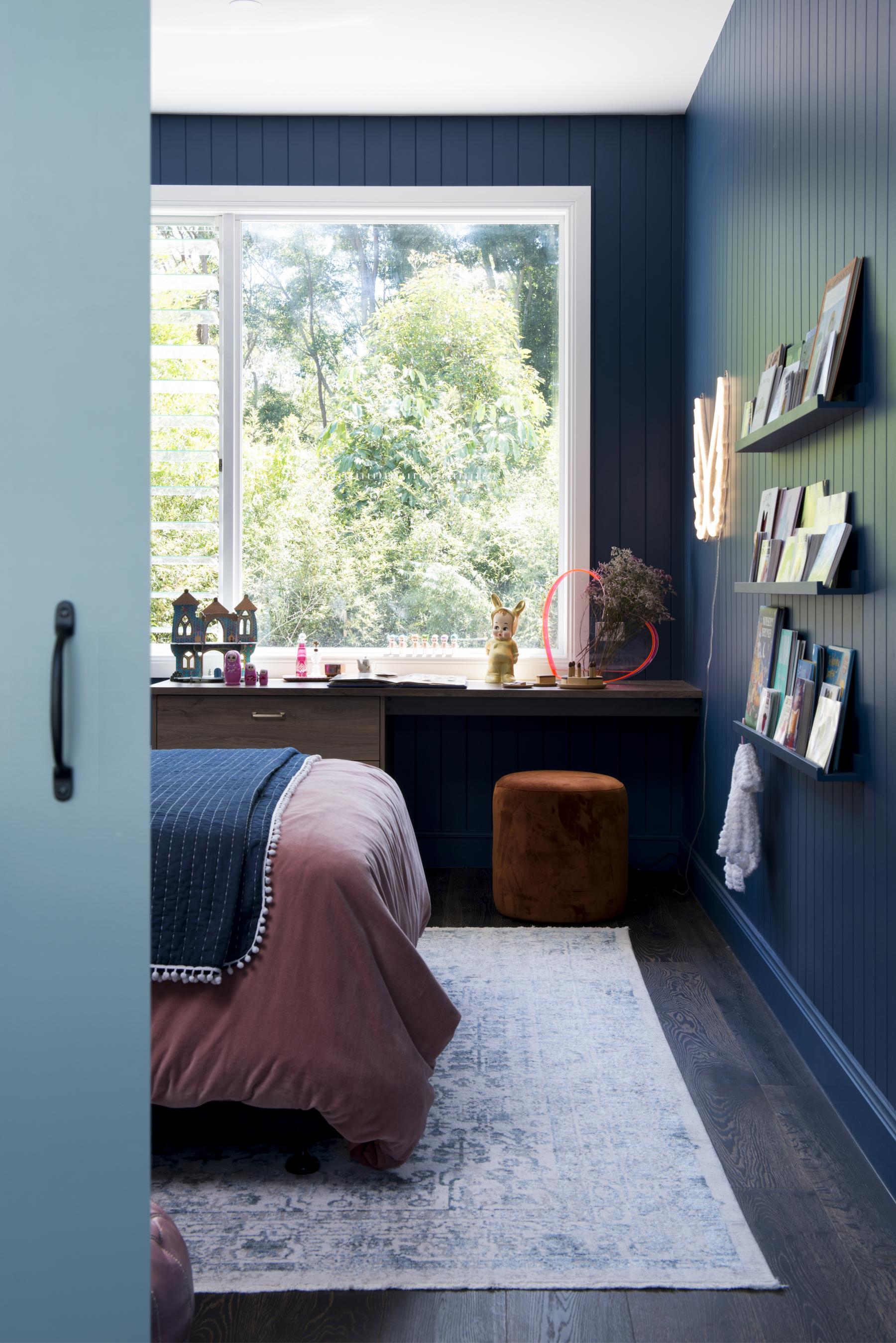
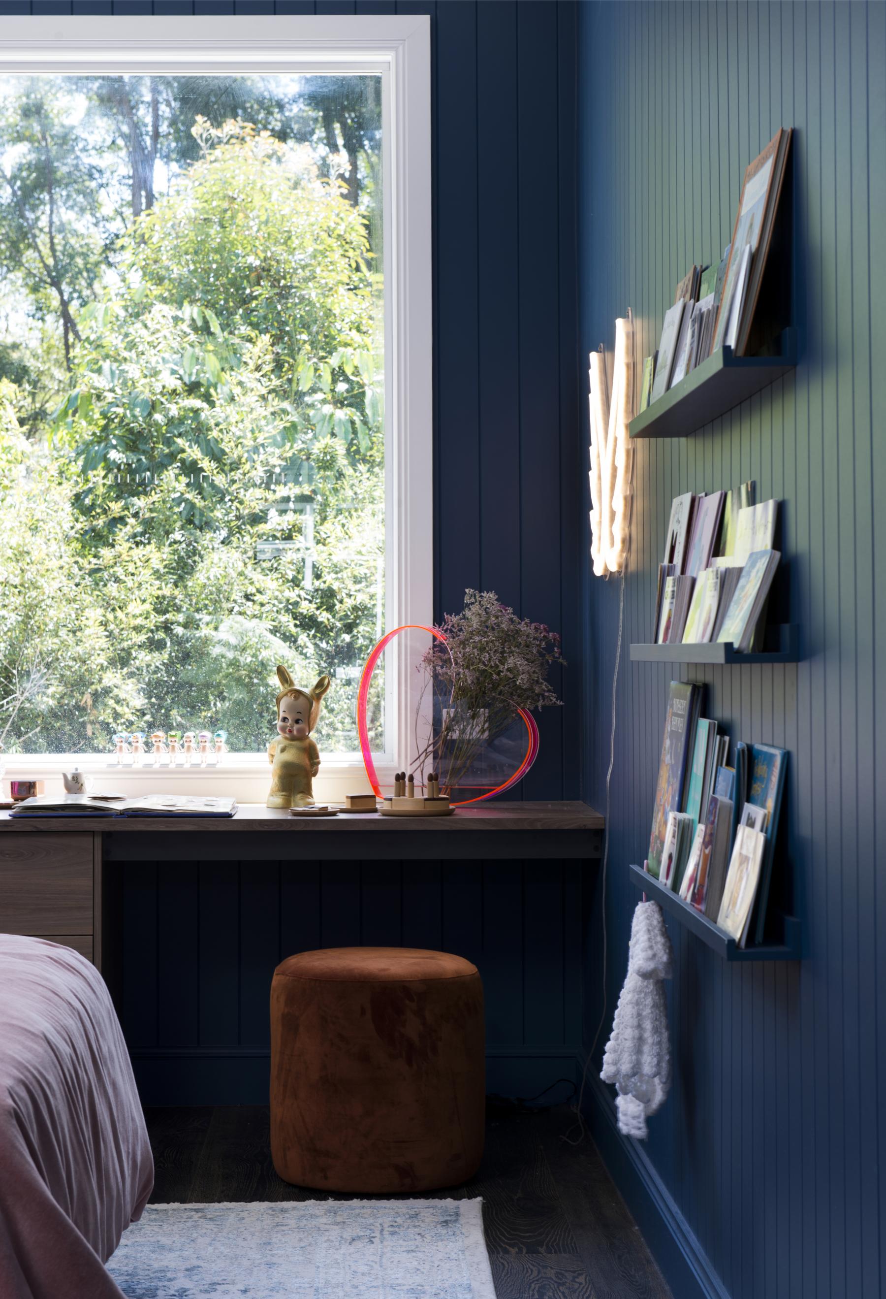
The windows in our home are key to the effectiveness of the overall design because we are fortunate to live in a semi rural area with amazing ancient native trees and vegetation so it was important that we frame them into the space. We engaged A&L Windows and Doors and Michael worked closely them them to create make the windows real WOW factors in all the rooms. Now we just need to address the fly/security screen factor because with trees comes bugs. You’ll note in the pic below that we have no window coverings up. We still don’t as I write this post but install day is close and I cannot wait, not because the kids are waking up too early (they wake up the same time year round) but because all the surfaces in there will be sun damaged if we don’t get something up quick smart. We’ve gone with a soft roman blind in a linen look (not linen). I’ll post pics once they’re up.
The kids are really too young to use their desks for anything right now. They do their homework at the kitchen bench so that we can help them whilst we’re making dinner or preparing brekkie and they do craft in the living room so right now their desks display collectables, books and basically anything the presents well. When I styled them up for the shoot I expected them to get busy rearranging their items but I think they take pride in their little display I’m dreading 5 year’s time when teenage years hit and their bedrooms become smelly warrens of stinky socks, school papers, bad posters and cookie crumbs. That’s how it works doesn’t it?!
The above pic actually shows you the type of skirting we used. It’s from Hume Doors and Timer and it’s the NSW Colonial profile. Hot tip: an ornate profile works on any style of home, not just a classical style of home and it doesn’t just work but it enhances a space. A flat profile is a fast way to cheapening your look.
The acrylic heart vase is from Lovestar and it’s one we’ve had for years that gets moved around the house although it’s really found its home in Stella’s bedroom. The doll lamp is the Lapin and Me Baby Lamp from Big Dreams Emporium. It’s a really sweet night lamp that shines a really warm light. Its little bare bum lights up and is so bloody cute.
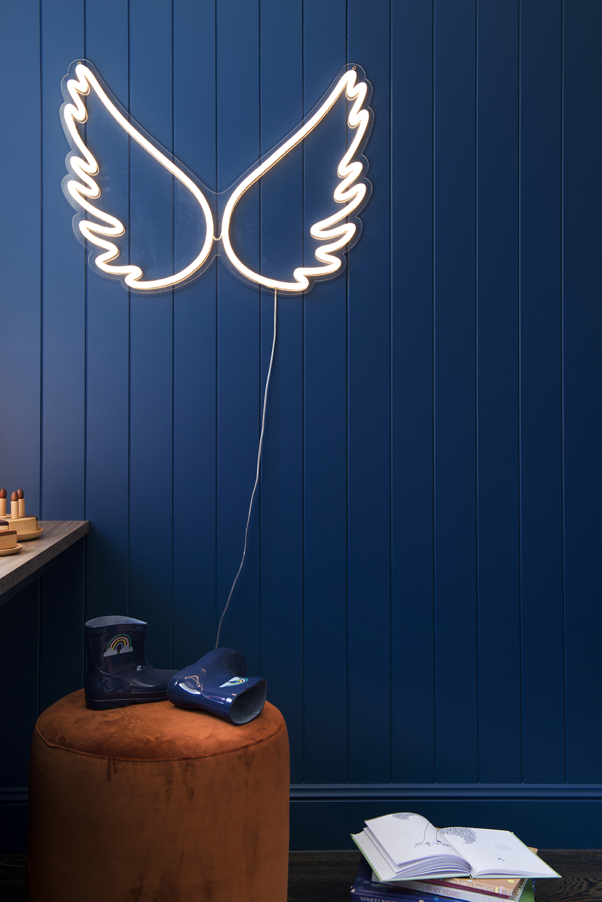
Those ridiculously sweet angel wings I had pegged for this space before I even knew what this space would look like. They’re from What She Said Co. and they act as Stella’s night light (which I turn off before I go to bed because I don’t understand how people sleep with lights on). The ottoman is from a fab homewares brand called Arro Home and I love the random pop of terracotta in this space. The earthiness of the colour (along with the sage green sliding door) somehow helps to prevent the colours in this room from being a cliche (because blue and pink ain’t ground breaking, my friends).
The velvet blue chair is the buddy to the one we used in Paddy’s room and which used to be part of our dining setting. They are a vintage find from the RSPCA which I found a few years ago. Sometimes you just get lucky and these chairs demonstrate why sometimes you should go op shopping when you’re not looking for anything in particular because how bang on is that blue velvet?!
The book shelves are the old tried and tested Ikea art ledges that we painted the same colour as the wall to help disguise them. I wanted the books to be the feature here not the shelves and if we’d left them white here it would have cheapened the look. I love that these shelves mean that the kids can see all of their books clearly whilst also providing colour.
Dang it, we didn’t get a good photo of the kids; bench seats which I so regret because they’re cute as hell. In the pic above you can just see it poking into shot behind Stella and I’ve included the fabric in the moodboard below. In here, we used These Walls Leopard Palm fabric in Night. Could the colours be any more perfect?! You really need to check out their latest range because it’s superb.
Next week, we’re revealing the exterior, which is arguably the most impressive part of this project and if you ask Michael, was certainly the most laborious. On a side not, Ready Set Reno airs again from this Saturday 6.30pm on 9Life where you can see how this whole (7 years coming) renovation unfolded.
Please leave questions in the comments below because you can bet your bottom dollar that others will have the same question. Until next week…….
Carlene xx




January 19, 2018 at 2:01 pm
Did you use double beds for your kids? (Apposed to king single or queen)
What colour velvet bed linen would you use for a boy in this space?
Thank you! These rooms are amazing!!
January 19, 2018 at 2:54 pm
We’ve used red and white in Paddy’s room which is also on the blog. You could also do a sage green, pale blue or a neutral pattern.
January 19, 2018 at 6:14 pm
Thank you! Are the beds sizes double?
February 5, 2018 at 8:16 pm
Love those colours. I have those Kip and Co pink velvet pillow cases. Love them. Chair from RSPCA??
February 5, 2018 at 8:21 pm
Thank you – yes, the blue chair is from RSPCA.