Sometimes the spare bedroom is a bit like the quiet, unobtrusive, introverted runt of the family; keeps to itself, demands nothing and therefore gets little attention. The kitchen and bathroom get all the love and are always the topic of conversation and when it comes to bedrooms, it’s all about the master and kids’ rooms.
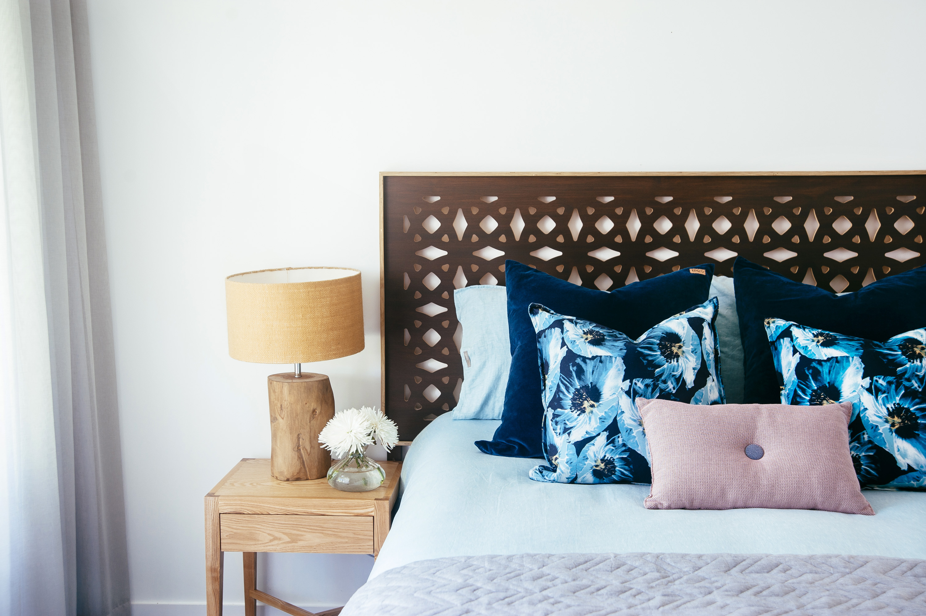
I initially wasn’t going to shoot this spare bedroom that I styled as part of a recent project because the bedhead and lamps were hand-me-downs from my client’s master bedroom (they got booted because they didn’t work in there in relation to the size of the wall they were sitting on – it was a big wall). I initially figured I shouldn’t showcase it because they weren’t considered purchases but then I decided that that is ridiculous reason and that I in fact should be promoting repurposing furniture and reshuffling your house. But more than that, they are good looking pieces and with everything else in place, the space came together with success.
The overall room is quietly feminine, not in a girly girly way but in a sophisticated ladylike way. It’s fairly minimal, in keeping with how my client prefers to live. If it was my house I would probably include some plants in here and a pouf or rattan basket next to the console but this bedroom is one of six in a house that is only occupied by two people so I had to check myself so as to not over-layer any of the spaces just for the sake of it. My client is also not a collector. She didn’t own a bunch of décor pieces stored in cupboards looking for homes and while I love fluffing around with small décor items when styling, I’d prefer them to be organically accumulated by a homeowner over time because at least then they have some meaning.
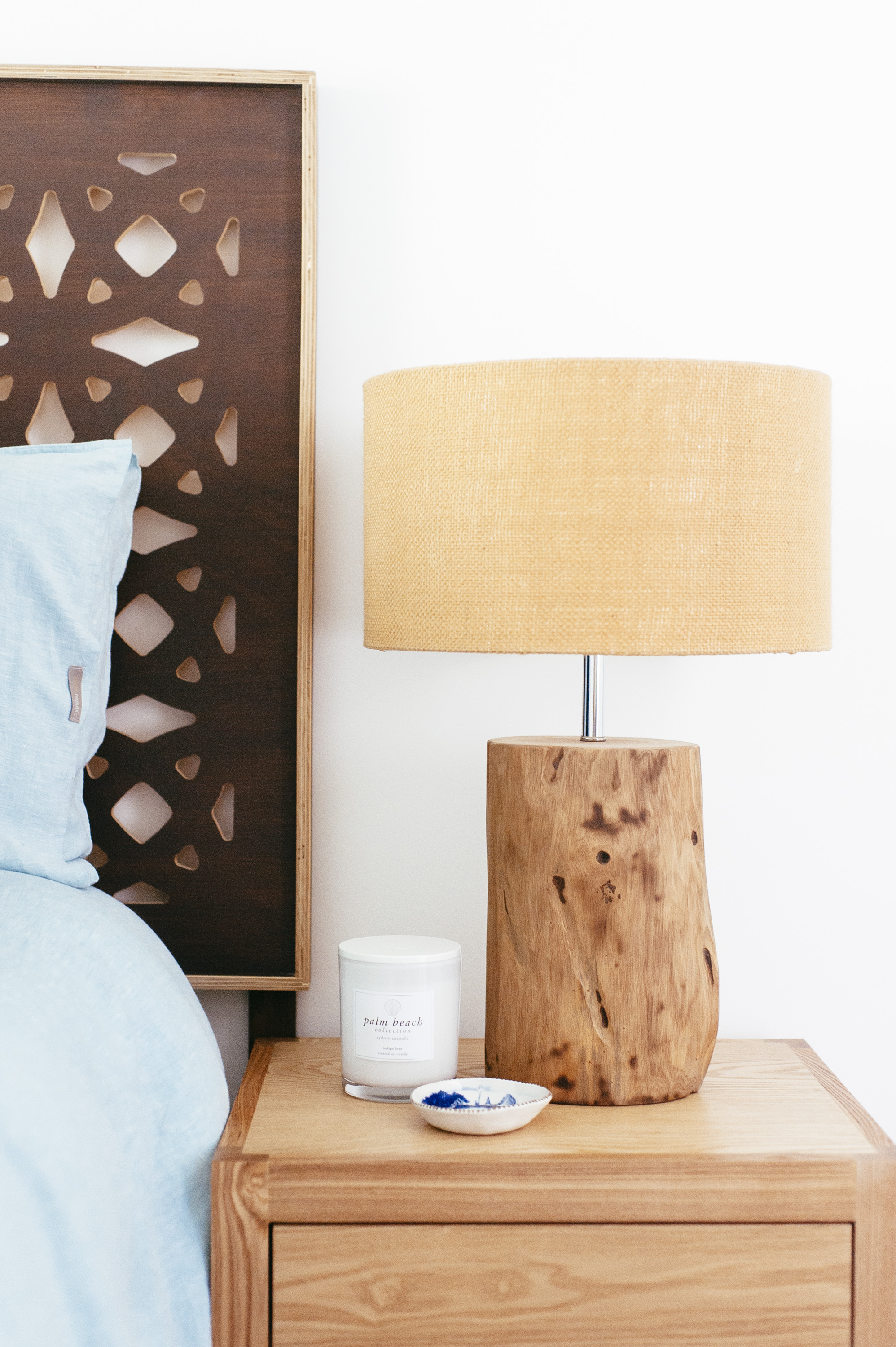
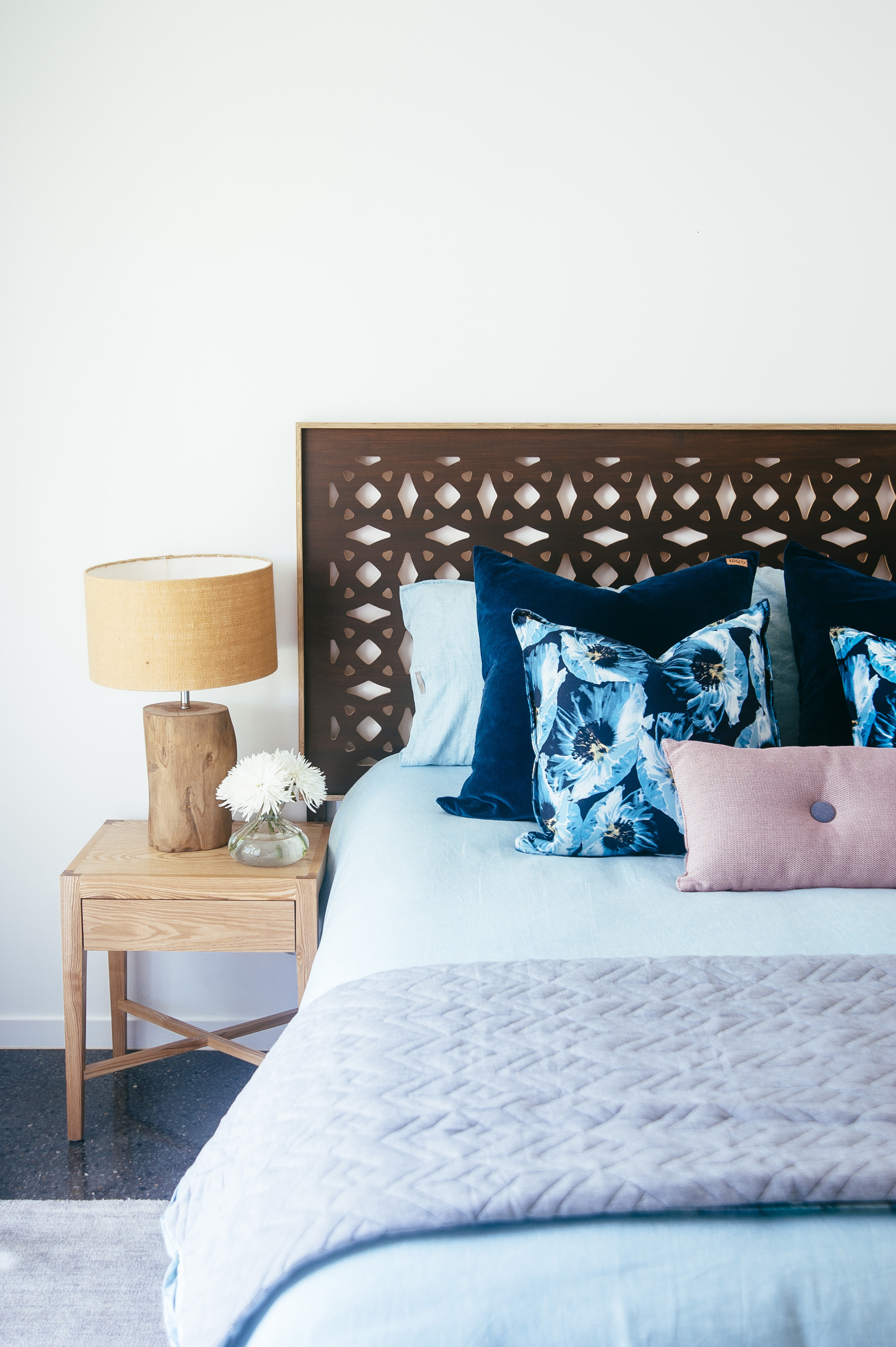
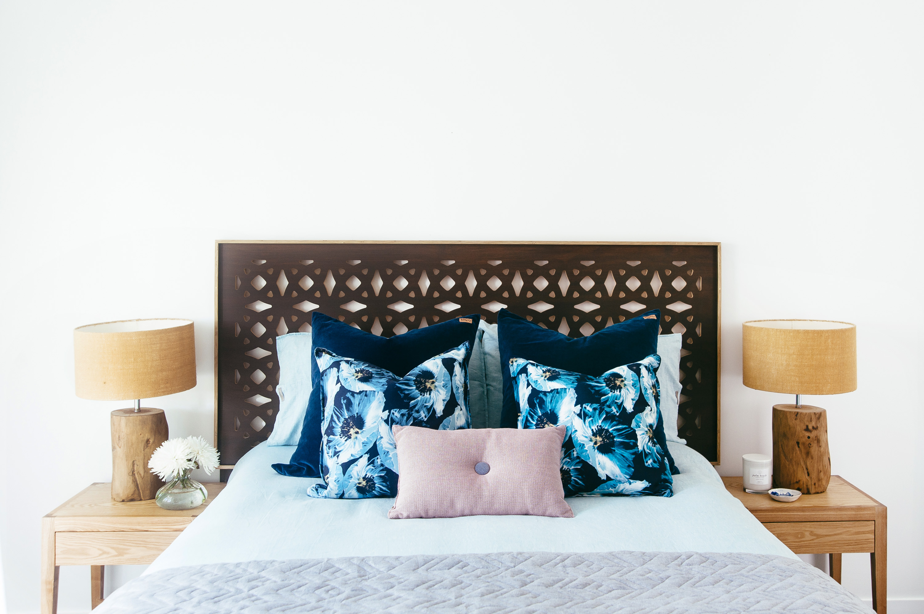
I love how perfectly the lamp shades talk to the blonde timber trim of the bedhead (which I take no credit for) and the warmth of timber tree trunk the lamp base.
Tip: keep styling simple on your bedsides. You don’t want clutter next to you while you sleep and you need to leave room for your novel, phone and tissues (this is why I am pro drawers in bedside tables).
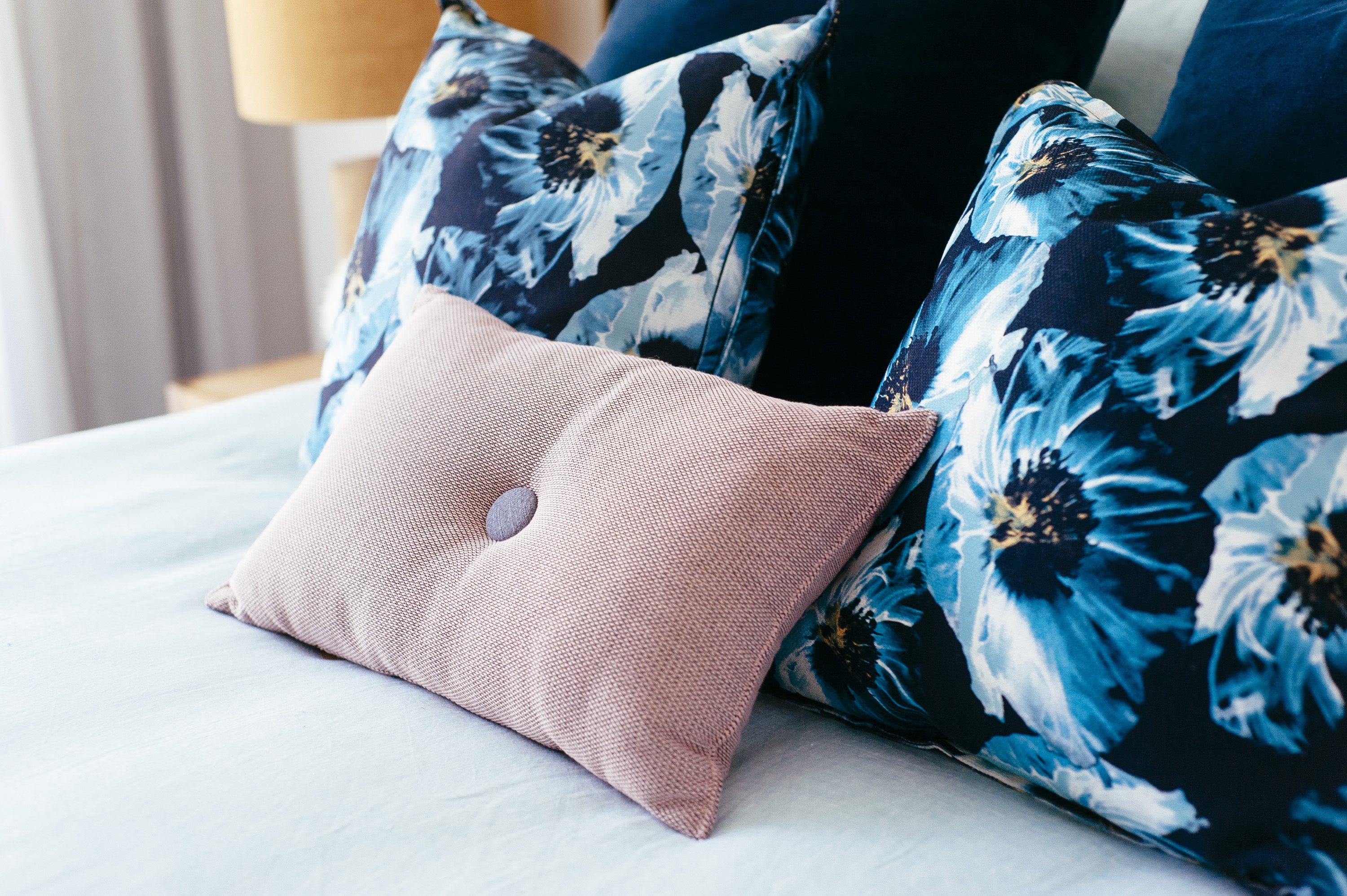
I absolutely love those navy and powder blue large floral cushions by Sheridan. I wish they were feather filled and not foam (especially for their price) but I couldn’t go past them. This bed wouldn’t have needed the dusty pink cushion in front except that I needed to tie in the art and the corner lounge chair.
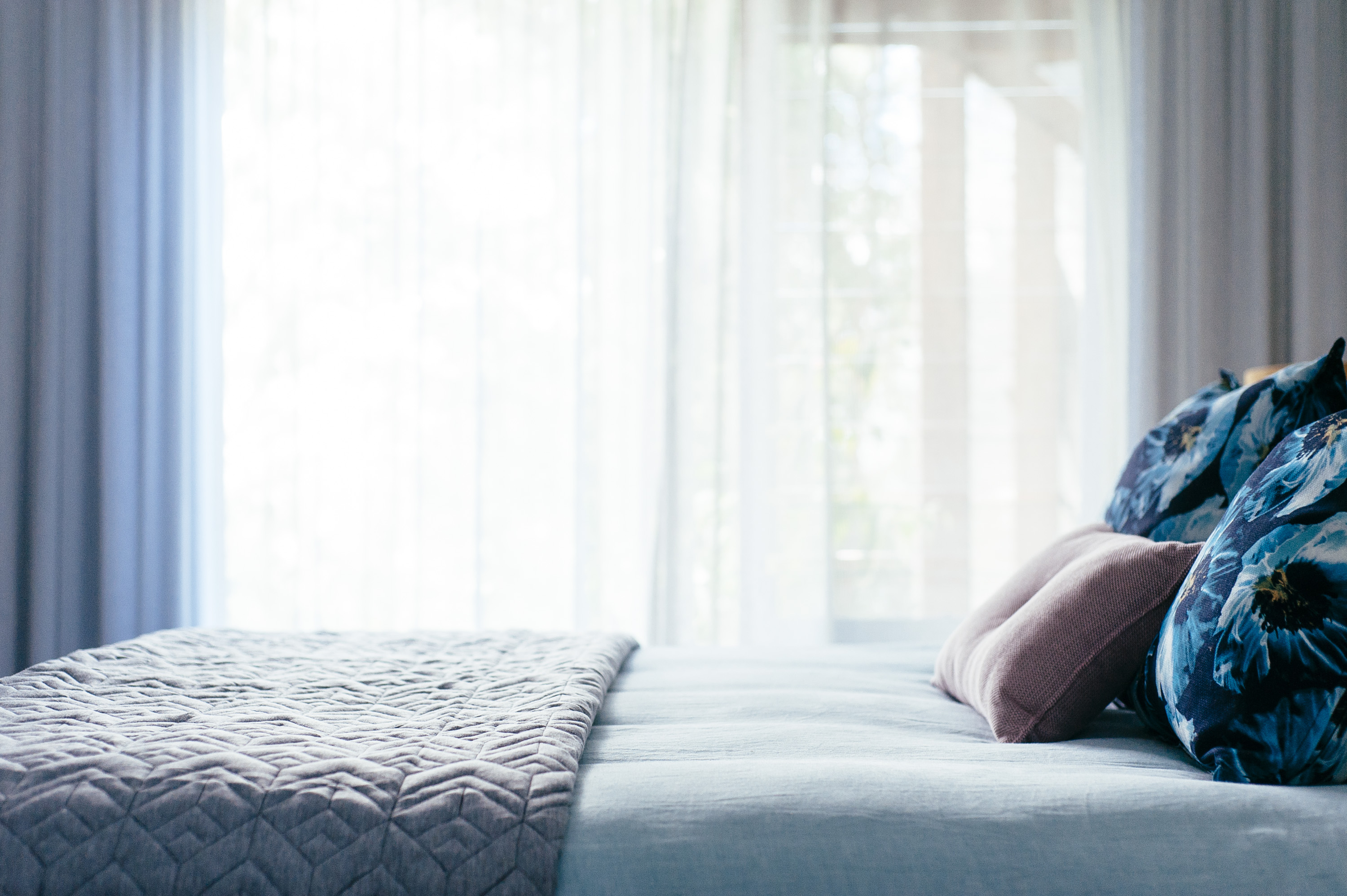
The grey patterned quilt at the end of the bed is from Adairs and was useful in breaking up the pastel in the room and the block colour of the linen bedspread. Powder blue and dusty pink are making a big impression at the moment but I firmly believe pastels need to be paired with neutrals and deep hues to help anchor a space and to avoid a space becoming too lollypop/fairyfloss. This also applies to really white spaces. I have a friend who keeps filling her house with white and I am forever telling here that is she doesn’t get some deep coloured accents in there she risks her space floating away.
You can only see a little of it it in shot above but the bed is sitting on a beautiful plush wool rug from West Elm, which is fundamental in a bedroom with hard surfaced floors, whether it be concrete or timber. I am pro rugs under bed in nearly all cases even in carpeted bedrooms except when the room needs pairing back.
The simple clean lines of the bedside tables from Globe West were just right for this contemporary space and the blonde timber works in perfect harmony with the other furniture.
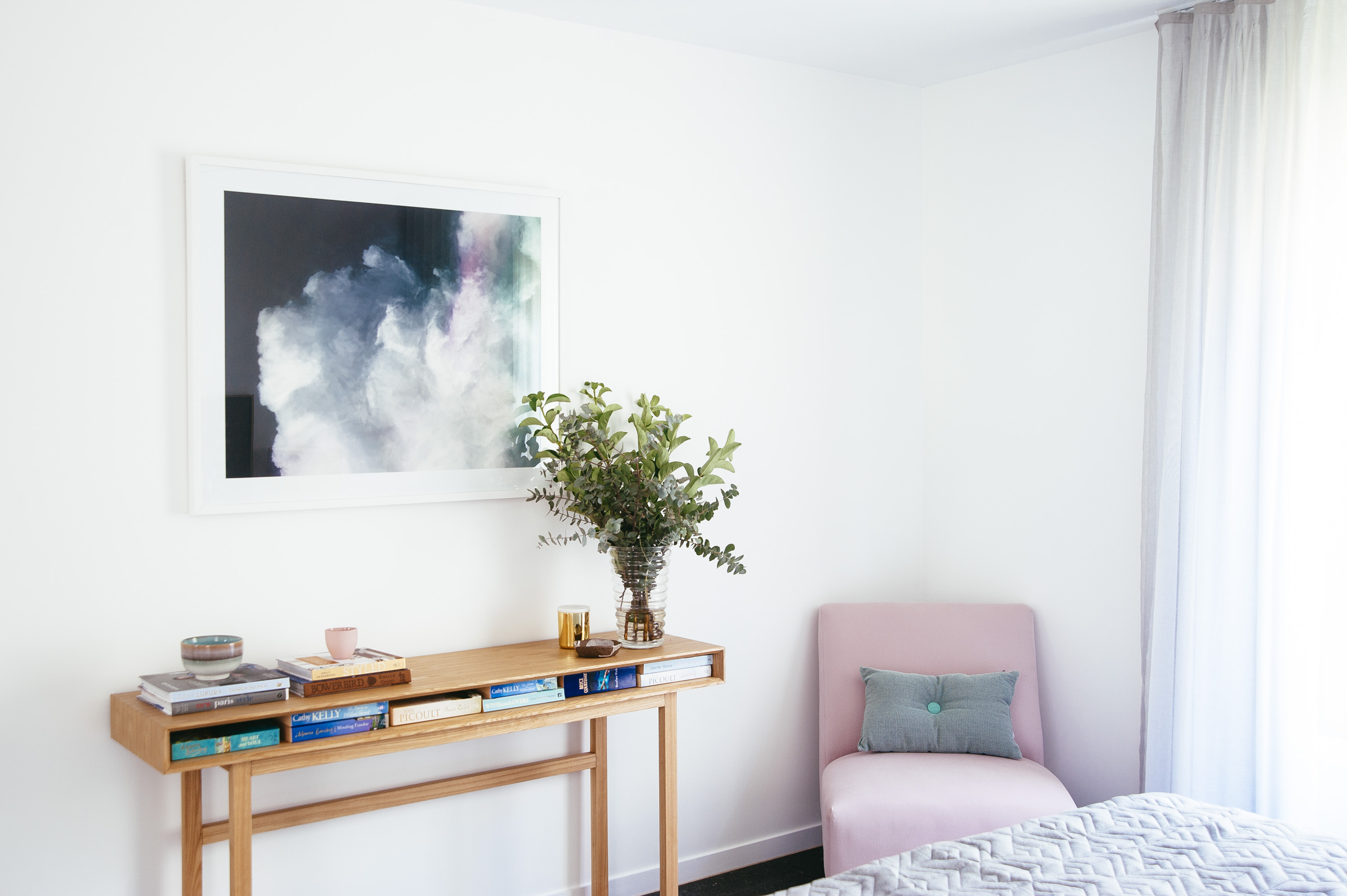
The dusty pink chair is actually more dusty in person (it’s appearing much brighter (more lolly pink) in the image). I pulled the colour from the art. It was my client’s chair that we had recovered and Gold Coasters, Tony from Foam World, Burleigh is the most inexpensive upholsterer in town and does a superb job.
I’ve actually colour matched more in this bedroom than I usually do in interior spaces but a uniform look suited my client and her paired back aesthetic.
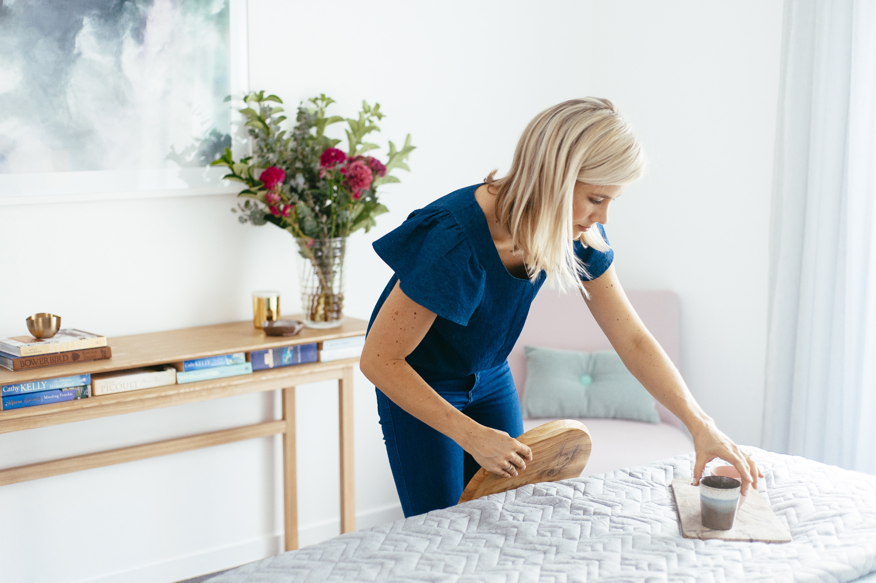
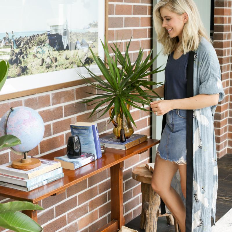
This is me playing…… play play play play, I could do it for hours adding and deleting items – adding , deleting, adding, deleting. I go into a zone, into a bubble and I could be looking at you asking me a question but I won’t see or hear you. You wouldn’t think styling would require so much concentration would you? I mean, it’s not like I’m painting the Mona Lisa……..
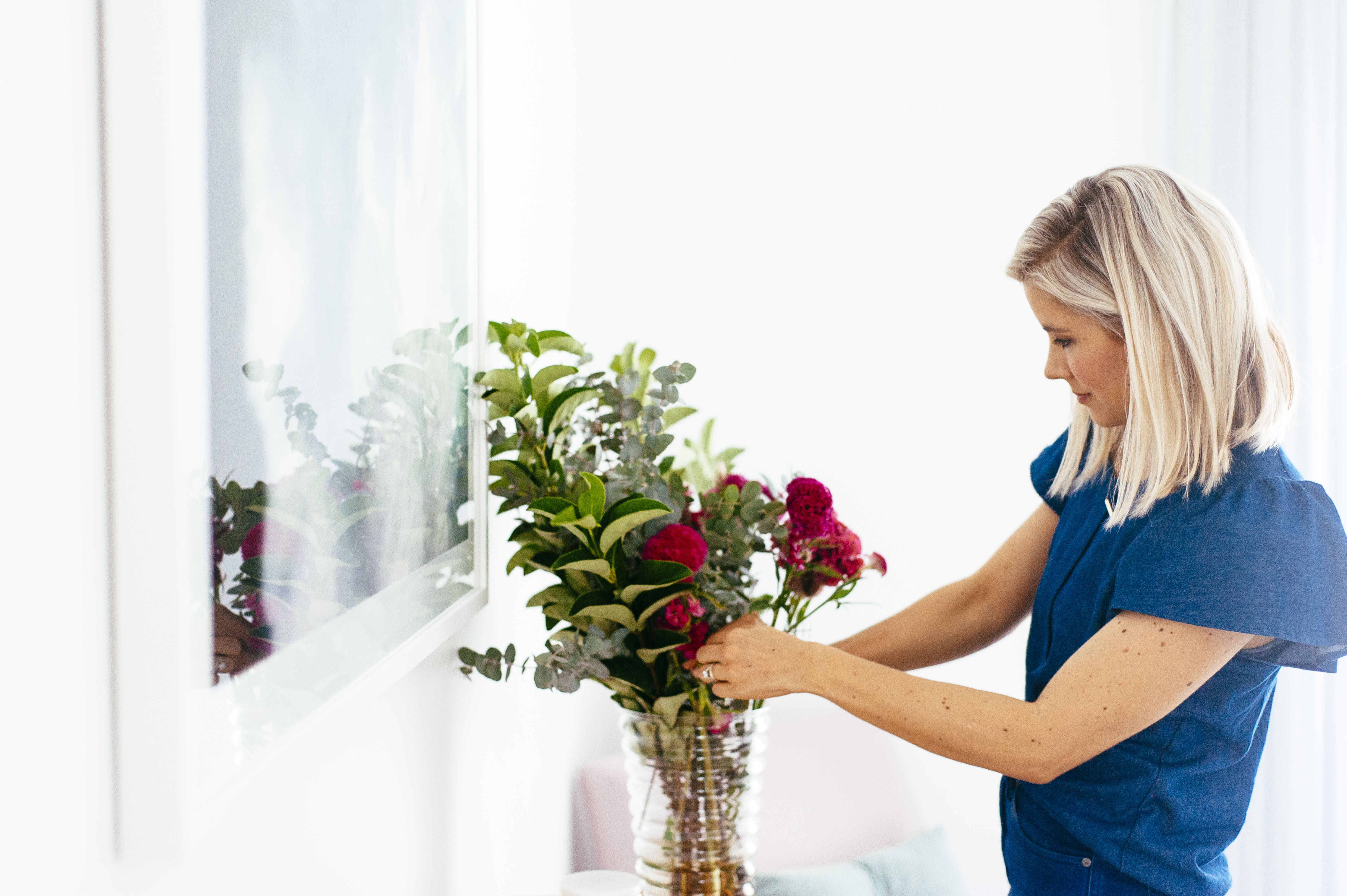
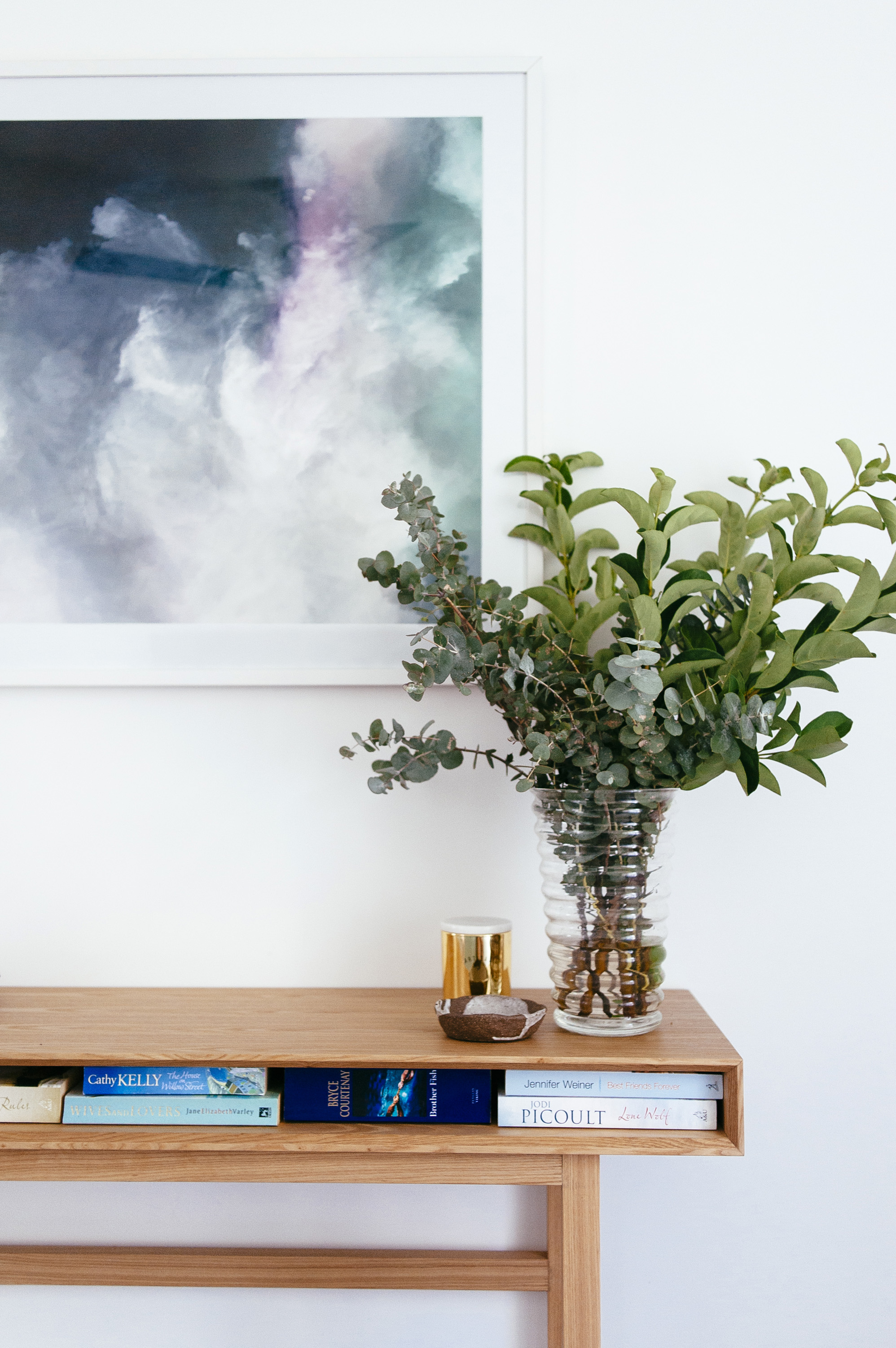
I toyed with the pink flowers in the above two shots but I ended up boycotting them because they were a a bit loud for the room.
For some reason greenery in the form of plants acts like a neutral colour in interiors because while it is technically a colour, it doesn’t compete with other colours.
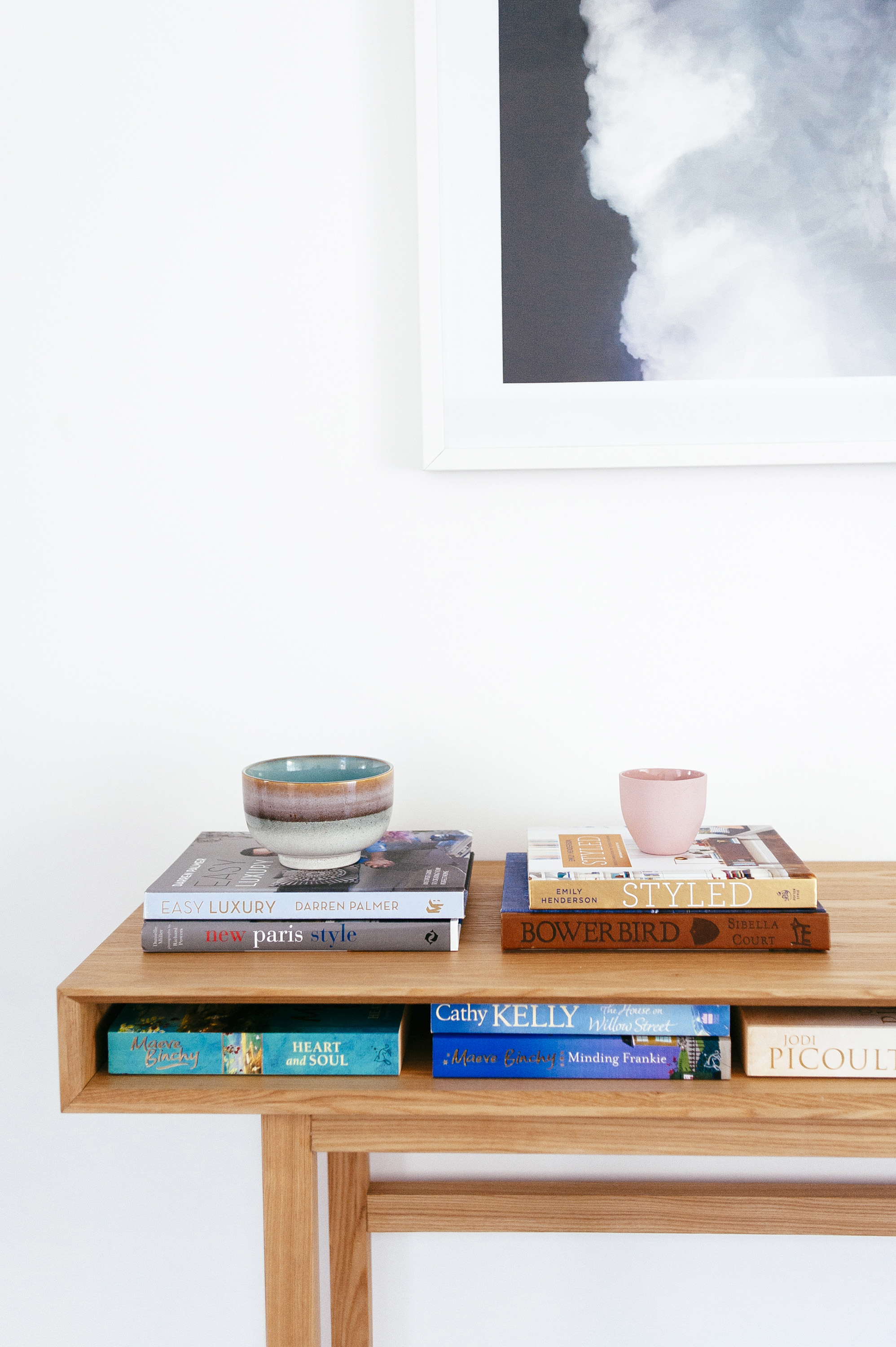
If this bedroom was occupied by someone permanently, I would have opted for a chest of drawers under the art, for storage in addition to what the built in wardrobe provides but this console from Globe West was an opportunity to save in the budget (drawers cost more) and the books on display in the narrow nook actually provide a really effective hit of colour.
Books books book, I can’t get enough of books. BTW the bowl on the left is from Kira & Kira.
Oh and those amazing navy velvet euro cushions are from Kip & Co. but sadly they are no longer available in that colour and it’s such a good colour too; a true navy that doesn’t appear too dark in low light.
All in all it turned out to be a pretty, calm and functional room that reflects the needs and aesthetic of my low key, semi-retired client to a tee.
As I look at this pic now, I so badly want to paint the walls a saturated colour but it wasn’t part of the brief and it isn’t entirely necessary, not that that’s ever stopped me……
Photography by Natalie McComas.
Carlene xx


