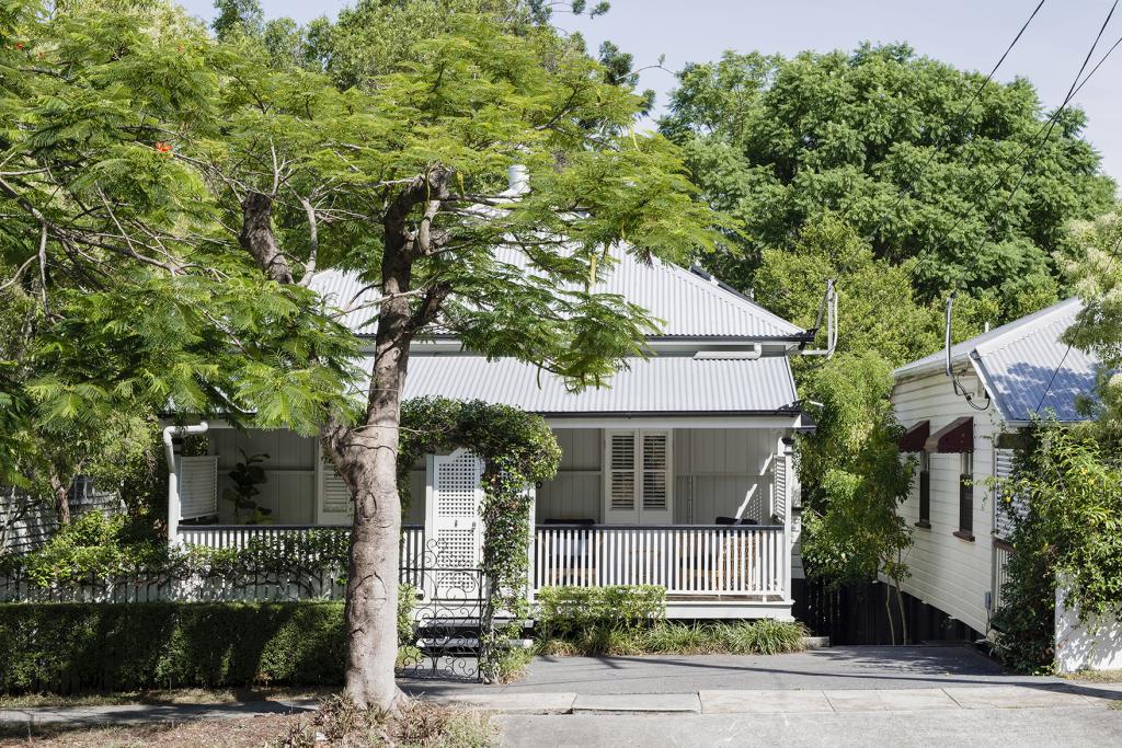
Not all Queenslander homes are created equal. To be honest, most have been renovated within an inch of their life, which is why this lil Federation gem felt like a breath of fresh air. The entire project was a refreshing departure from most of our projects that involve a lot of dirt and dust and large machinery. I’m a stylist before a designer. Styling is where my passion lies so being tasked the job of making this house a home without even painting a wall felt like a real win.
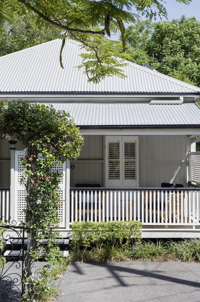
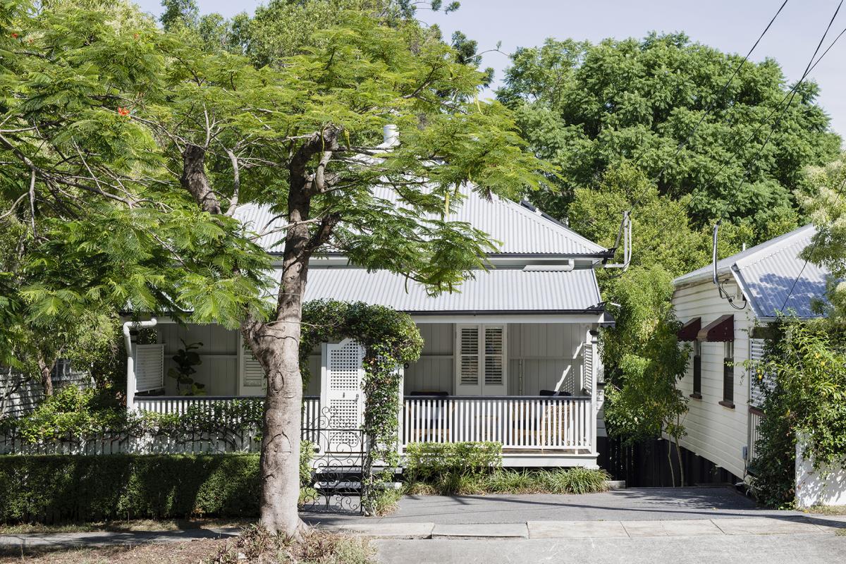
I can’t take any credit for the facade of this home. It was this gorgeous when we turned up, although we did source those cane outdoor chairs from Naturally Cane, which felt ideal for this home.
It’s no secret that I don’t do a lot of neutral. I’m typically more of a maximalist but I also always take my cues from the individual building and there was something about this space that called for quiet. The beautiful decorative shutters, and VJ walls and ceiling were enough here to provide interest and texture. The rich natural materials of the cane, timber and rattan delivered the warmth.
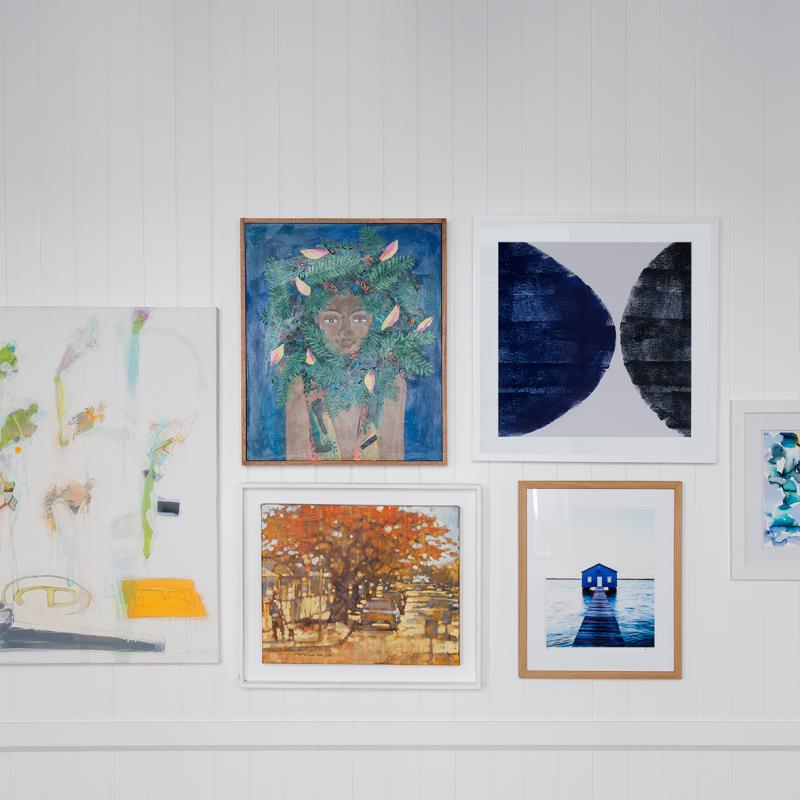
The artworks in the gallery wall are a combination of vintage, client-owned and new. The vase on the coffee table is vintage and tall vase on the entertainment unit is from Kira and Kira. The rug is a faded vintage Persian look from Pottery Barn. NB. It’s smart to use colour and pattern in a rug when you’ve got kids because it absorbs any marks. which are inevitable. I know this from experience because our dog puked on our own living room rug! The rattan planter basket and chest are both from Freedom. There’s no ‘play room’ in this house so the chest is ideal for storing baby toys.
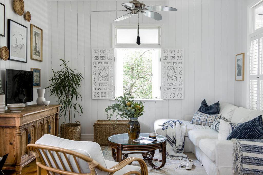
I’ve always been of the thought base that classic spaces require taller TV cabinets rather than the modern, low lying option. This one is from Bisque and it’s not strictly an entertainment unit, it’s really a buffet that you could use anywhere but in this case it’s the ideal TV unit in all of its decorative, carved-timber glory.
The cane coffee table is from Naturally Cane. I love round tables because they keep the space fluid. Rounded edges are also good Feng Shui. The sofa looks sooooo comfy doesn’t it? It is! We went for the relaxed slip cover variety. It’s a bit more ivory in the flesh than depicted here and the cover comes off to be washed for when it gets too grubby. It’s from Plush and just quietly, they have 50% off everything as I write this.
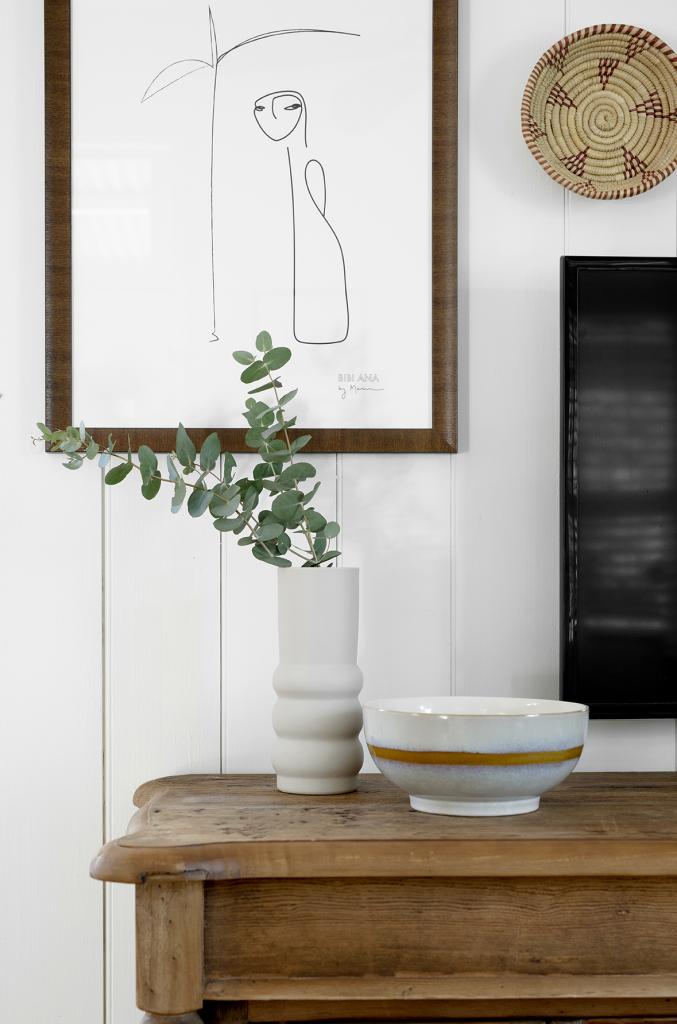
That lovely, quiet line drawing is from Bibiana and Co. I can’t get enough of a good line drawing. They always look so sophisticated and can really be applied to any type and style of space. The African woven bowl hanging next to it is part of my collection, sourced from Ebay about 10 years ago. Back then, it was standard for me to find myself in all parts of South-East Queensland collecting Ebay and Gumtree purchases. These days, I’m still a magpie but now I keep it closer to home because who has time?! The vase and bowl are both from Kira & Kira, my homewares go-to.
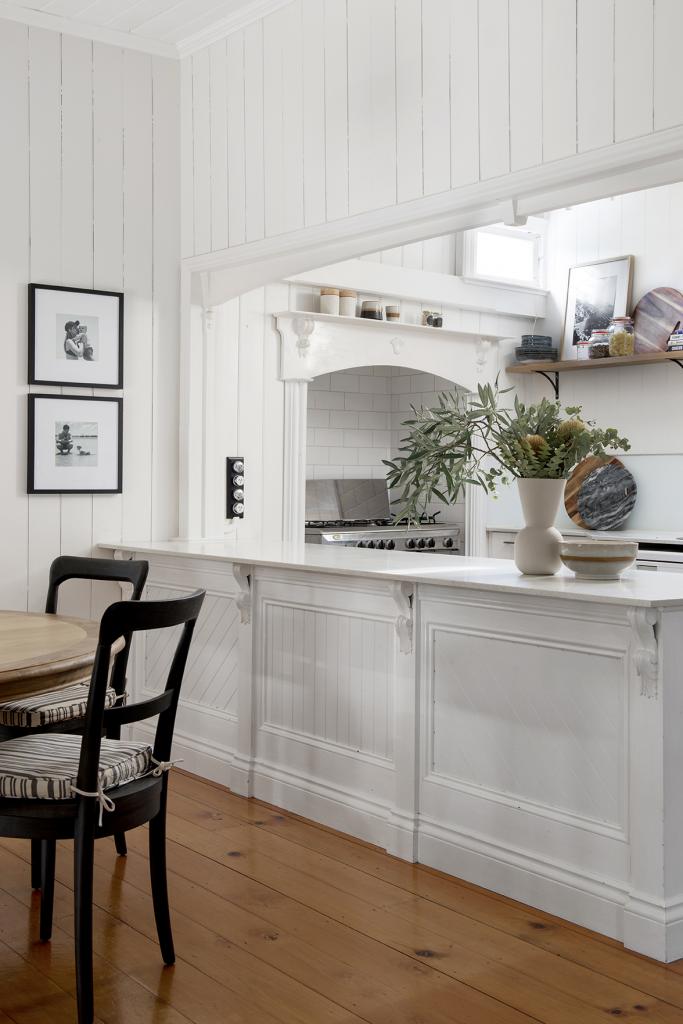
Finishes in the kitchen indicate that this space received a small renovation some years ago. The only thing we added was the floating shelf to help fill a very bare wall and to provide some extra storage. How cute is the oven cubby and those power points!!
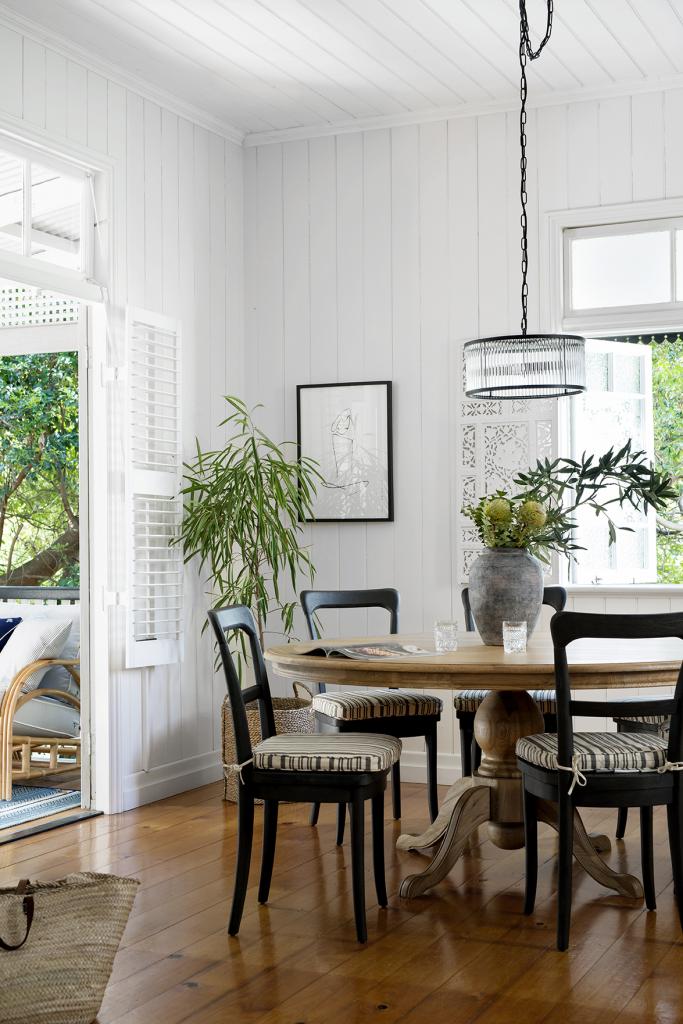
In the dining room, we kept things really simple although it wasn’t simple finding a provincial style 6-seater pedestal dining table. I ended up sourcing this one at Interiors Online and the price was good. Timber dining tables and black dining chairs, to me, are a like peas and carrots. These particular timber chairs are from Pottery Barn. It’s the little things that get me. I love the curved lines and hand painted finish and to be accurate they’re actually charcoal, which slightly softens the look. The pendant is from Beacon and this is another line drawing from Bibiana and Co. The rustic urn is HK Living (love all their stuff) from Kira & Kira.
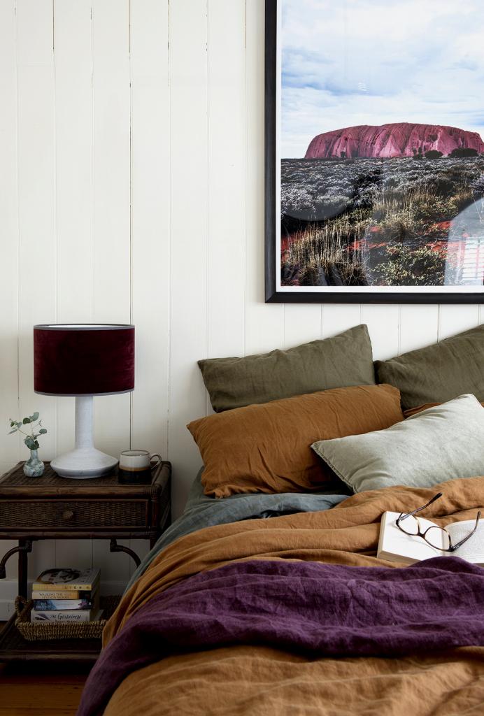
The master bedroom is one of my favourite spaces in the house. The colours just make me gloriously happy. I’m not sure what came first, the art or the bedding but there’s no doubt they are a match made in heaven. I’m not normally so literal with colour matching. I usually work with more varying tones within a colour palette but this combo sort of just fell into place and I’m not mad about it.
The art is called ‘Uluru’ (fittingly) by Kara Rosenlund, my go-to for landscape photography. The piece pretty much sums up the vulnerability and strength and sheer vibrancy of this rugged country, which is hard not to awe over. The linen quilt cover is the ochre colour from I Love Linen, the plum linen throw is from Adairs, and the velvet table lamp, from MRD, is completely awesome.
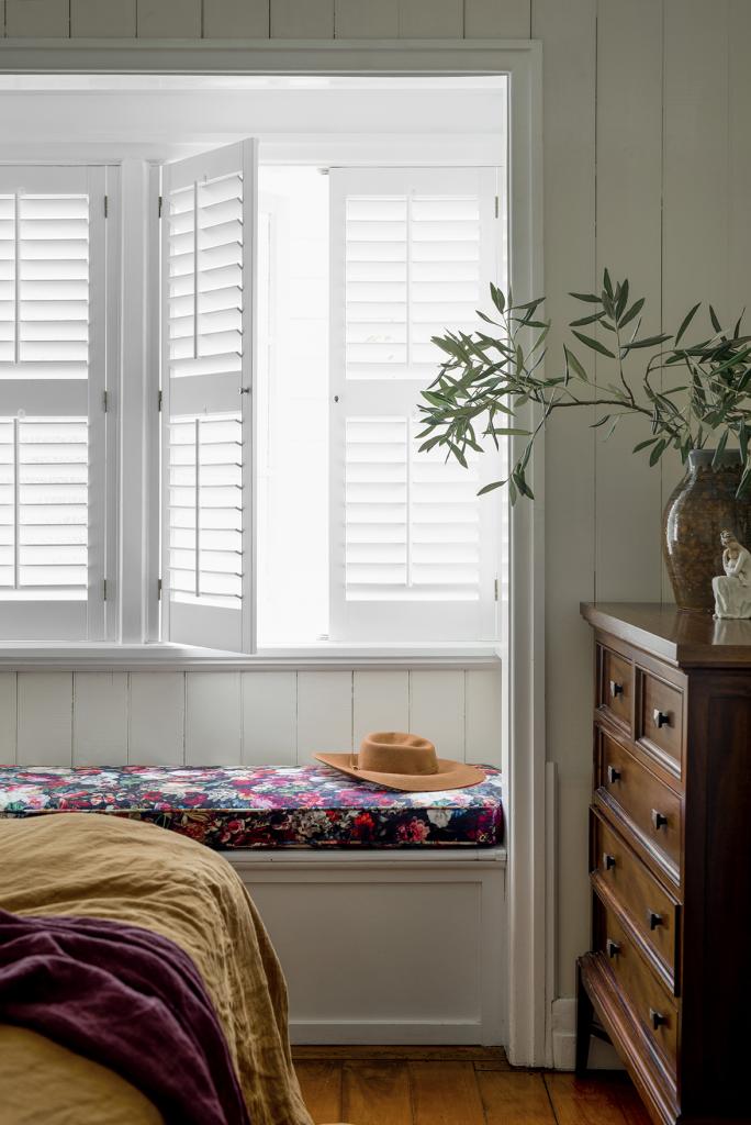
Does this cushion fabric look familiar? I loved it so much I used it in our own house, a house with a completely different aesthetic, mind you. It’s called Flowerbomb from Warwick Fabrics and the cushion was made by Graham King at Abode Furniture.
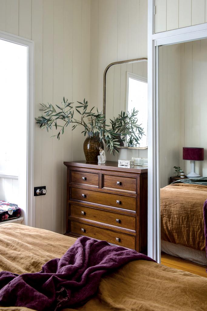
How deliciously beautiful is that walnut-stained timber dresser? It’s from Xavier Furniture and it’s one elegant piece of furniture! I hope they pass it down generation to generation, with a few dints and scratches along the way that indicate a well loved life. The aged brass mirror I sourced from Gallery Direct, another trade supplier. It’s patina and the shape felt too good to be true.
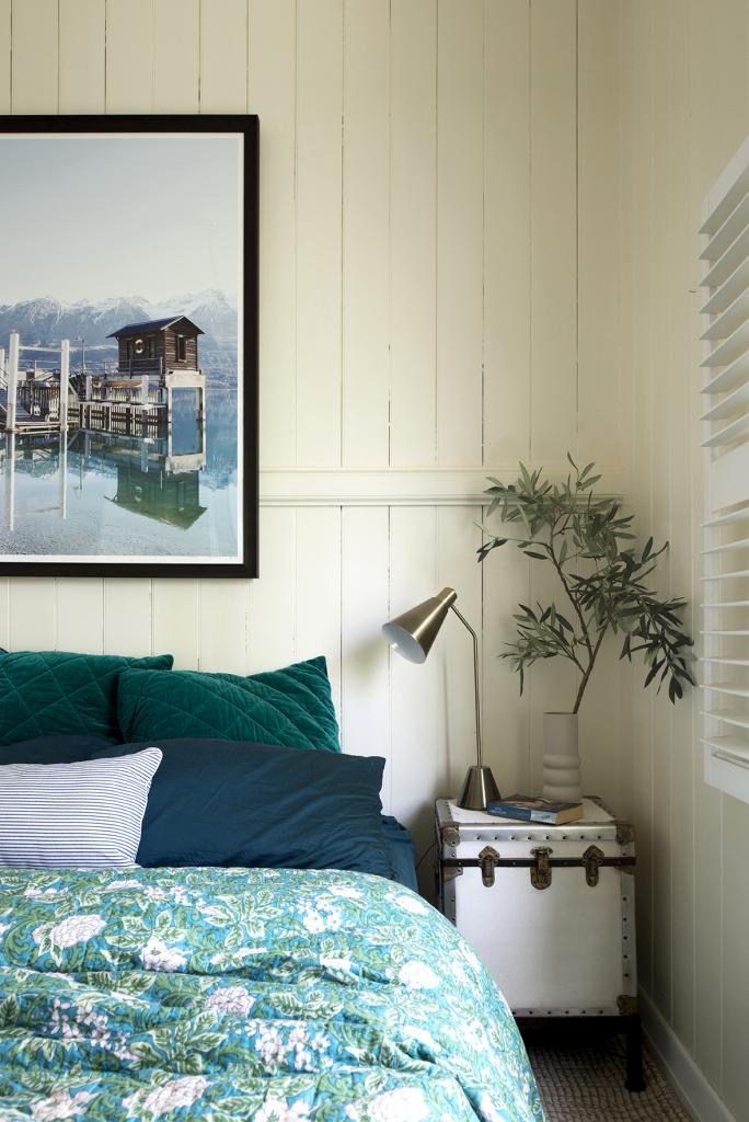
Again, I’m not sure which came first, the art of the quilt. I think it was divine intervention. The art is another of Kara Rosenlund’s and the quilt is from Canvas & Sasson. The trunk style bedside table is not a bedside table at all but a side table from Pottery Barn. It’s top-opening so in it, you’d only store infrequently needed items. The brass bedside lamp is MRD and I was drawn to its simple, no-nonsense aesthetic and the fact that it could easily be moved around the house and do its job equally as well in a different setting.
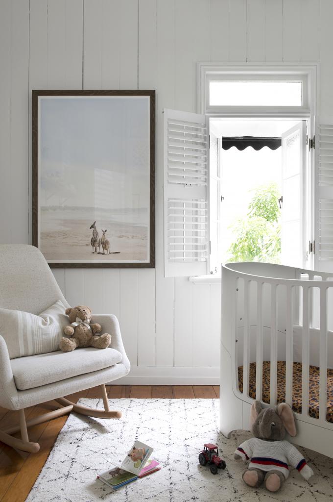
My clients’ delicious little boy already rocked a fab cot and rug that they’d brought with them from down South so this space just needed a few more key pieces and new layout. The rocker is from Freedom. It’s a great, oatmeal colour that I suspect will get good use. I love a rocker in the nursery. I happened to own the ugliest rocker you ever did see but it did see me through some long nights with sick babies. The cushion is from Eadie Lifestyle whose cushions I truly love but it is Kara Rosunlund’s photographic print that sets the tone for this space. It’s called ‘Nurture’ which is very fitting to this space, don’t you think?
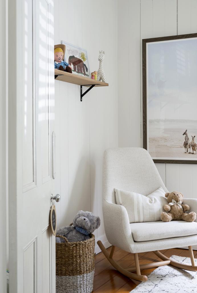
We added a floating shelf in here also to display some books and cherished items. The timber was from a local timber supplier and the brackets, an inexpensive type from Bunnings. The simple, utilitarian style of the exposed brackets felt right for this house but may look out of place in a more contemporary home.
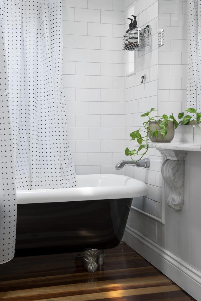
This bathroom makes up for in character what it lacks in size. We’ve photographed this space for your enjoyment, not to show off any of our work because we literally did not a thing to this space apart from frame up the shot. It was already perfect right down to its polka dot shower curtain and ornate marble shelf. My clients might would argue that the teeny tiny vanity is insufficient but that’s an issue for another time, if ever.
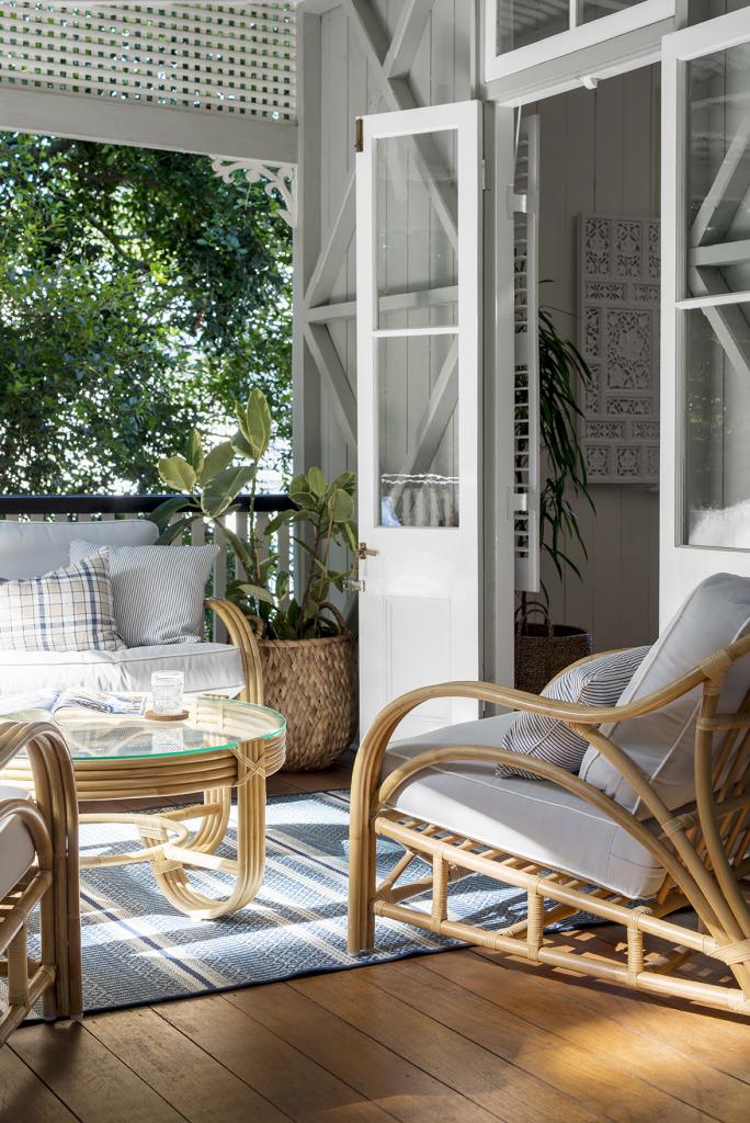
Onto the back deck. All the cane furniture for this house was sourced from Naturally Cane. There was something about this house that called for cane. This house is located in suburban Brisbane but in my head, we were somewhere hot and humid in far north Queensland farming country. The rug is an outdoor rug from Pottery Barn and the striped cushions we had made in outdoor fabric from The Textile and Design Studio. The plaid cushion is an Eadie Lifestyle Cushion, not an outdoor cushion but looks good in my photo.
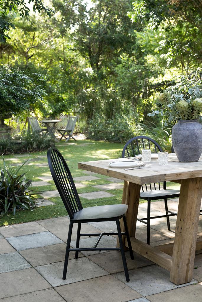
I was so happy to walk outside and see this backyard. Have you heard of the great Australian shrinking backyard epidemic? It’s a thing and the idea of it makes me so sad and so nostalgic. I spent so many hours in our backyard as a kid that I wonder what it means for Australian kids of the future.
The timber dining table and black chairs are from Early Settler’s outdoor range and I love the simplicity of the combination but anything was going to look fab with that awesome checker board paving.
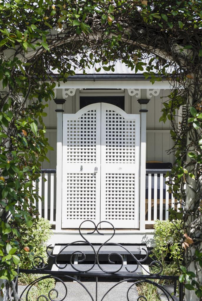
Well that’s it in a nutshell, folks but can we just take a moment for the heart in the front gate above!
I’m not on here as much as I’d like anymore but blogging is also not my business and I decided that if I don’t have anything significant to say then I’ll say nothing at all. Let’s call it quality over quantity. This lil project felt meaningful. It reminds of a simpler time. It feels like this gorgeous home has opted out of the ‘bigger and better’ race and is entirely comfortable in its own skin, stoic and unperturbed by the fast world and changes happening all around it. It makes me want to take a big, deep breath. I hope you love it as much as I do.
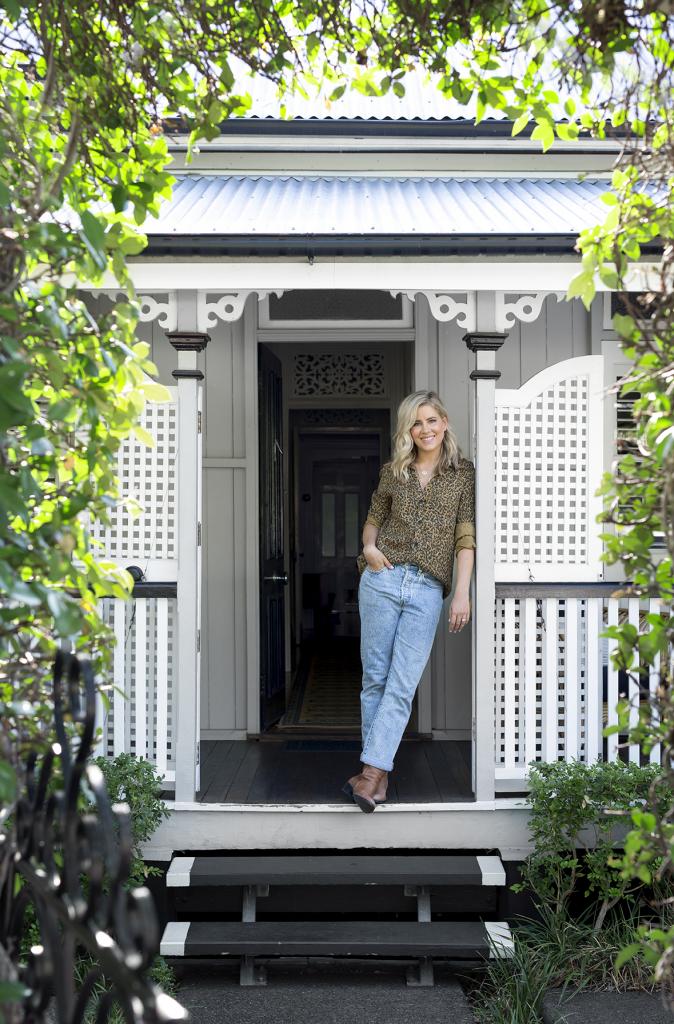
Carlene xx



May 30, 2019 at 9:50 am
It looks fabulous, very calming, cosy and restful . Looks like a loved home unlike a lot of the sterile decorating/styling we see these days. Love all the links you provided too 🙂
January 8, 2020 at 6:03 pm
Agreed, Jen.
January 4, 2020 at 12:07 pm
Hi guys where did you get your fan?
Love the place
January 8, 2020 at 6:03 pm
It’s so cute isn’t it!? It’s original though so I’m not sure where it’s from, I’m afriad.