My sister, with her hubby (my bro in law) and their two lil whipper snippers (aged 1 and 3) recently purchased an original, late 60’s home on the Southern end of the Gold Coast and it needed a serious reno. Although ocean views don’t come cheap, which meant the reno needed to adhere to a pretty strict budget.
These two were like no other clients and for a couple of reasons. You see, usually when people take on a renovation they consume themselves with interiors magazines, start a Pinterest board, draw inspiration from Instagram and so it goes. Well, my sister didn’t want to know about it. I’m pretty certain she doesn’t know what Instagram is. So she was all like,”I don’t have time to deal with it so you just tell me what to do and I’ll do it.” And I was all like, “whaaaat, free reign? Don’t need to tell me twice.”
Sounds good right? Wrong. Because my bro in law was all like, “I have absolutely no idea what I do and don’t like because the only magazines I read are surfing mags but…….. are you sure about a navy blue kitchen? Are you sure about that pendant? Are you sure about that paint colour? Are you sure about that flooring?” Worst client ever! It’s OK, they know it, I’ve told them so.
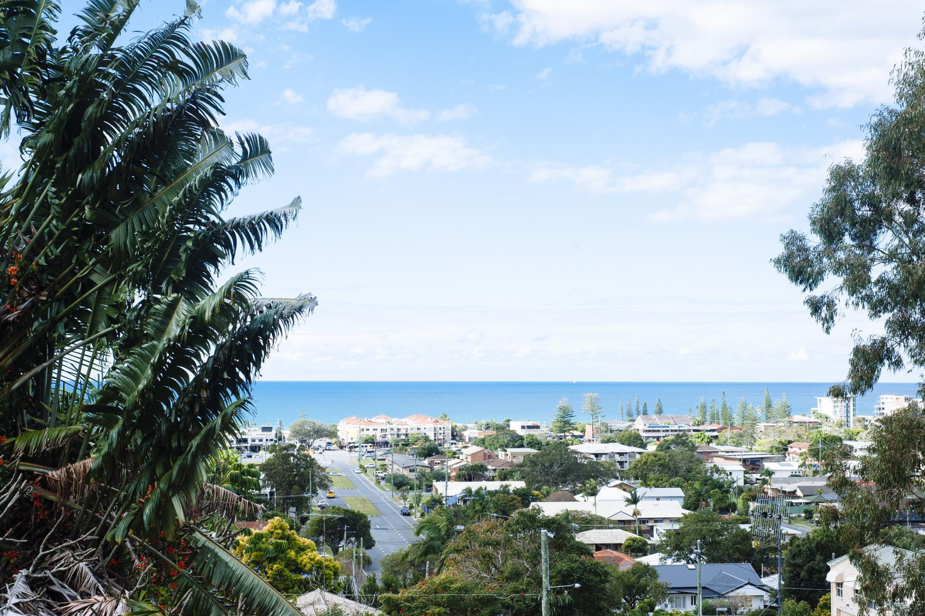
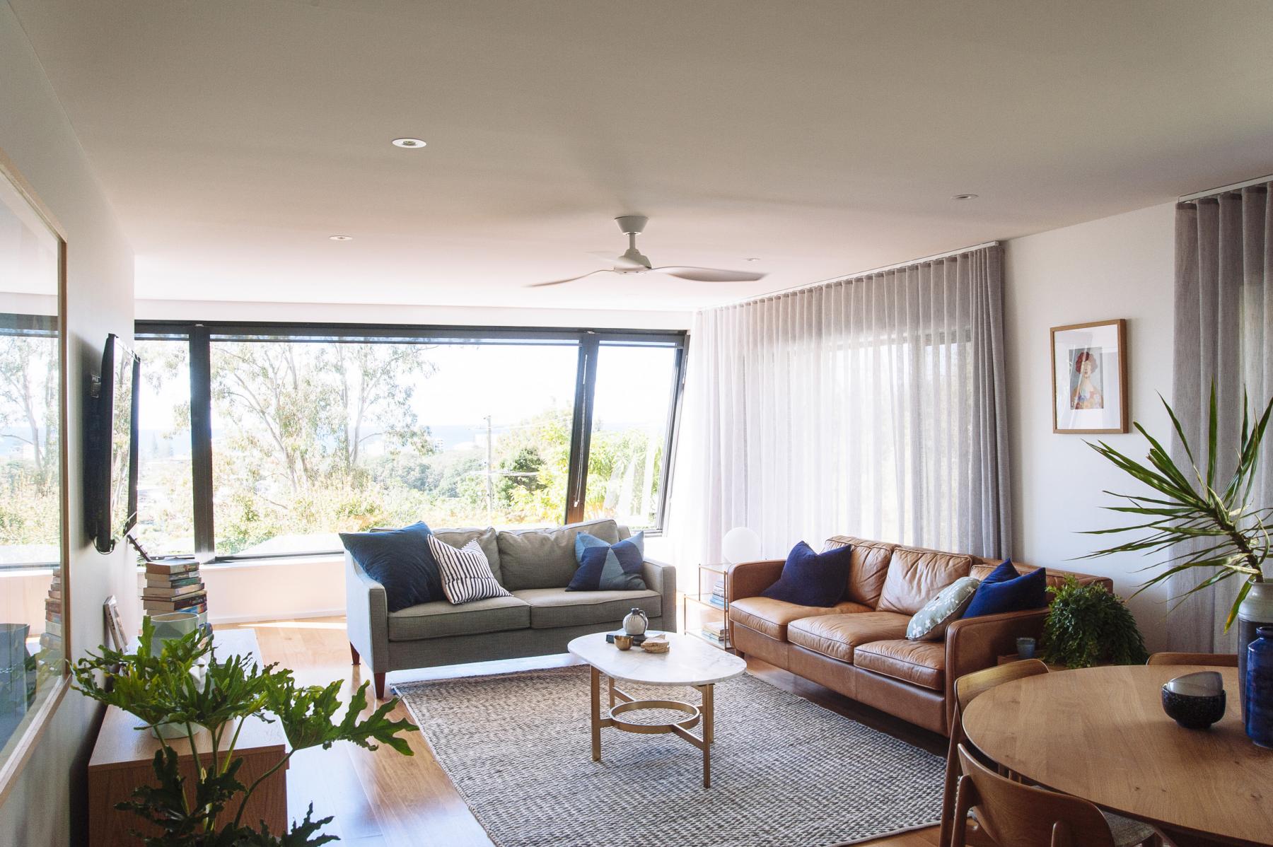
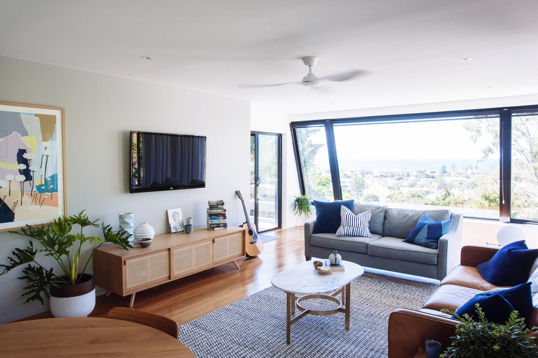
Anyway, we got there in the end so let’s get down to business, starting with the view. It ain’t too shabby right? Well, it dictated the interior colour scheme for this home – powder blues, greeny blues, navy blues – just all sorts of blue goodness.
Now for the kitchen…..
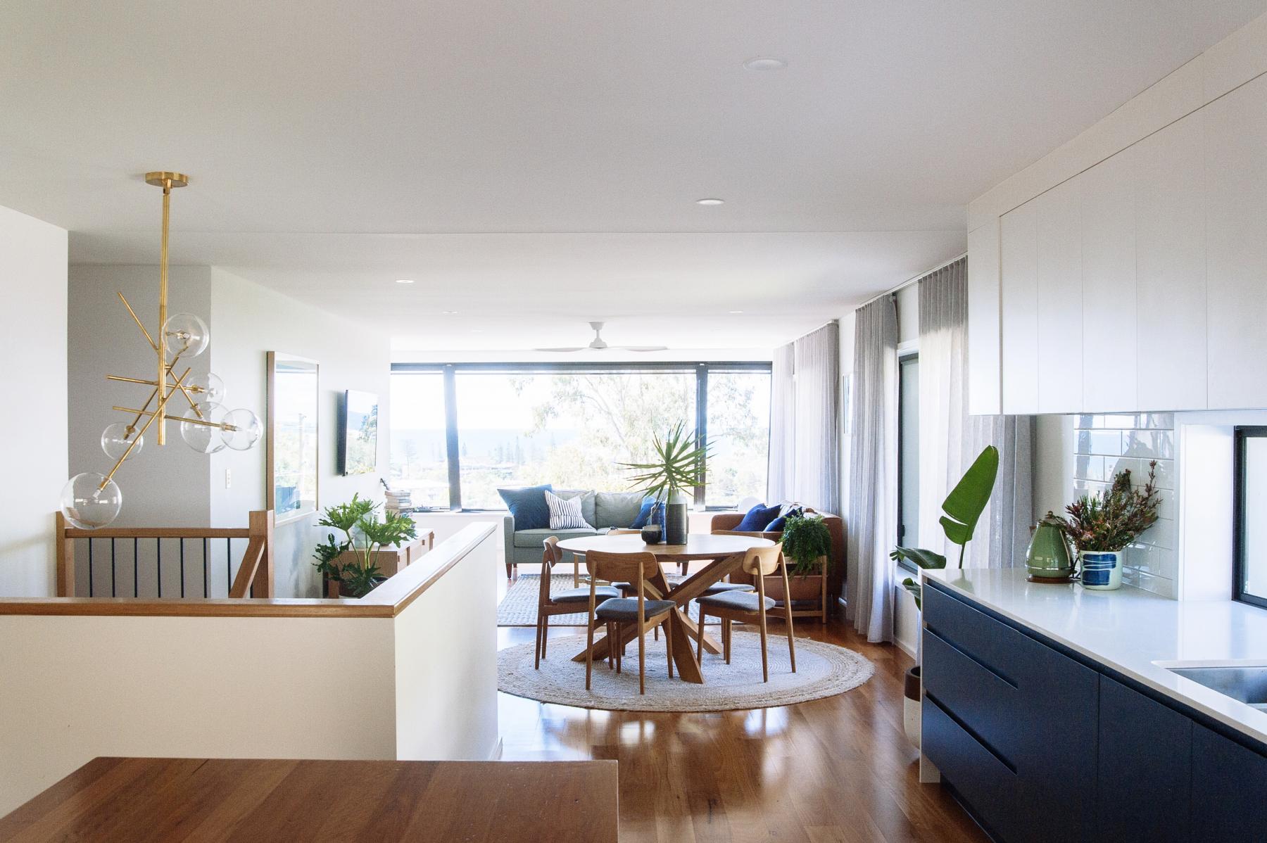
The kitchen layout had to be completely reworked to create easy access to the atrium and that indoor-outdoor fluidity that we all strive for.
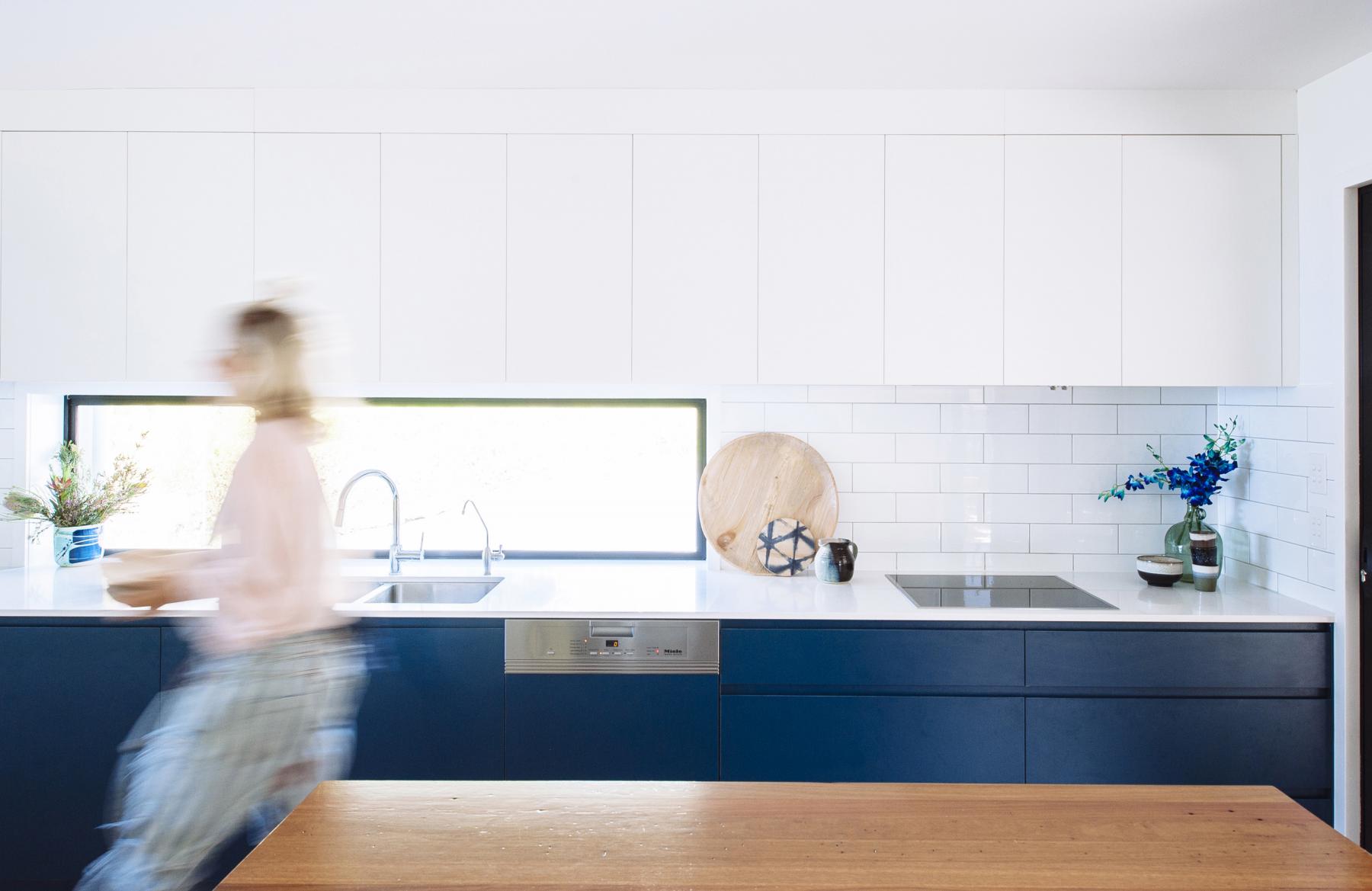
I knew from the get go that I was going to do a navy blue kitchen so this was my starting point for the whole interior colour scheme. You can’t really see it in the image but this navy throws a very subtle green, which is beautiful. It’s called Deep Sea by Laminex. There was no budget for custom 2pac colours so it was a big bonus to be able to find a beautiful colour in laminate, which has come a long way as a material.
We had what was a full size window shortened to allow for overhead cabinets. You don’t always need overheads. Open timber shelving is a really nice option too but there was no room in this kitchen for a butler’s pantry so in this instance the overhead storage was necessary.
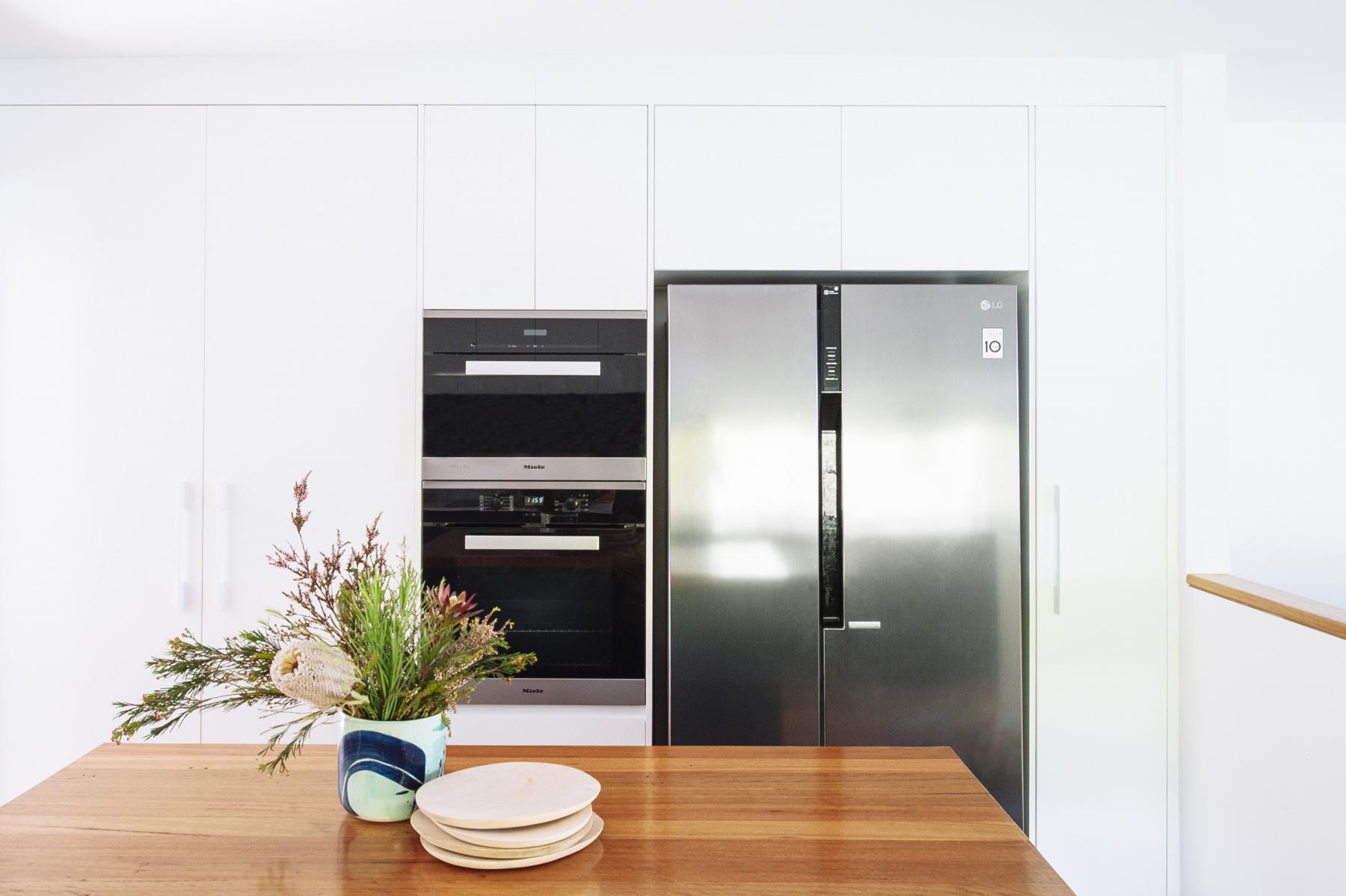
I chose to do the floor to ceiling cabinetry all in white so that the navy bank of cabinets on the opposite side had the chance to shine. And the timber island bench was the perfect addition to warm up and break up the blue and white surfaces.
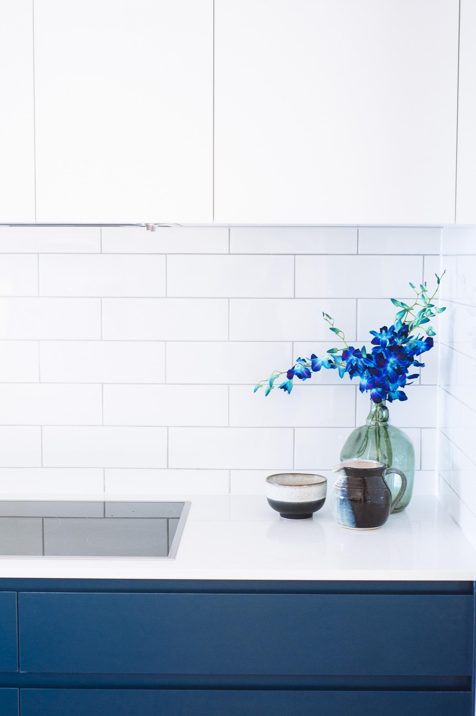
The splashback tile was a super inexpensive subway style laid in timeless brick pattern with a very light grey grout, just contrasting the tiles enough to highlight the pattern. You can’t go wrong with this look in a splashback. It provides interest and texture without demanding attention.
The Caesarstone benchtop is a simple, crisp white. I’ll admit that while at the cabinet maker’s showroom I did look lovingly and longingly at the beautiful, veiny, engineered stone samples but you should know that the price jumps considerably once you step out of the basic colour range. In this case the money was better spent elsewhere.
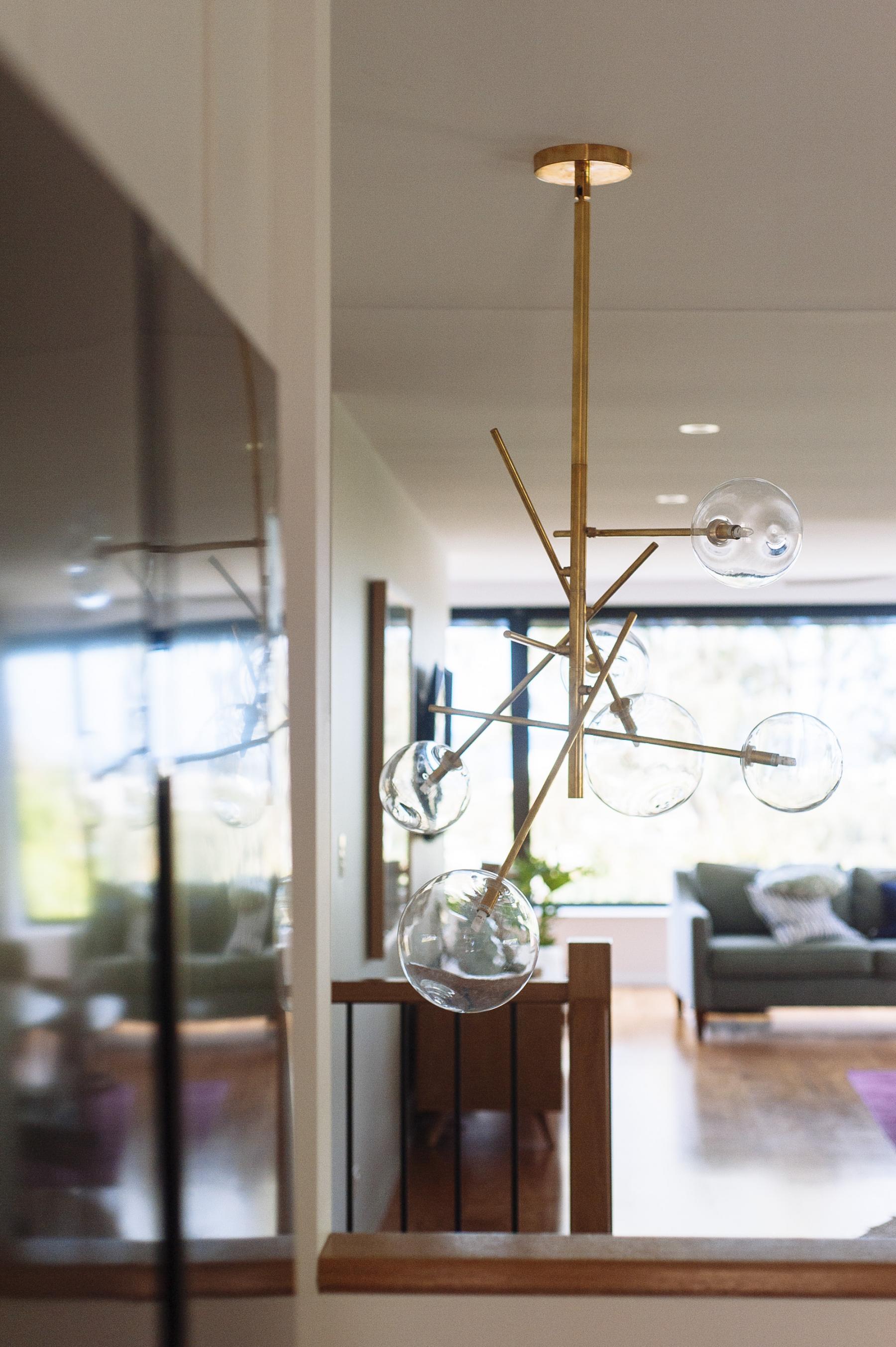
This Beacon pendant over the stairwell was the ideal final addition to this space for a few reasons. 1. The asymmetrical shape of the light fills out the stairwell void perfectly; 2. The glass fittings means that it remains subtle enough that it doesn’t become the focal point; 3. It brings the brass detail, that is also in the living room, into the kitchen; 4. Brass and navy blue is my heaven.
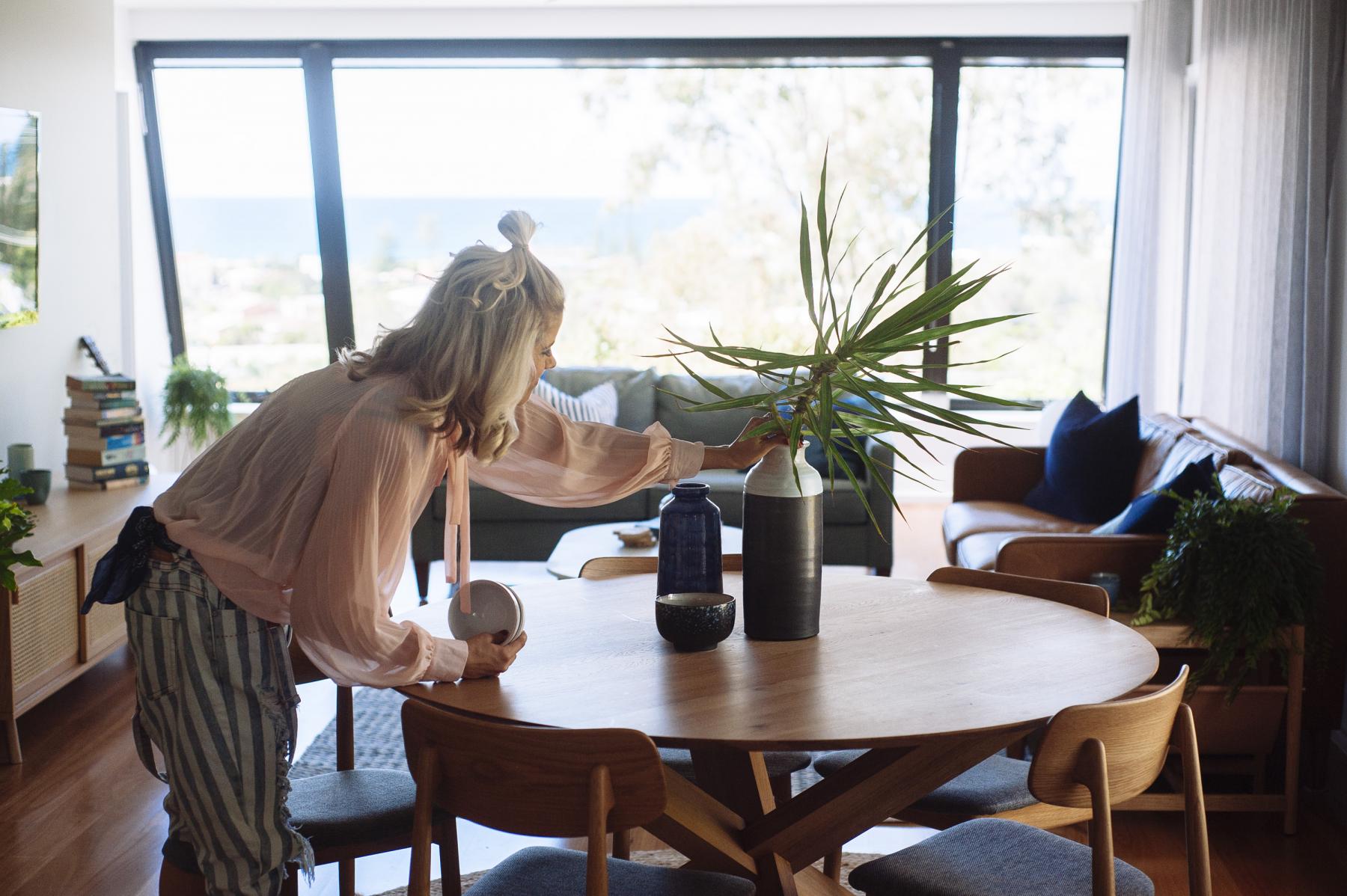
On to the dining room, which is more of a zone than a room. This space demanded a round dining table rather than anything angular, as this space is a bit of a thoroughfare into the living room and you don’t want to have to feel like you’re walking around something. I’m a big fan of round edged tables across the board, including coffee tables, bedside tables and side tables because they are so darn easy to work with in a space. There is also the fact that rounded edges and young kids go hand in hand.
The inclusion of brass accents in this space was organic and I really can’t resist the urge to use brass with blues. Why should I? It’s so rich and deliciously good.
The simple, clean lines of the furniture here aligns perfectly with the mid century design of the house and more importantly suits the home’s occupants.
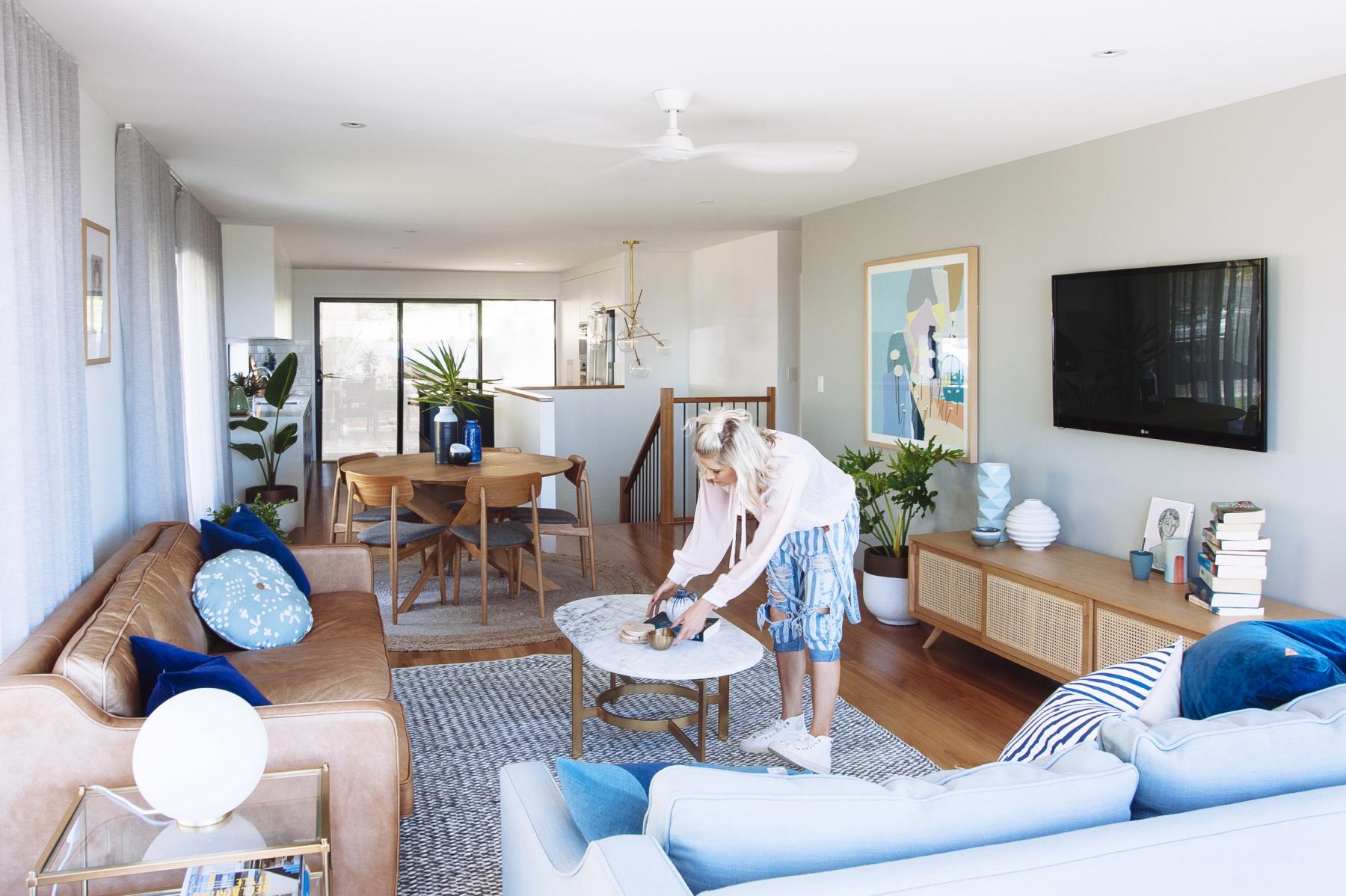
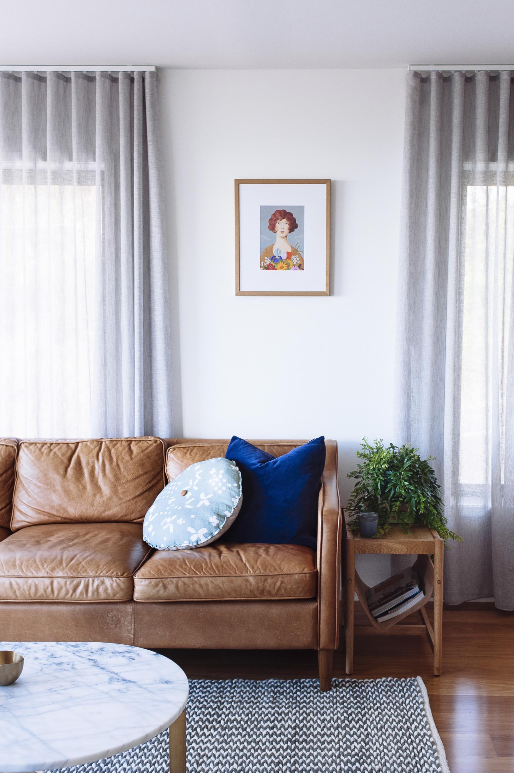
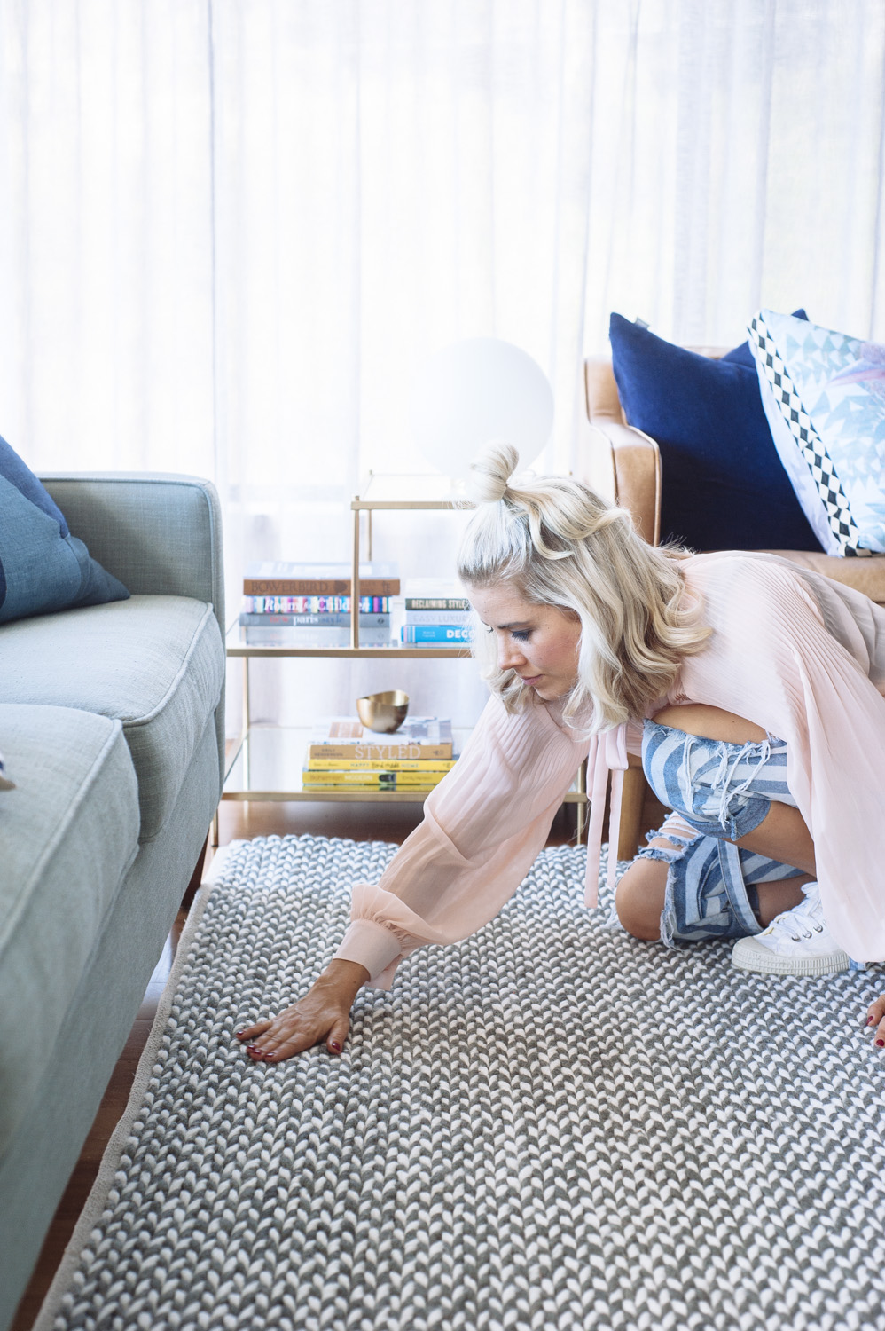
I love the simplicity of this corner with the texture of the rug, the clean lines of the mid century inspired side table, the marble and brass coffee table, and the rich velvety navy cushion and contrasting duck egg blue linen cushion in front. How squishy and wrinkled and aged-looking does that West Elm tan, leather sofa look? And that cute as pie print was a bargain buy from Etsy.
This rug above is the Soho rug, which is hand-braided wool and viscose, and part of my range for DecoRug. This one in particular is the Charcoal/ Ivory colour but it comes in a range of 7 beautiful colours. More about that in the next post.
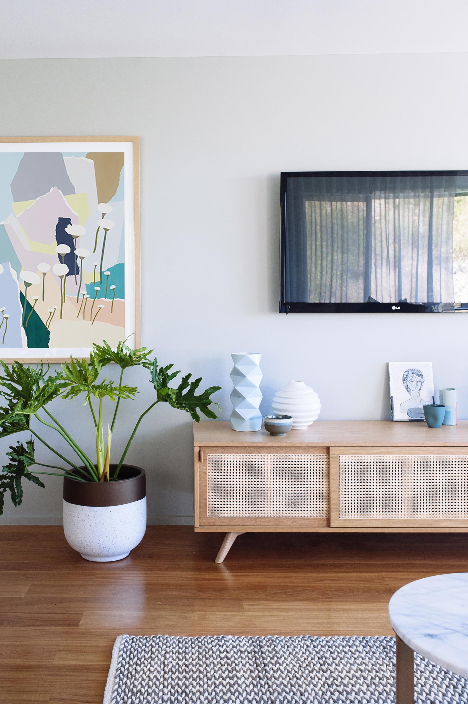
That’s Leah Bartholomew’s Sea Daisies print, which I had framed in an oak frame and is just so bang on in this space especially given Leah’s work is all inspired by QLD/NSW coastal flora.
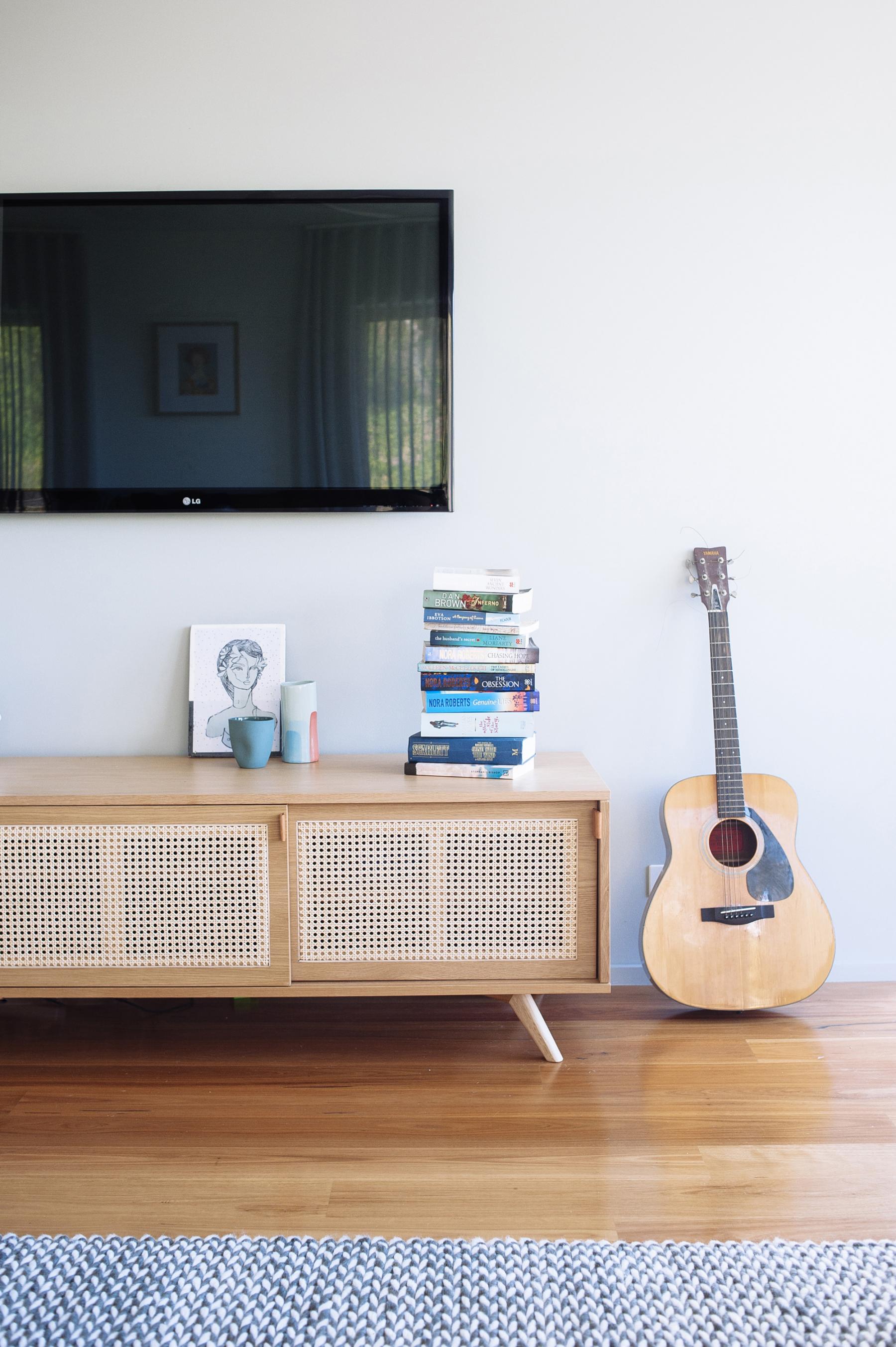
Both my sister and bro-in-law loved the Kira & Kira Iconic sideboard, above, as soon as I showed them. Yee ha! The rattan front doors and American oak body is right in line with the laid back coastal aesthetic of this house.
Though I hate to kill the buzz that these lovely photos emit, you should know that the exterior of this home is still very much unfinished but outside the kitchen sliding doors sits a huge, amazing atrium with original crazy pavers intact and which, once completed, will be the showstopper of this home in spite of the view. That’s another post and in the meantime this family can enjoy their lovely and finished coastal-cool interior.
Images by Nat McComas.
Carlene xx



August 25, 2016 at 1:25 pm
What a beautiful space. I love mid century homes. Very curious to see the rest of it.
August 26, 2016 at 7:34 pm
Looks fantastic – just wondering what your thoughts are on the half wall around the staircase with littlees… ? We are building a new house with a half wall at the back of the lounge room. Ideally the lounge would be up against this wall but I think it might be too risky for the kids to climb on and tumble over. Does it feel safe enough just not having furniture next to it? Did you consider running the ballastrade around instead of the solid half wall to let in more light…?
August 27, 2016 at 8:37 am
Hi Kellie, I probably wouldn’t put a sofa up against a half wall around stairs for the safety reason you’ve pointed out. These guys will be putting a piece of storage furniture up against their wall in this instance but it won’t be climbable. You could run your balustrade around if you don’t need to put furniture up against it but otherwise it might look busy.
August 30, 2016 at 10:44 am
The kitchen is so fresh and beautiful and I love the colour! Where did you source your subway tiles from?
August 30, 2016 at 1:08 pm
Thanks Phillipa. They were cheapies from National Tiles.
November 14, 2016 at 10:31 pm
This looks amazing. Just wondering if the wall behind the to is painted a feature colour? Also, where did you source the large pots from?
November 15, 2016 at 8:14 am
Thanks Jill. Yes, the wall is painted Resene Delta, I think, and the pots are from Bunnings.
November 24, 2017 at 7:20 pm
Hi I know this is an old post, but in just wondering if you can remember the colour grout you used? Was it Magellan or misty grey? Thank you!
November 25, 2017 at 3:44 pm
Hi Sarah
I actually can’t remember but it was probably misty a grey or one shade darker.