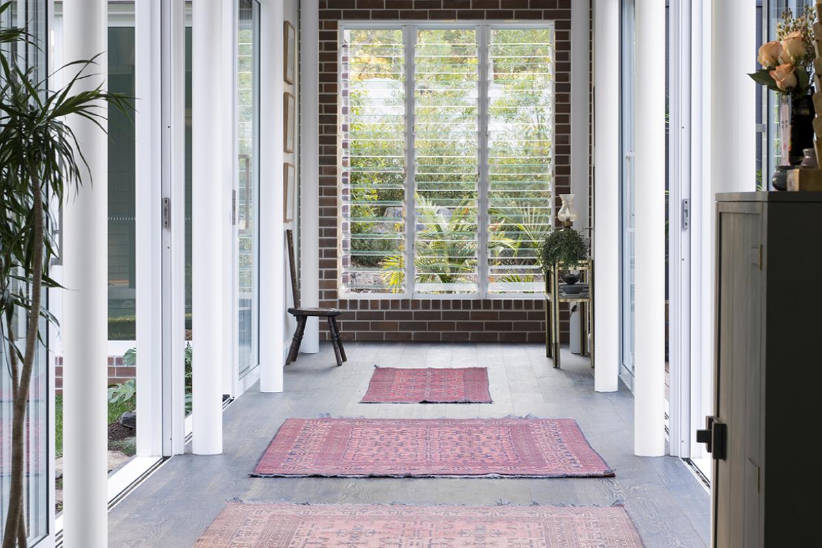
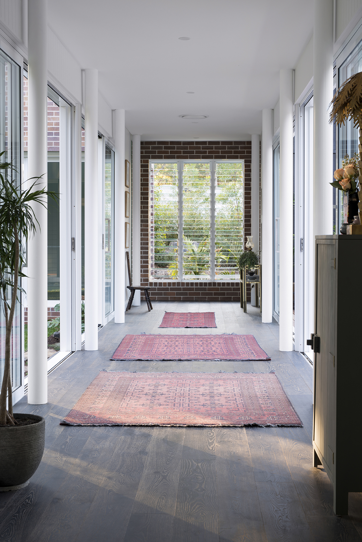
It’s the last space to be revealed of our Tallebudgera project/our home and there isn’t much in it but somehow it’s one of the most significant design elements to this build. The breezeway! It was Michael’s cousin and partner who came up with the design concept for this and I’m so glad they did because I was seriously thinking, hell, how are we going to fill the space that is that giant concrete slab? The concrete foundations were huge and we certainly didn’t need more rooms!
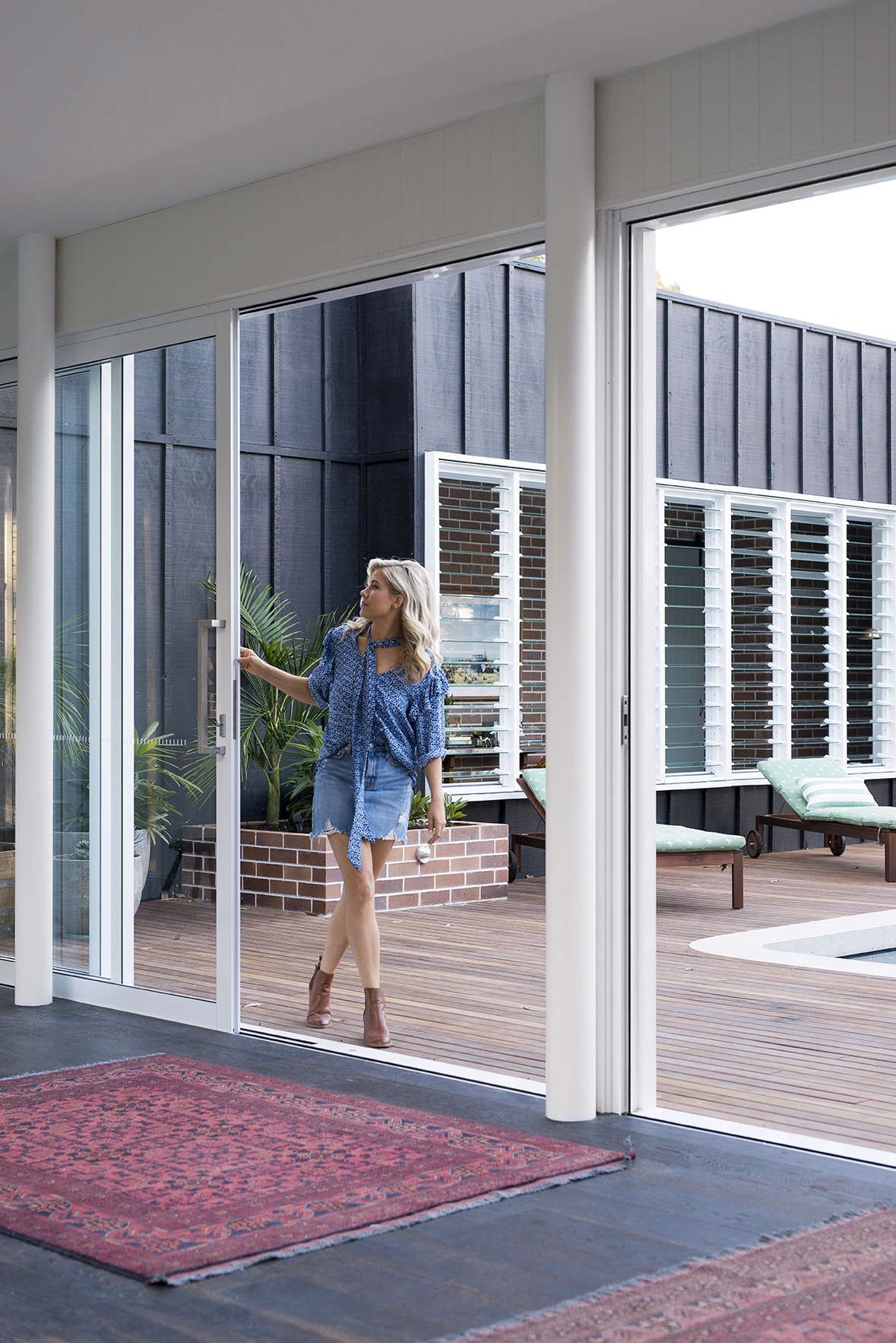
The design called for us to cut into the existing concrete slab, instal a front courtyard and create the breezeway, which on a practical level just connects living/dining/ kitchen/deck to the the bedrooms bathrooms and rumpus. But you see, it’s the way the breezeway opens up to the pool and courtyard with a now flourishing garden at one end, that make this space far more than a thoroughfare. The breezeway is also responsible for making the front facade feel so interesting and unique. It means that when you pull up the driveway you can see all the way through to our pool and the valley beyond. The bonus is, we live in a quiet tree lined cul-de-sac and our house is set up high from the road which means we don’t have to worry about privacy.
Like I said, that garden at the end of the breezeway has been since filled with more plants (courtesy of Michael’s greenthumb parents), which have gone gangbusters and the feeling of ‘holiday’ that it creates just makes me so happy. It the same garden in which the main (kids) bathroom looks onto and with those louvres open we get amazing cross ventilation. I just need to address the fly screen a situation because ideally, I’d like to be able to leave those louvres open more.
The glass sliding doors are by A&L Windows and I have to say, sliding doors are by far the most practical, easy-to-open door. The engineered timber flooring is Black Mountain oak from Decorug as are the Persian rugs. The perks of being the spokespeople for a flooring brand! There aren’t many rugs that could withstand the foot traffic of a thoroughfare but these can and beyond that, it’s a real treat having handcrafted rugs in your home that you know you’ll have forever. They go a long way in creating warmth in this space and are key in making this thoroughfare a space in which you want to linger.
Since the house was photographed I’ve installed curtains in the breezeway because whilst we love the idea of it being open and fuss free, the sunlight comes in strong, sideways from the pool area in the morning and again from the front courtyard in the afternoon and it’s just a bit much. We installed sheer linen-look curtains in a colour called ‘linen’ and had the windows tinted, which helps diffuse the harsh sun. Maybe there is something wrong with my eyes but I hate bright light in the home so I often have sheers drawn in our house. It’s calmer.
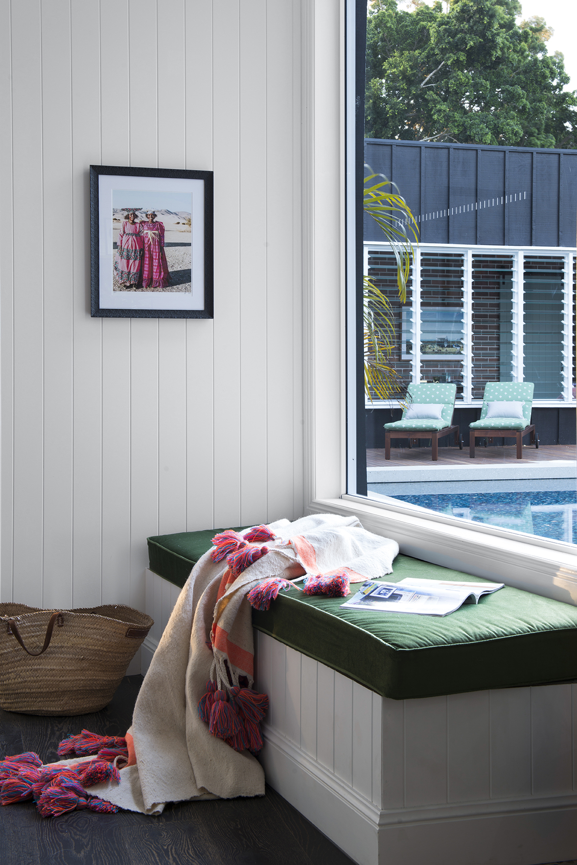
Gosh I love this pic above. I also love that it’s the first thing you see when you walk in our front door and I love that you look straight out through that huge window to the pool and gum trees beyond. The idea behind this area was about creating a sort of mudroom with the initial plan to install drawers in the front of the bench to store school bags, shoes etc but at this point of the reno we were maxed out and couldn’t afford to spend anymore on cabinetry. Instead, we included a top opening mechanism, which is something Michael could do himself (free labour). As expected, a top opening bench seat is awkward so right now it’s storing items that only rarely get used until we get around to those drawers that I so want. When we have people over, the bench seat quickly becomes a dumping ground for bags etc. which is fine for the time being but down the track I would love a dedicated mud room somewhere in the house, which I argue will both, house mess and keep us organised. That market basket in the pic above is permanently there and it’s where I dump anything that eventually needs to go over to the other side of the house. It means that when I’m on my way to the bedrooms I can just pick up the basket and file everything away in its rightful place.
This little drop zone gets used A LOT. The green cabinet is HK Living from House of Orange. I love the hand painted look and this brand just nails simple, no fuss design. This cupboard stores everything that people leave at my house after a visit. It seems ridiculous that I would need a cupboard dedicated to forgotten items but it’s a busy house often filled with kids soooooooo……. Before anyone leaves my house I check the cupboard to see what might be theirs.
That crazy, amazing brass lamp is also HK Living from House of Orange and I think I got the last one in Australia (the may have restocked). I’m hoping it’s one of those pieces that will get handed down generations. In saying that, my kids would have to share my penchant for the quirky.
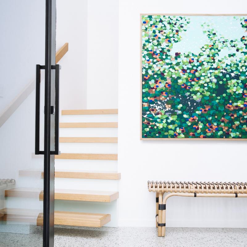
The vase is the iconic Frida Kahlo from Lovestar and is one I’ve had for a couple of years that gets shuffled around the house but has really found its home here. The bowls are vintage from The Grainery in Murwillimbah and they house our car keys, hair bands etc. The art is an indigenous piece that Michael’s brother sourced from his time in North Queensland a few years back. Many people love the idea of indigenous art but find the colours too heavy for their homes. By using a large white border and fine, white or timber frame you can give the art a lift and really make it work.
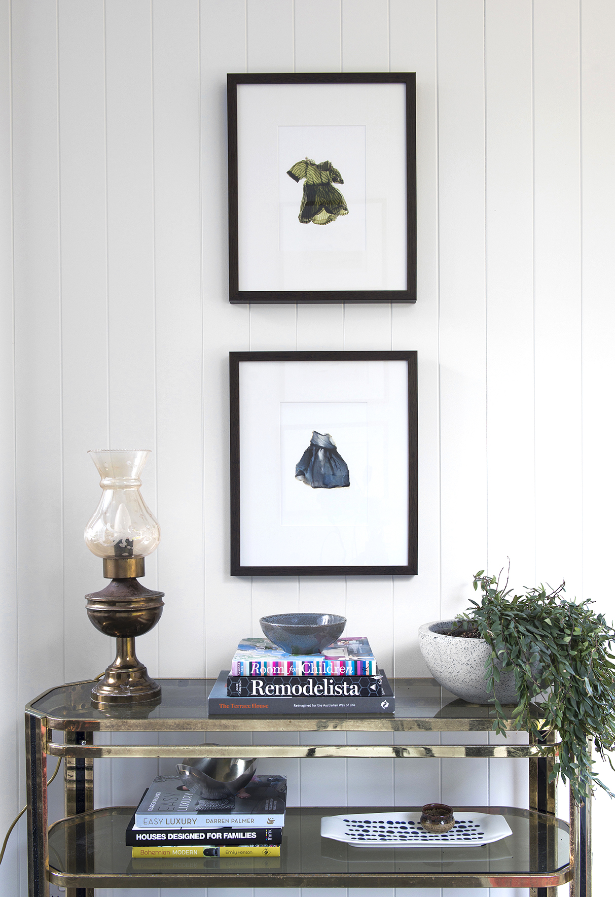
I had to be clever with my furnishings in this space because although IT IS a thoroughfare, it needed to feel like more than a thoroughfare. It needed to feel like our home. Leaving it unfurnished made the space too vacuous but furniture needed to be narrow so as not to impede on the space. The brass console above I picked up from the Salvos a few years ago and somehow it’s dimensions were PERFECT for this space. I think the blue book is from Big W (or maybe Kmart) and the Georg Genson silver bowl was gifted to me by a Danish work colleague in my pre-Block work life, and is a lovely little pop of architectual design.
And can we please take a moment for the oil lamp. It is vintage from The Grainery, a nice contrast to the Georg Gensen bowl and it’s just the most fabulous addition to this space. Don’t worry, the wiring has been updated and the cord is new. I HATE the downlights in this space (we installed waaaay too many) so at night I only flick on the lamps and some of the outdoor lighting and together they create the most delicate, calming ambience.
The artworks above are by by artist, Ilona Nelson from Signed and Numbered. They say that art is personal and I loved these pieces as soon as I laid eyes on them. I’ve used a dark walnut timber frame (which looks black in the photo) and a decent sized white mat for plenty of white space.
This is officially the last reveal of our Tallebudgera project. Sad really. Its been a rollercoaster and an absolute labour of love. The kitchen, living and dining are next in line for a renovation, although I hope not in the very very near future and besides, Michael’s focus has shifted to vintage caravans, which has become an unexpected and fulfilling passion. So expect more renovation reveals but of the mobile variety.
Carlene xx





February 16, 2018 at 2:30 pm
Hi Carlene (+ Michael),
I have loved this whole series of reveals. It’s such a beautiful home you have. I was curious if you have an up to date floor plan, to help picture the outline of the house? Thanks x
February 26, 2018 at 1:28 pm
Thanks Jackie. We do somewhere. I’ll post something soon.
February 25, 2018 at 9:38 am
kristeenbentley70@gmail.com
Hi love your front door. Builder said I can’t have it due to no door hardware suitable. Can you tell me what track and door hardware you used.
Love your home and style.
Cheers Kristeen
February 26, 2018 at 1:27 pm
Thanks Kristeen. The lock is from Bunnings. The track is a “zero clearance top-hung sliding door track” from Brio.
March 5, 2018 at 3:50 pm
Hi there,
It looks like you don’t have a pool fence between the breezeway and the pool. Am I not picking up a glass fence, or have you not installed a fence there (and if so, how did you get away with this?!)?
Beautiful home!
March 5, 2018 at 4:20 pm
Hi Julie,
We have glass fence along our glass doors but not in this photo.
Thank you.