

I was recently fortunate enough to work on the interior design of a new build, located a street back from the beach at Miami on the Gold Coast and I’m not modest enough not to boast, it made the cover of the latest (summer edition) Queensland Homes magazine.
Taking my cues from the architecture of the building and location meant this interior would have clean lines with a minimalist aesthetic but with subtle coastal influences. Not in an overt coral, driftwood, and anchor sort of way but with accents of rattan, and light timbers and with colours that mimic the local natural landscape.
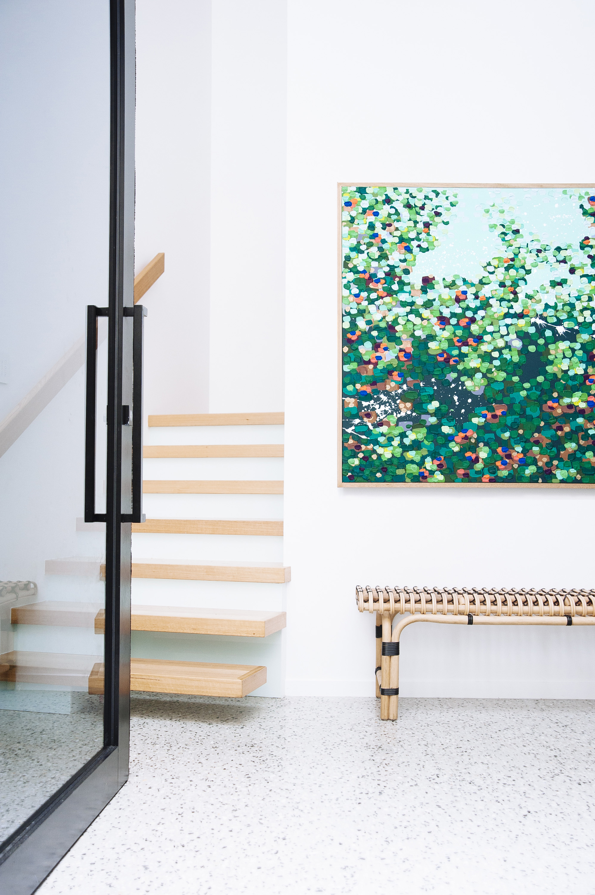
I think the front entrance says it all. The clean lines of the stairs and the sleekness of the black framed door juxtaposes perfectly with the HK Living rattan bench and vibrant, tactile art work by Tania Blanchard Creative.
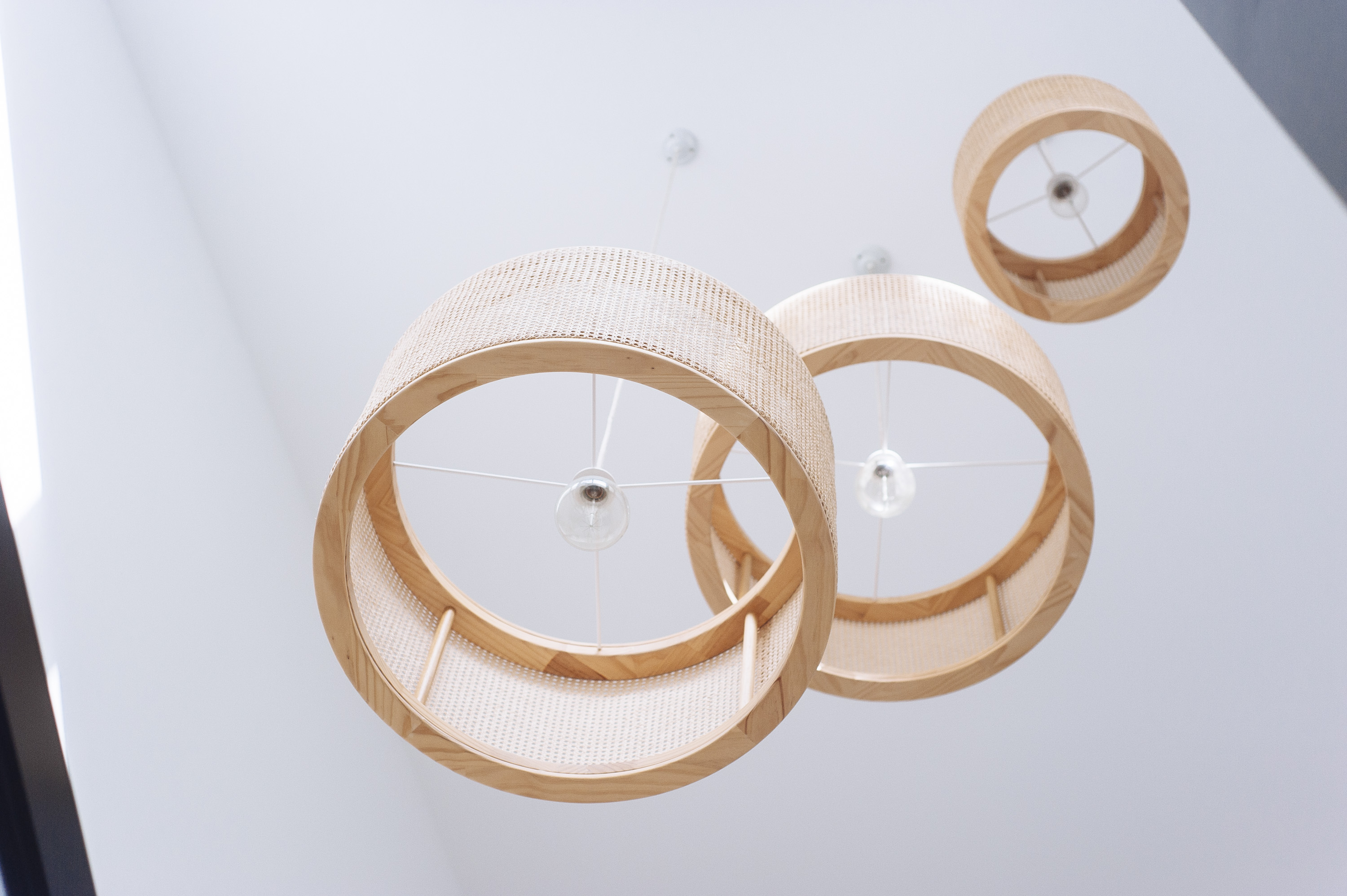
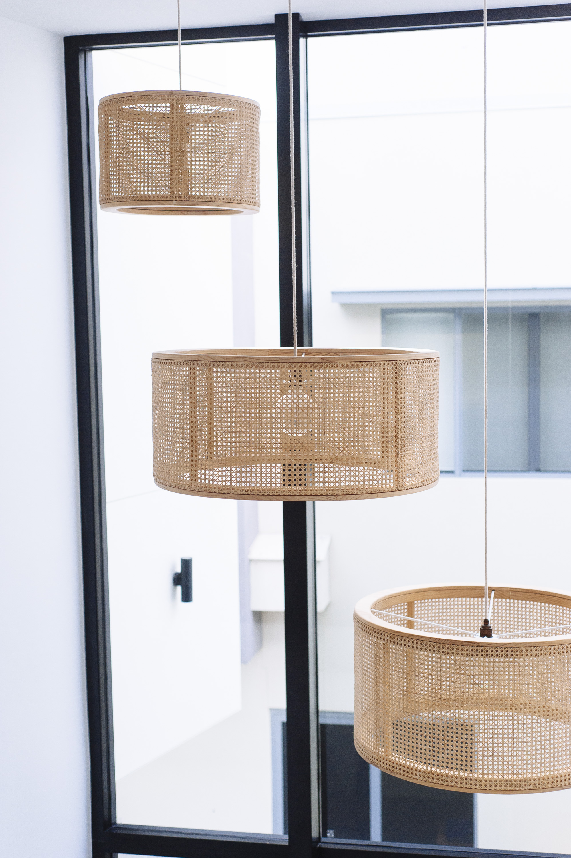
Looking up, these Kira & Kira rattan and pine pendants fill the void and also provide some eye candy from the upper level.
The architect (John Campbell Design) designed a really unique kitchen layout in what is a narrow house. As soon as I saw it I knew the best way to emphasis its unique shape was to colour block. This meant one cabinetry colour on one wall, another on the other wall and another on the island. I went with matte black, white, and a timber grain, which, as a scheme, will almost certainly stand the test of time. Being a modern home with an open plan layout, these colours also wouldn’t dictate the choices in the living and dining room, which was important.

The timber grain cabinetry is Polytec Natural Oak which I tend to favour as a laminate. It’s not streaky like a lot of timber grain laminates and it also has more depth than most. I also love that it has a lot of colour variation within it, which makes it easy to pair with other timbers.
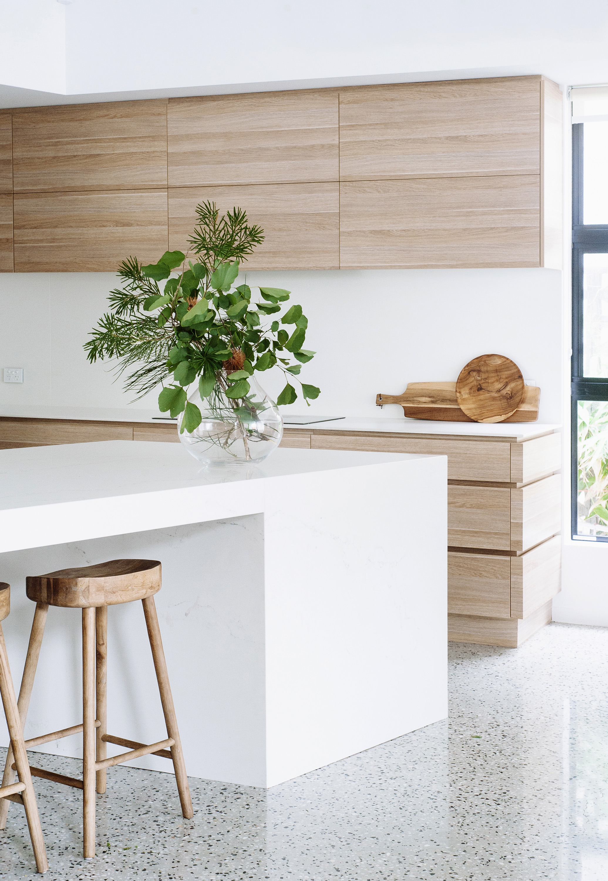
You can just see the marble-look vein in the engineered stone of the island bench in the image above. It is more visisble in reality, providing enough contrast to the sleek white splashback.
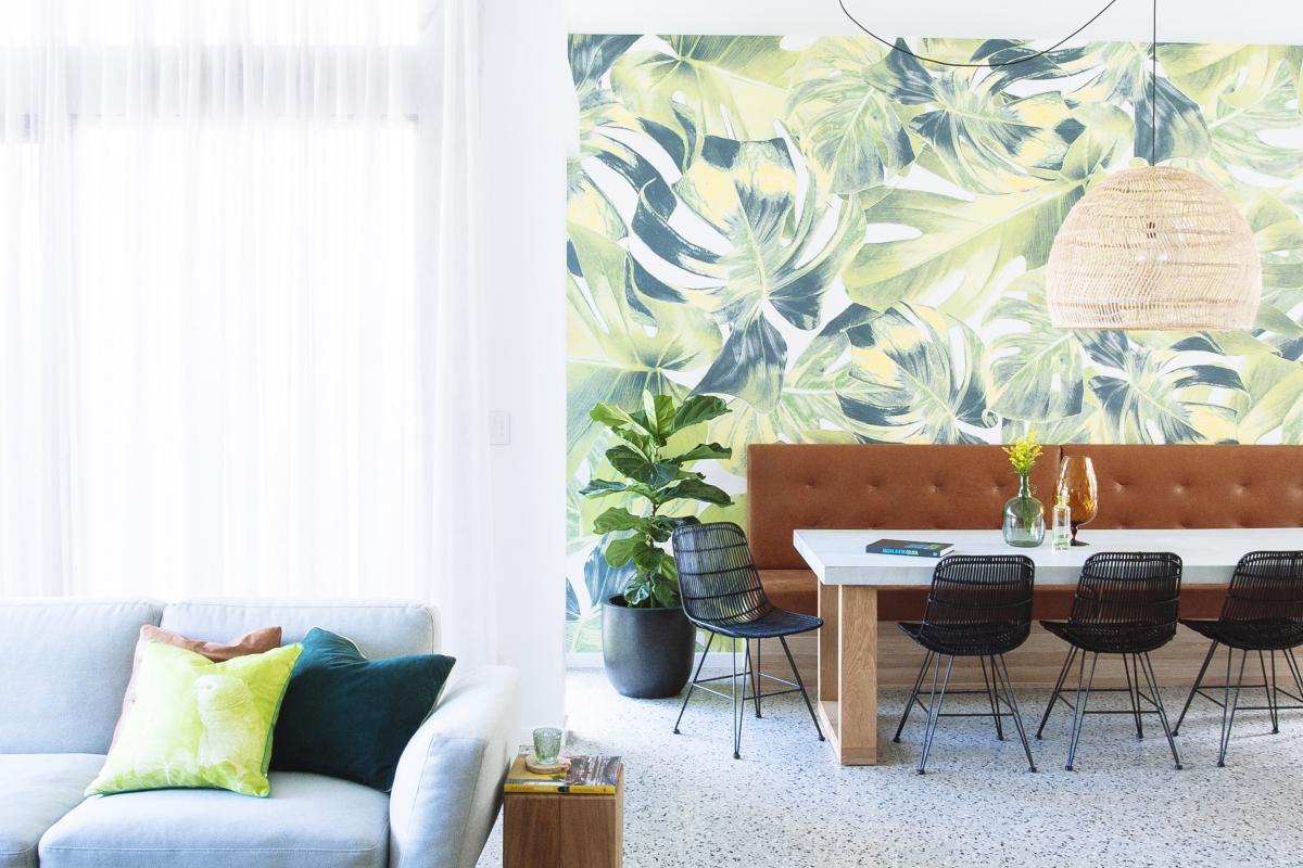
Ahhhh the dining room wound up being one of my favourite spaces in the house with the tan leather banquet seat, intricate detail of the HK Living rattan pendant (from Kira & Kira), the green, statement palm wallpaper (from Wallpaper Decor), black rattan dining chairs (HK Living), and polished concrete and solid oak dining table (Kira & Kira). It was, in fact, my bad-ass client who selected the oversized palm print wallpaper so I can’t take credit for more than giving it the green light (see what I did there- pun intended). I’m obsessed with green and tan leather so this room was an easy winner.


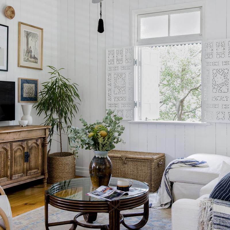
The styling of the living room was modified slightly from the original plan when the dining room wallpaper was selected. While the major pieces (sofa, TV unit and coffee table choices remained, the style of art had to complement the vibrancy and fun of the wallpaper while not being overshadowed by the boldness of the TV unit.
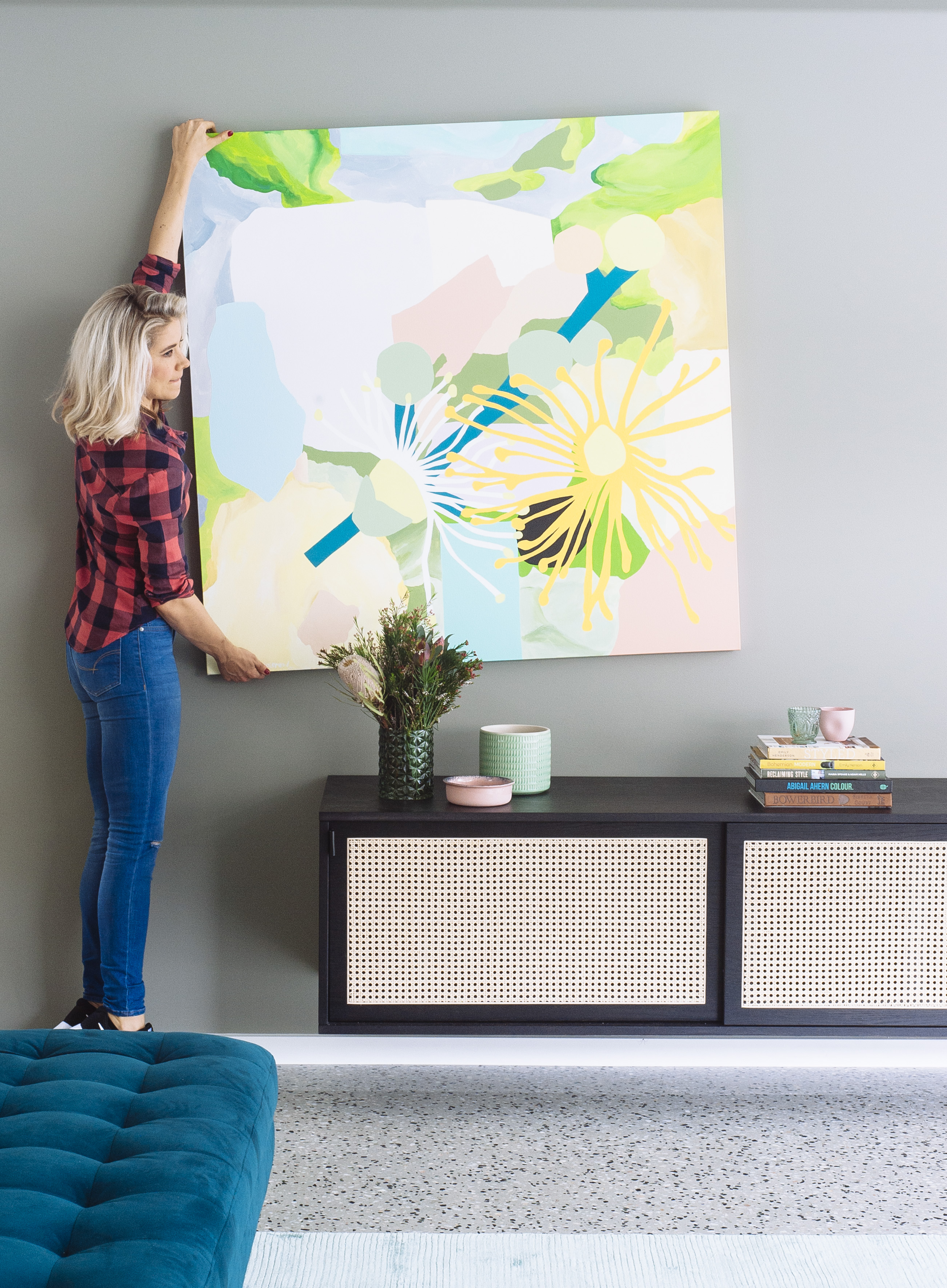
And yes the TV unit is an absolute doozy. We had the 4 metre timber veneer and rattan piece, custom made by Kira & Kira to accomodate my client’s sound system. He takes his music audio seriously. It also had to be long enough that is wasn’t dwarfed by the room. It’s really the showstopper of the entire space.
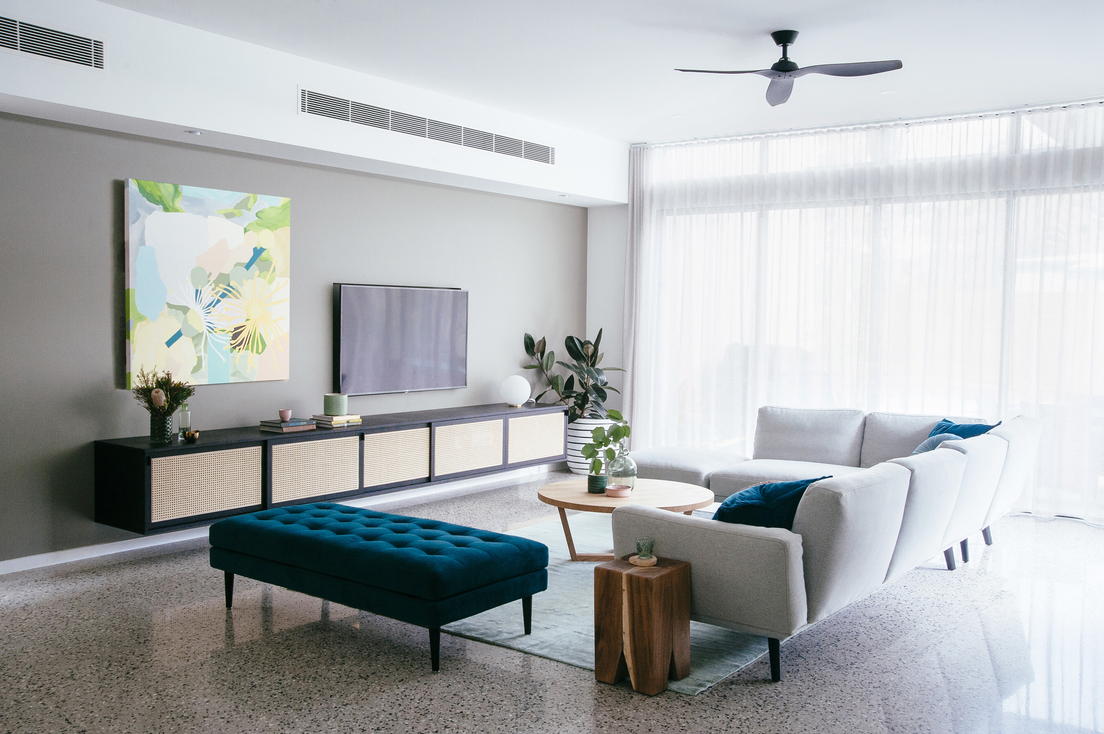
That deliciously decadent ottoman is from King Living. I’ve used it before and just can’t get enough of the colour. It’s called Peacock which is like a really deep teal, the only kind of teal that I really like, in fact. It’s just on the brink of being an emerald green. Yum!
Upstairs, the design of the master bedroom also had some really interesting angles. I love a moody master bedroom so I was pretty darn happy that my clients also loved this wall colour. It’s Resene Snapshot which is an inky blue and whilst making a statement, it’s still really calming and easy to work with.
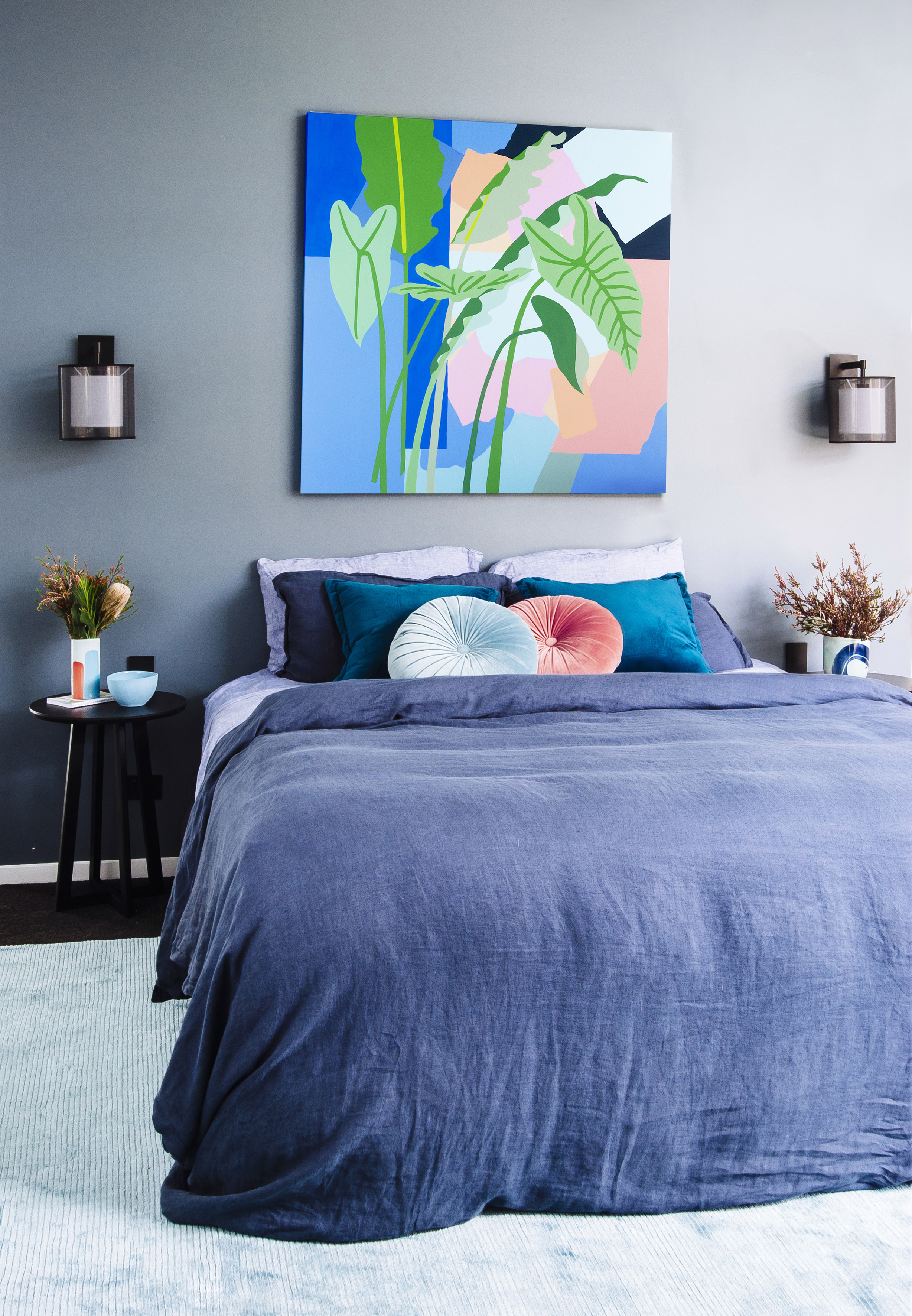
The black accents of the bedside tables and wall sconces really helped to set the tone here. I wanted sophisticated and grown up but not uptight. I also wanted to produce a room that wasn’t pinned down to one style. This bedroom is not mid-century modern, nor minimalist, nor Scandi, nor Hollywood glam. It just is what it is; warm, bold, and energising.
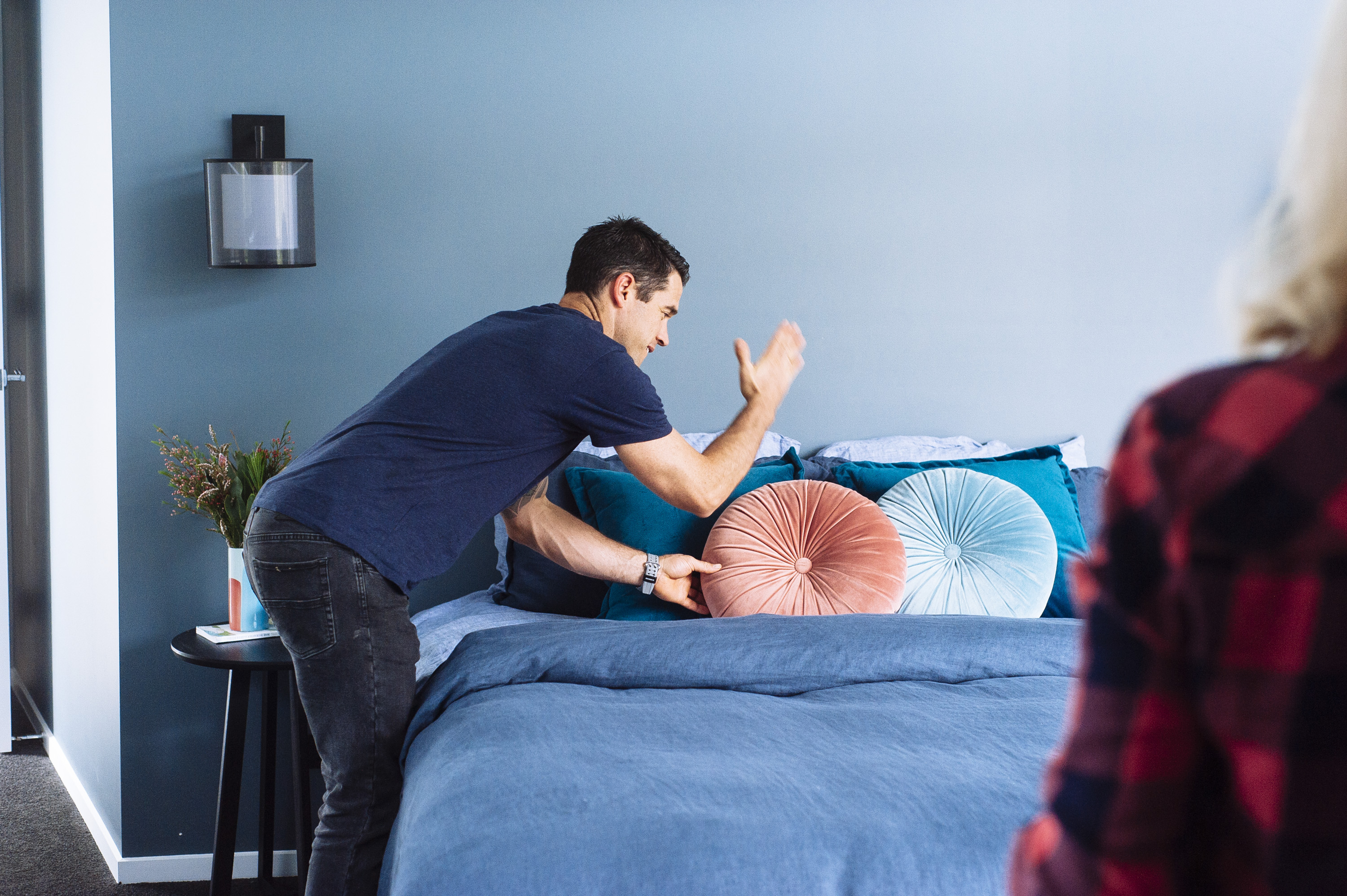
Oops, some one forgot to tell Michael that you can’t chop foam cushions, they aren’t malleable.

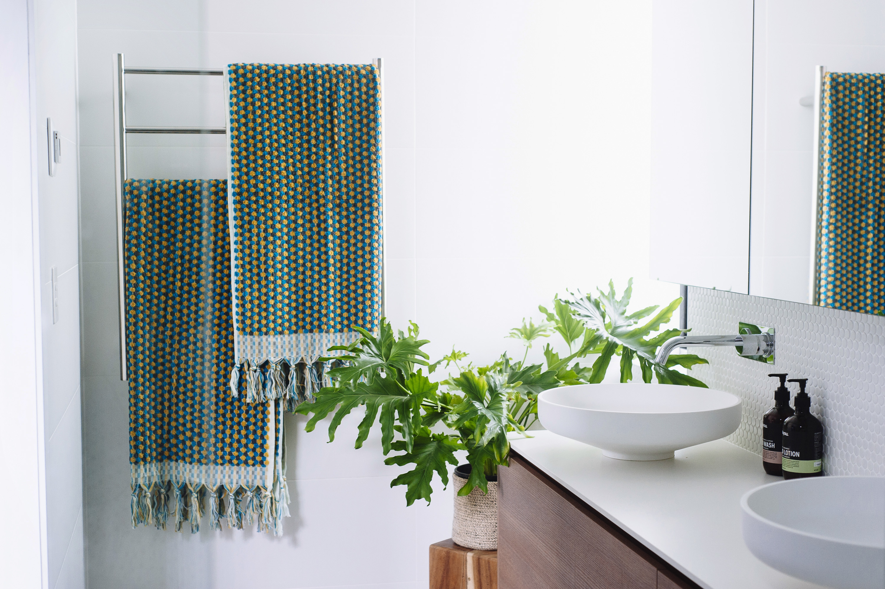
The simple and paired back look of the ensuite is a nice contrast to the confident and moody colours of the bedroom. The white penny rounds on the curved wall provide just enough texture and interest without dictating the space. The mid grey floor tile is low maintenance and the timber grain laminate vanity provides necessary warmth. Resale down the track was in the back of my clients’ minds so the choices in here had to be non-polarising whilst still making a mark.
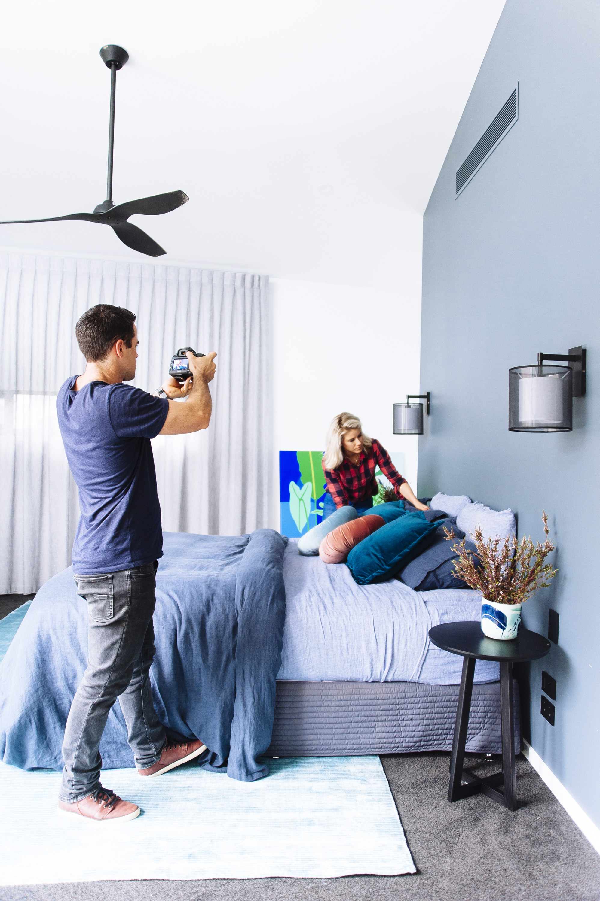
Watch the below clip for some for some behind the scenes of the shoot.
Carlene xx

July 4, 2017 at 4:14 pm
Hi Guys,
I love everything about this! Just wondering if you can tell me what timber was used for the stair treads?
Thanks so much!
Jaz
July 4, 2017 at 4:54 pm
thanks Jaz! oooh I don’t know actually, as I didn’t spec this but looks like an oak. Best to see your options in person as provided by your stair supplier. C