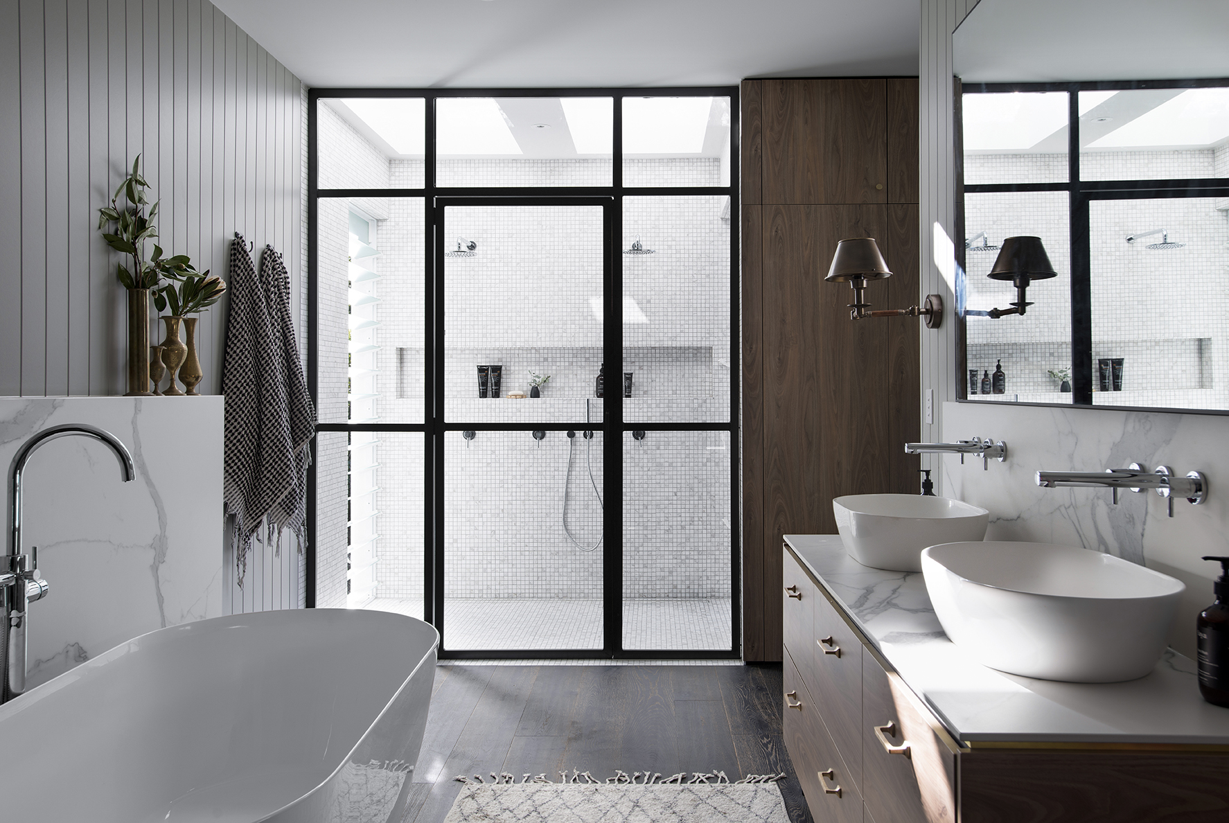
Here it is, Michael’s favourite room of the renovation, the ensuite. It seems like such a non-eventful room to be excited about but it really is worthy of a little adoration. We’ve actually used many of the same materials and colours in the ensuite as our main bathroom but with a completely different effect.
Is it true that there is some debate about doors on ensuites? I’m sure I’ve heard that. The fact is, we never contemplated one. We didn’t have a reason to and we also had every intention of creating a bathroom that should stand loud and proud as part of the master bedroom rather than be shut behind a door. Initially, we were even going to have two entrances to the ensuite, one on either side of the bed but after it was framed up it just wasn’t working for me, for a few reasons, but mostly because I wanted bedside tables. The alternative would have meant we would have had to have a nook in the wall and that wasn’t an option for me. I’m soooo glad I made Michael change it because we really only need one ensuite entrance.
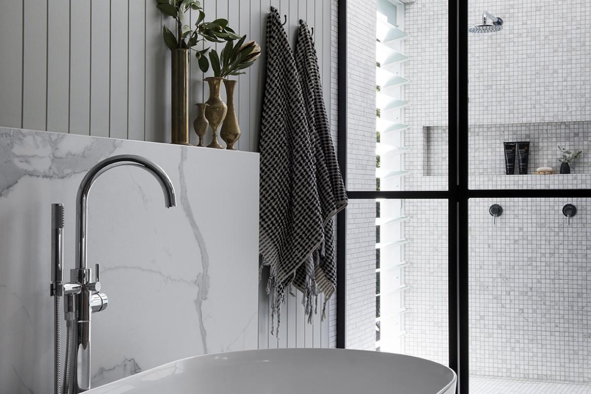
Like in the main bathroom, we used Easycraft’s Easyclad panels in the ensuite which are designed for wet areas and semi external spaces and the 12mm porcelain wall by Quantum Quartz WK Stone was really about breaking up the wall aesthetically but it also acts as a splash back for the bath.
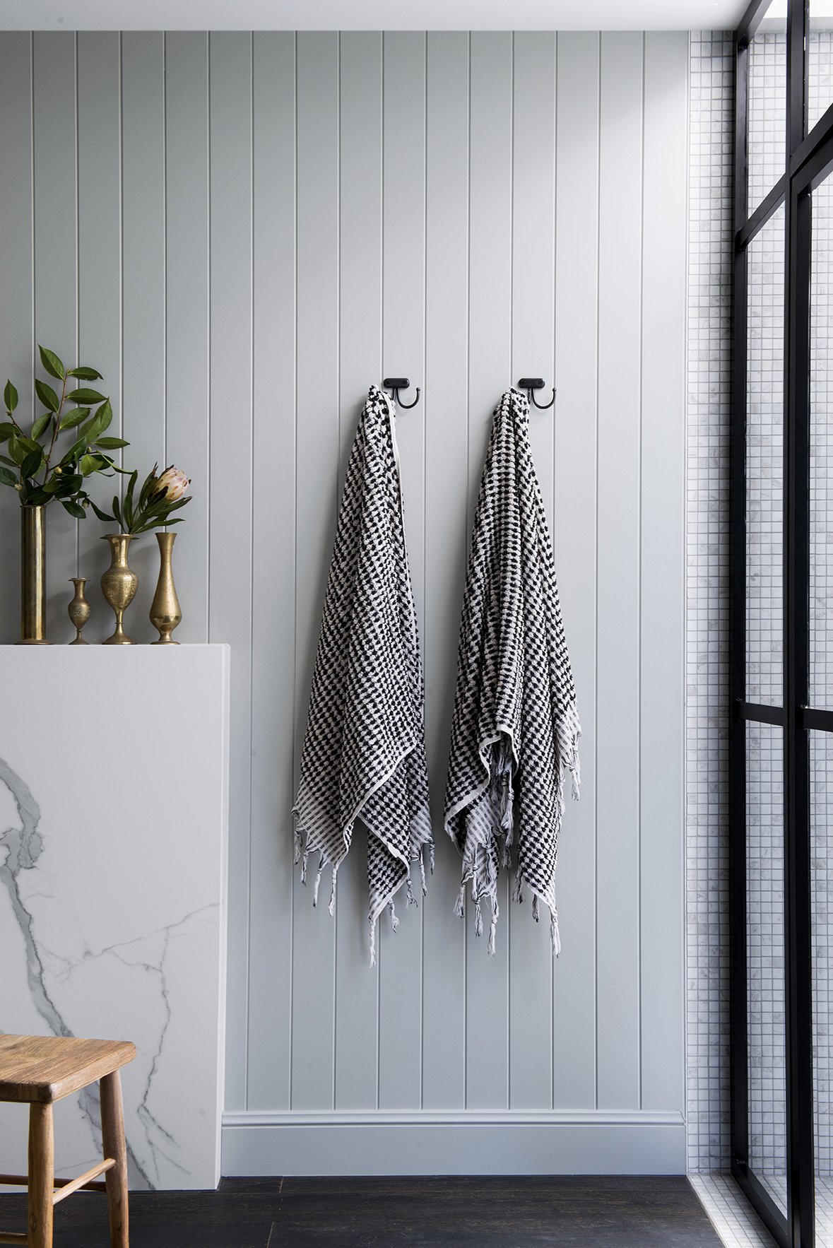
How dang cute is that family of vintage brass vases?! I’ve had these for years, picked up on one of my opp shopping expeditions but they have never looked quite as good anywhere as they do in this space. Hot tip, buy fresh flowers that dry out well like baby eucalyptus so that you don’t need to keep replacing flowers. Alternatively, just take clippings from your garden. Your greenery doesn’t have to be expensive to do the job.
As in the main bathroom, all of our bathroom products (tap ware, bath, shower heads, toilet) are supplied by Abey Australia and I’ve opted for classic style product in organic forms throughout for the sake of getting longevity out of them, aesthetically.
The tile choice too is the same that we used in the main bathroom, White Cloud Carrara marble mosaics from National Tiles and like in the main bathroom, they are used on all 4 shower surfaces to give the shower a feeling of being an independent space. I was adamant that shower wasn’t going to have any aluminium edging in there which would have killed the sense of luxury created by the mitred tile edge.
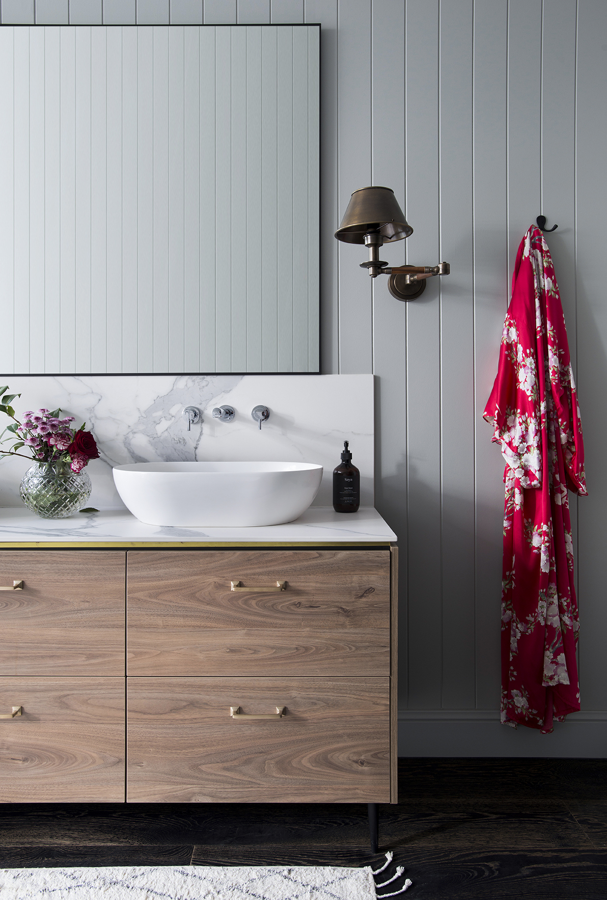
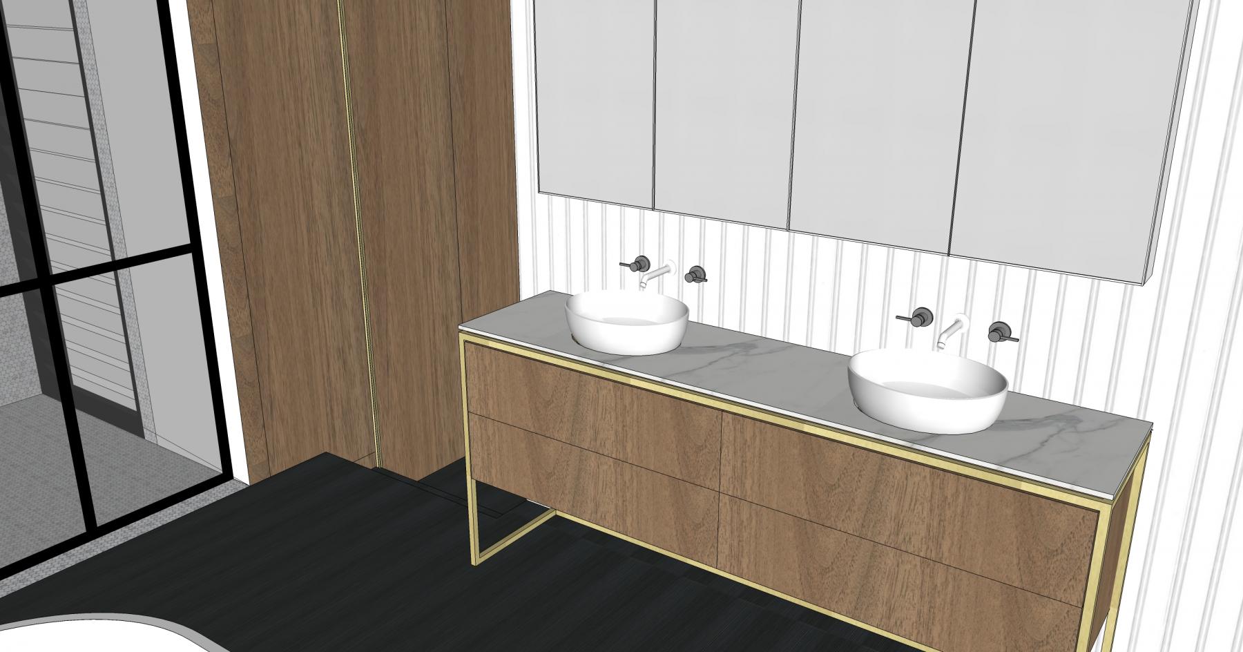
The timber grain laminate we’ve used on the vanity is the same as we’ve used on our wardrobes throughout the reno. It’s Natural Walnut from Laminex and we engaged local cabinet maker/ builder, MCDAS to create it. My original design (see Michael’s render below) was a little more elaborate with a brass frame but we learnt that welding brass is laborious, which took the cost to a price we didn’t want to pay. Instead, we simplified the design by eliminating the brass frame and just sourcing some subtle, slimline legs that I had powder coated black.
Actually the render above shows how we’ve included a linen cupboard on the ensuite level but which continues on from our bedroom wardrobes. It’s a detail that Michael came up with that I really love, making the flow between the two rooms seamless.
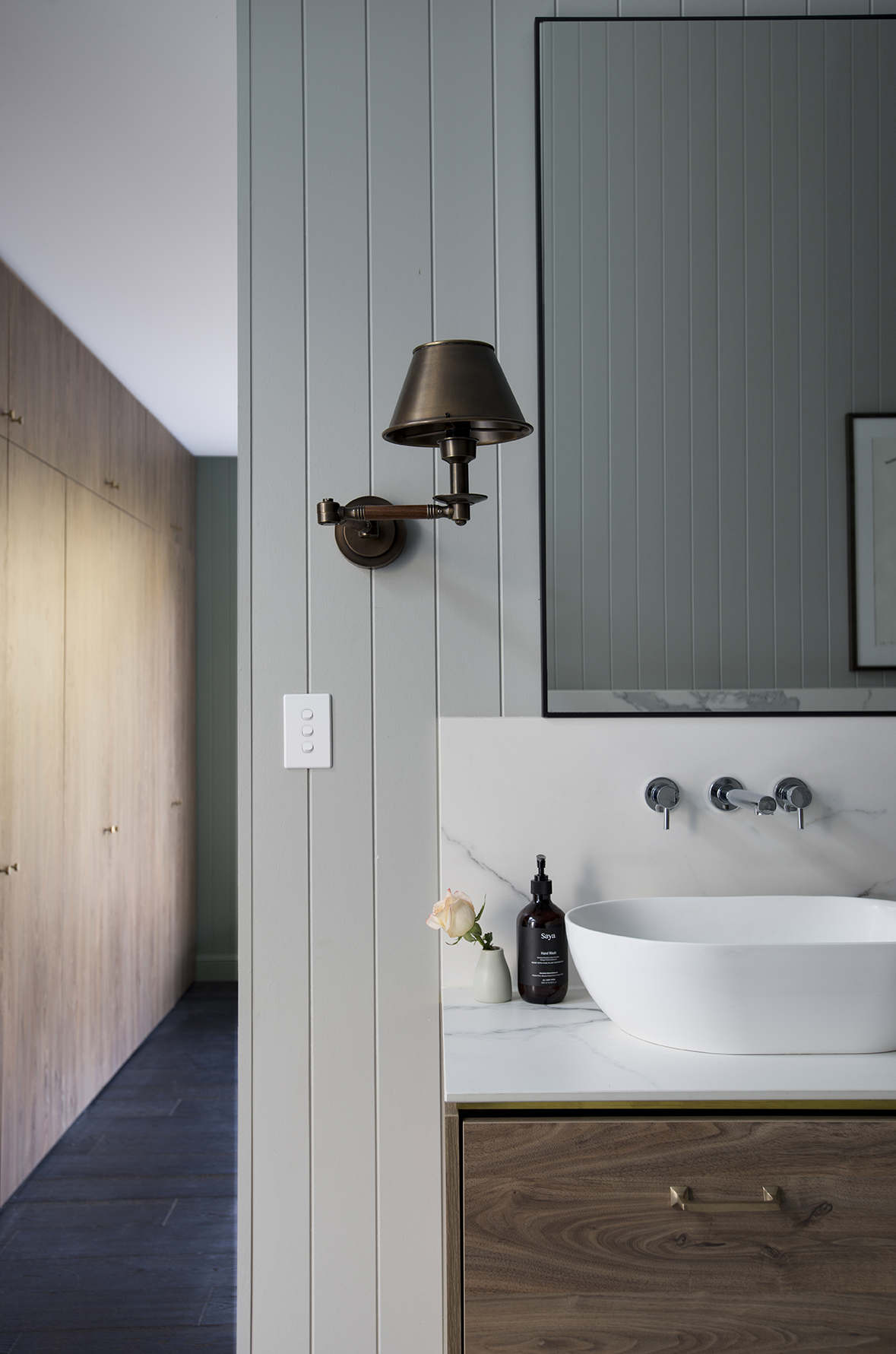
The porcelain used for the vanity bench top has been colour matched with the splashback (same colour used for behind the bath), and like the main bathroom, it’s separated from the top of the laminate cabinetry by a brass shadow line. Here again, I’m impatiently waiting for the brass to age to tone down the yellow. The handles are from Anthropologie which is an American retailer whose product range I love, however the postage cost I really don’t love. There is just no other Australian retailer with similar offerings so until there is, I’m stuck.
The swing wall lights are from Emac and Lawton and they are pretty perfect for this space. I take my decorative lighting seriously so I was happy to spend here although on the flip side, and it may be apparent by that light switch, that I (Carlene) have little (no) appreciation for fancy looking light switches and power points so this is where we could save some pennies. You’ve usually got to reign it in somewhere and this was where for us.
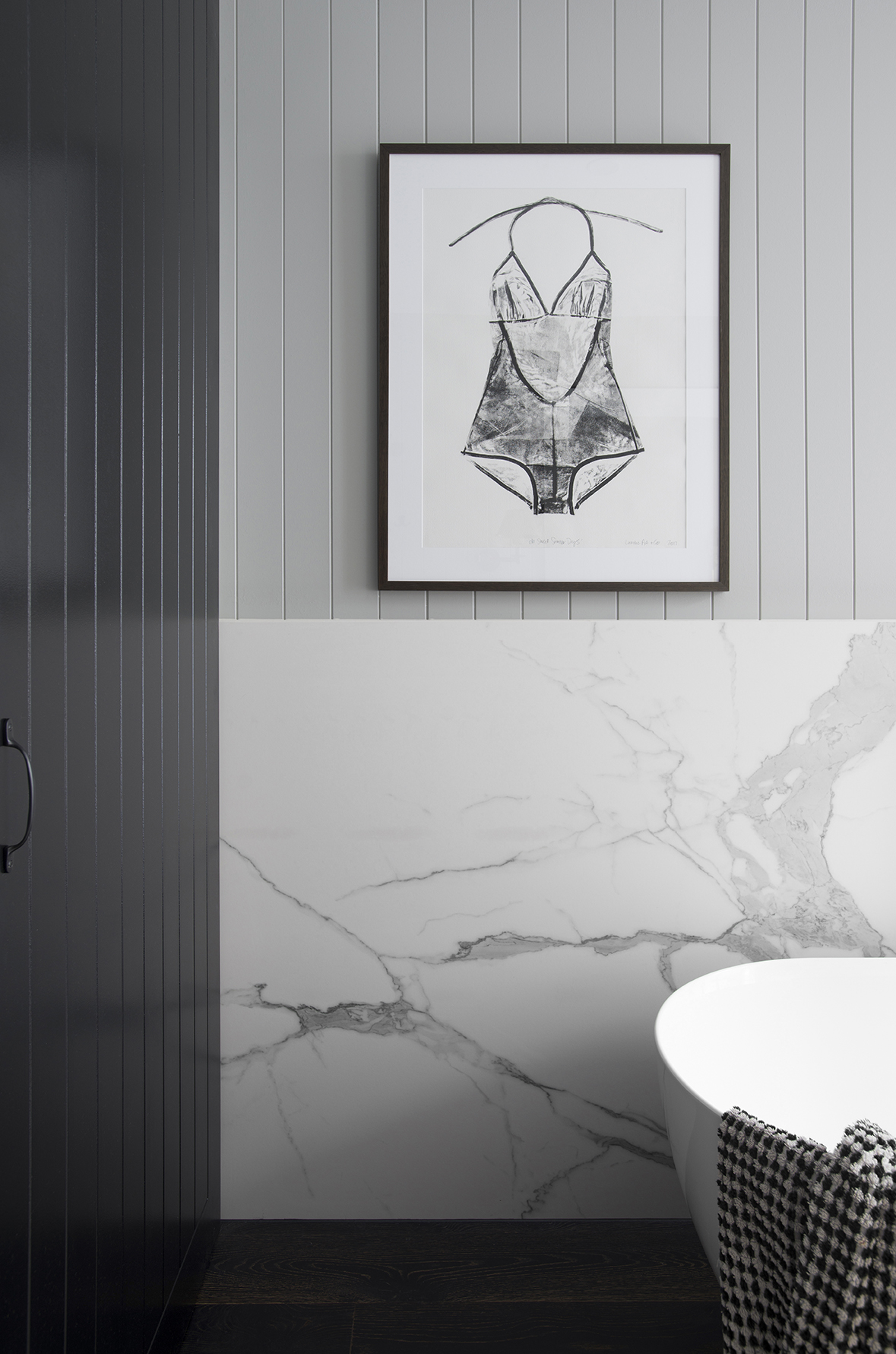
I’ve always loved art in bathrooms but it can look odd sitting on a tiled wall. Here though, on the VJ panelling it was a MUST. This piece above is called ‘Oh Sweet Summer Days’ by Lumiere Art and Co. and it is so spot on for this space. We had it framed in a really dark walnut frame (we use Artisan Picture Framing at Varsity Lakes for enquiring Gold Coasters) because I wanted it to be rich and sophisticated but black would have been too heavy against the back door.
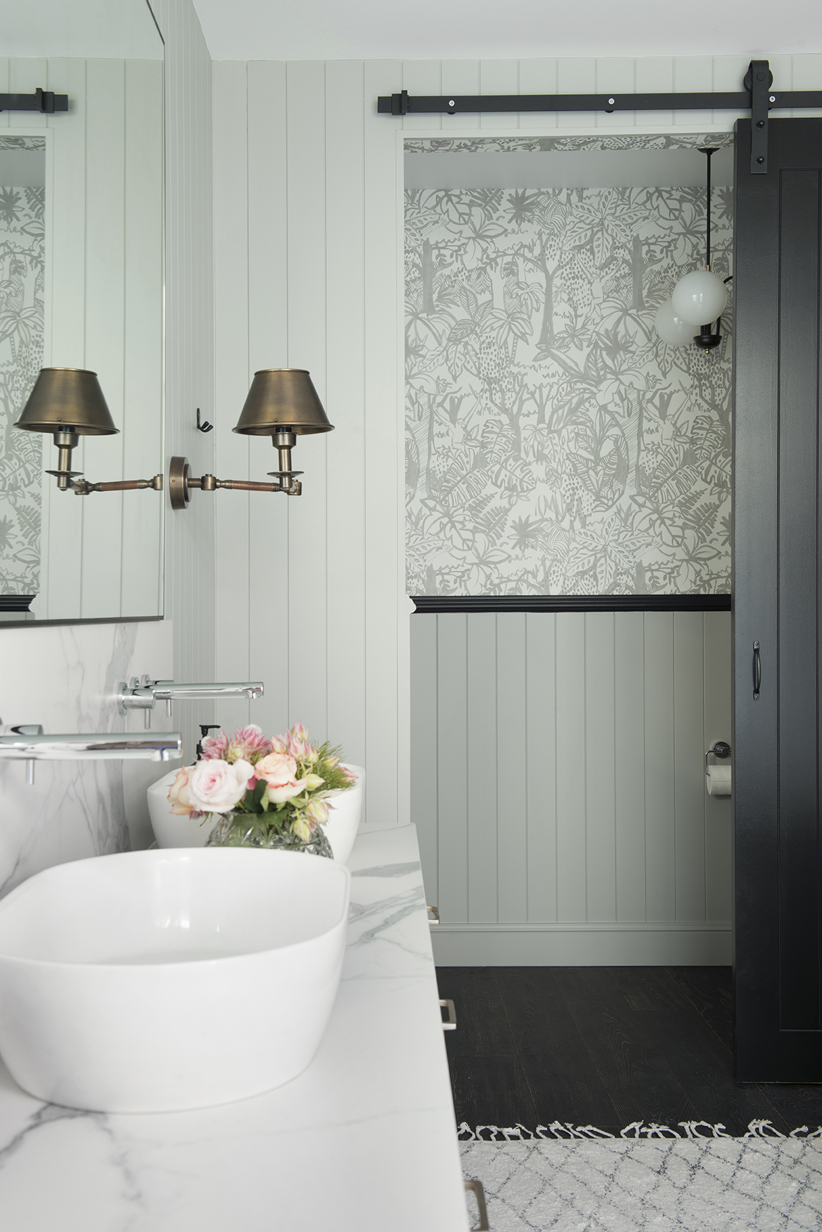
I always judge a restaurant/cafe by it’s toilet so yes, we have wallpaper in the dunny. It’s by These Walls and on a side note, they have just released a new range and it’s hot dang good., I love that the Jungle theme print keeps this space fun and interesting. Again, the wall colour in here is Resene Foggy Grey and the black of the door and dado rail is Resene Blackest Black which, as the name suggests, is their blackest black.
The quirky pendant light poking its head out is a vintage find from The Grainery in Murwillimbah, Northern NSW. There are hundreds, maybe thousands of vintage lights to choose from in this crazy place. This one was one of the least expensive and totally works. The doors throughout the home are a custom size from Hume Doors and Timber and the track is from eBay.
Alright alright alright, I know you want me to talk about that shower screen (we’ve had requests) and of course, I will because it’s FABULOUS and it would want to be for the amount of effort that went into it. You’ve all seen the warehouse-style, black-framed, glass movement and it’s bloody brilliant but what you are generally looking at when you see those windows is a steel frame. We couldn’t have steel because steel can rust and would also be cost prohibitive so after some head scratching, Michael found a fabricator that had an aluminium section that would work for what we wanted. We provided him with the opening measurements and design and once it was welded it was then powder coated black and installed. Once the frame was installed we had 6mm toughened glass cut and installed and secured with silicone by a local glass supplier. It actually sounds much simpler when I write it but neither we, nor our suppliers had done this sort of thing before so everyone was a bit green to the process. It’s OK though because we absolutely got what we set out to achieve.
The shower is actually suspended off the house and the way the light comes pouring in, it’s like a lil light box. We have two Velux Skylights built into the ceiling in the shower, which open and close via a remote. We open them after everyshower to let the steam and set the timer so that they close on their own. On a warm day we open them to enjoy the fresh air during our shower and it really creates a holiday feeling in there.
Michael also designed louvres on either side of the shower for another source of light and fresh air. They’re frosted, don’t worry and we don’t have enough privacy on that side of the house to ever open them more than a smidge but it’s enough. As with all of our windows they’re supplied and installed by A&L Windows.
Michael has always questioned the point of a double shower and double basin in an ensuite because we’ve never been in a situation that we have both needed to shower or brush our teeth at exactly the same time but there was something about this pace that sort of called for it and it likely serve us well at sale (one day). I really only included the hand held in there for cleaning sake.
There it is in all its glory. I wish it was possible to photograph an entire space in one shot but you get the idea. BTW that bath mat poking out is HK Living from Kira and Kira. I’m calling it, it’s the best looking bath mat on the market and I so badly want them to do it in a colour. It actually sits in from of the shower day to day because we don’t use the bath. It has a sort of rubber backing so doesn’t move around and you can throw it in the washing machine although I would put it on a gently cycle for the sake of the tassels. HK living, if you’re reading this can you please make a good looking coloured bath mat.
Next week we’re unveiling the hallway which although doesn’t sound very exciting, it’s a very good looking hallway and is actually one of my favourite spaces in the house so until next week……
Images by Mindi Cooke.




November 27, 2017 at 10:03 am
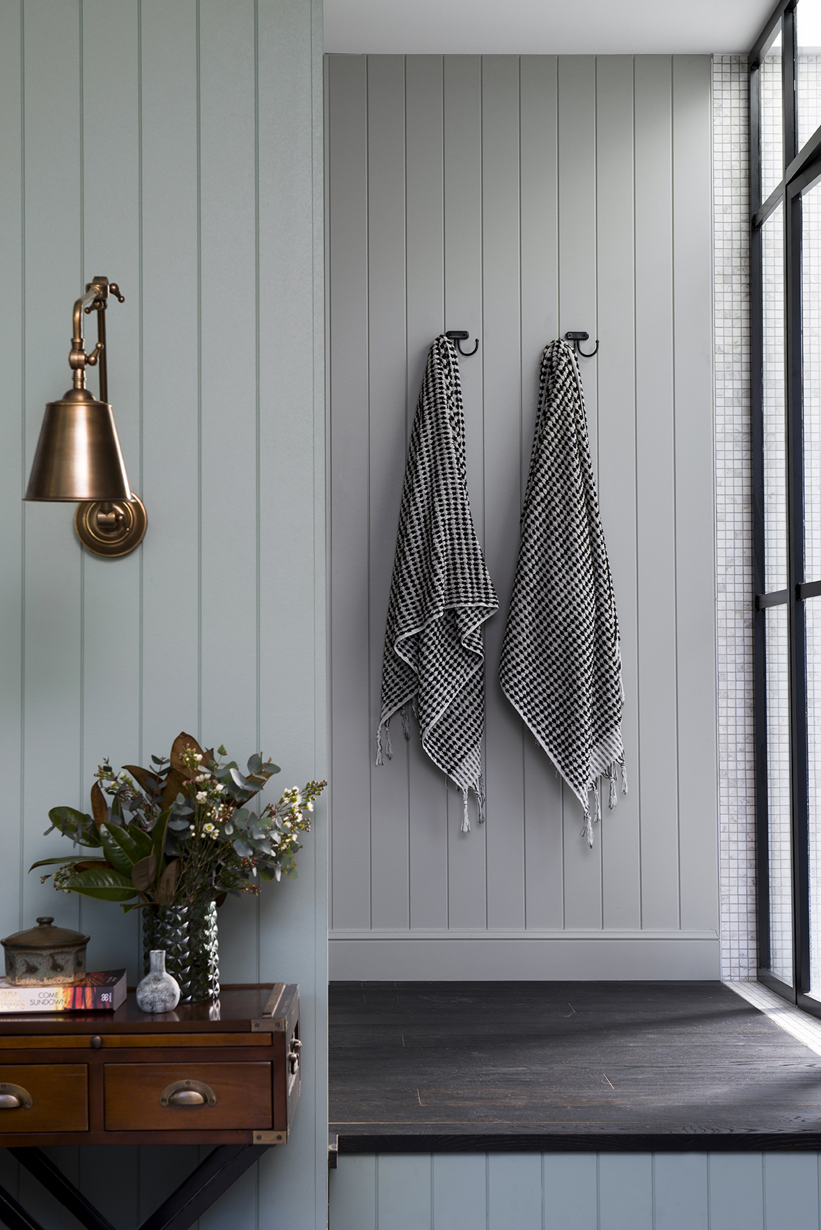
Beautiful! Can’t wait to see the rest. Can you tell me your skirting profile? Is it NSW Colonial?? Thanks
November 27, 2017 at 10:20 am
It is. Good spotting!
October 19, 2018 at 7:38 pm
Beautiful- can you tell me where you got the towel hooks from?
November 10, 2018 at 3:34 pm
They’re from Anthropologie but I don’t recommend because they are coated in stain that marks the towels.
November 10, 2018 at 10:58 am
Hi Carlene!
That shower screen is amazing. I’m looking to do something similar but do it as an entry to the en-suite and not just the shower screen. I’m from Brisbane so would love to know the name of the fabricator you used… it would save me the hassle as they would know what I’m wanting!!
November 10, 2018 at 3:33 pm
We used The Welding Spot on the Gold Coast. cx