It seems like a very non-eventful space in which to dedicate an entire blog post but our hallway is more than a hallway, this thoroughfare has serious SOUL and is definitely worthy of a conversation.
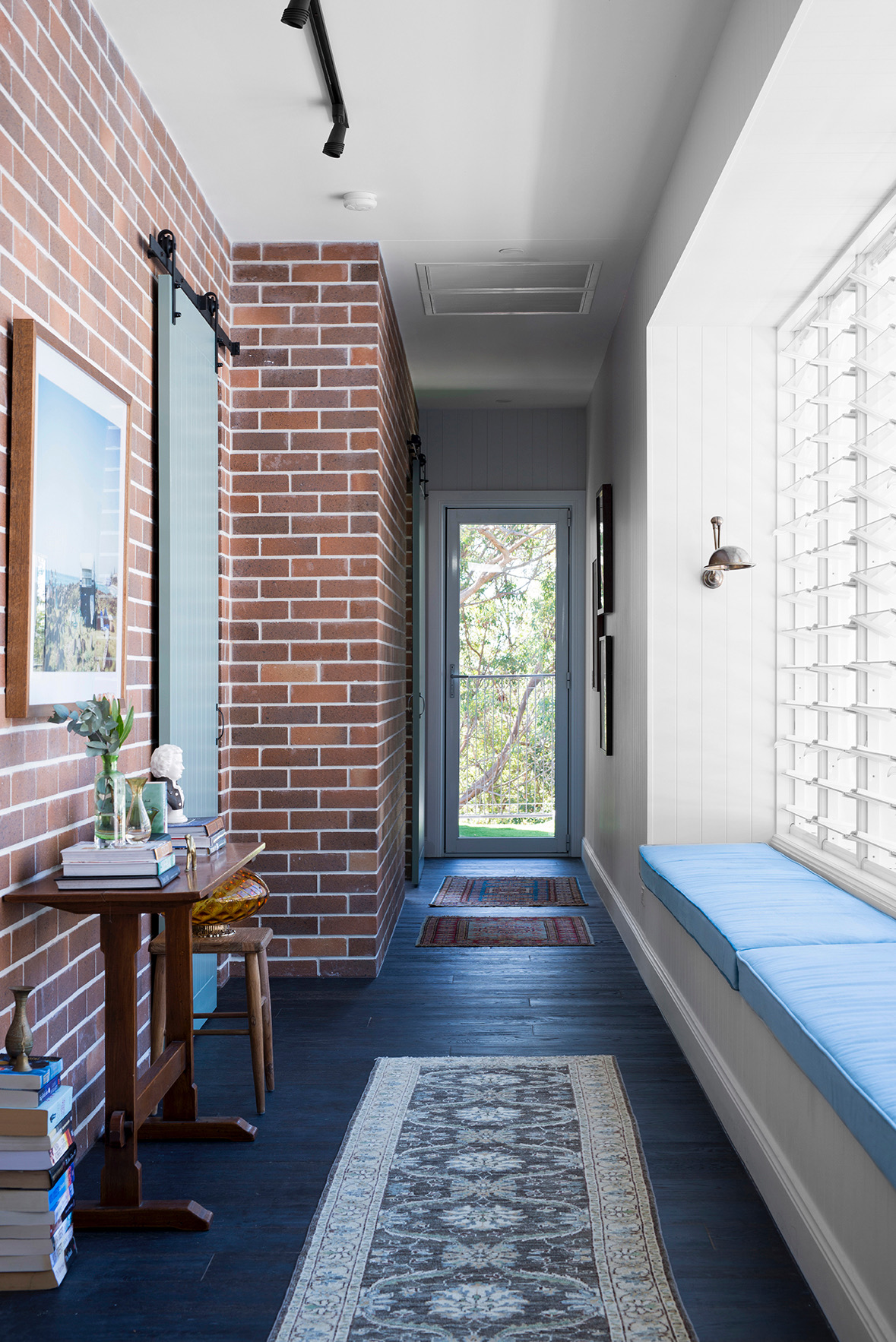
Michael made the decision, last minute, to step the hallway in to create more space and avoid the tunnel effect, which effectively made this space more of a room than a hallway. Off of our hallway are our 3 top floor bedrooms (there are 2 guests bedrooms downstairs) and the bathroom and the fact that the brick runs down the entire length means that each bedroom (and the bathroom) all get to enjoy that beautiful brick surface, which is a real treat. If you’ve read the previous blogs, you’ll know we’ve used Hawkesberry Bronze by PGH Bricks throughout the interior, paired with white mortar from The White Cement Company.
The hallway and the breezeway are the only rooms to don white walls and we’ve used Resene Black White, a really crisp, black-based white which, means it doesn’t throw blues or pinks or yellows. I wouldn’t be surprised if I end up painting the skirting the same grey as the bathrooms (Resene Foggy Grey) because the kids are constantly rubbing their feet up against that white and making it grubby. At least, if it’s grey I won’t see it.
The very long bench seat is also our linen cupboard, opening up from the top. The top opening mechanism is temporary, however, as ideally we want drawer fronts which are soooooo much easier to use but we were at the end of our budget so that’s a project for down the track. Those louvred windows from A&L Windows & Doors look out to our pool and to the other side of the house and when open, provide such a welcome breeze. With the amount of natural airflow provided by the number of windows built into this house design in general, it means for the most of the year, we shouldn’t need to use the ducted air con which was also installed during the build. You may be interested to know that until now, we’ve NEVER had home airconditioning, not even a split system. I’ve always deemed it an unnecessary luxury but after last year’s Summer, it’s more much more of a necessity. Where we once experienced only 4 days of suppressing heat, now it’s more like 4 weeks and for someone who works from home, I don’t have time to be affected by relentless heat. We’ve used Actron Air for those questioning and I’m feeling much better about our impending Summer (which officially arrives in 2 days, mind you).
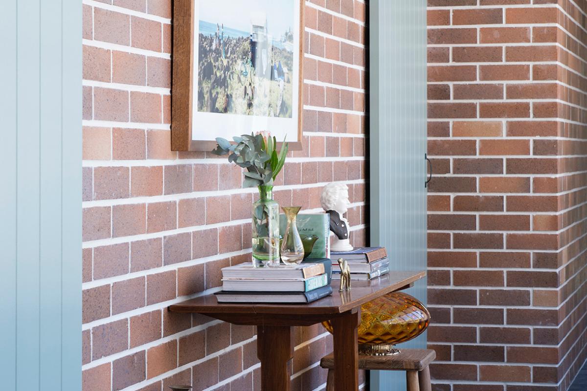
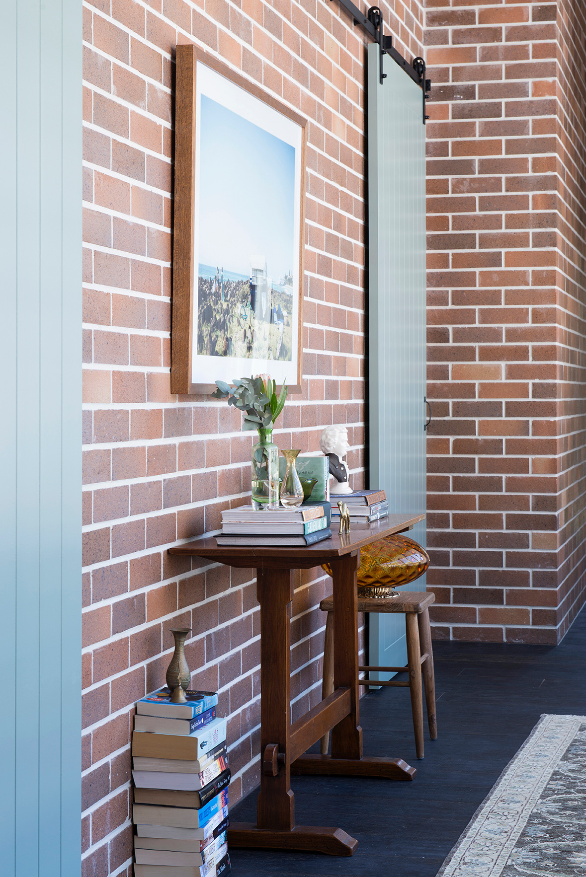
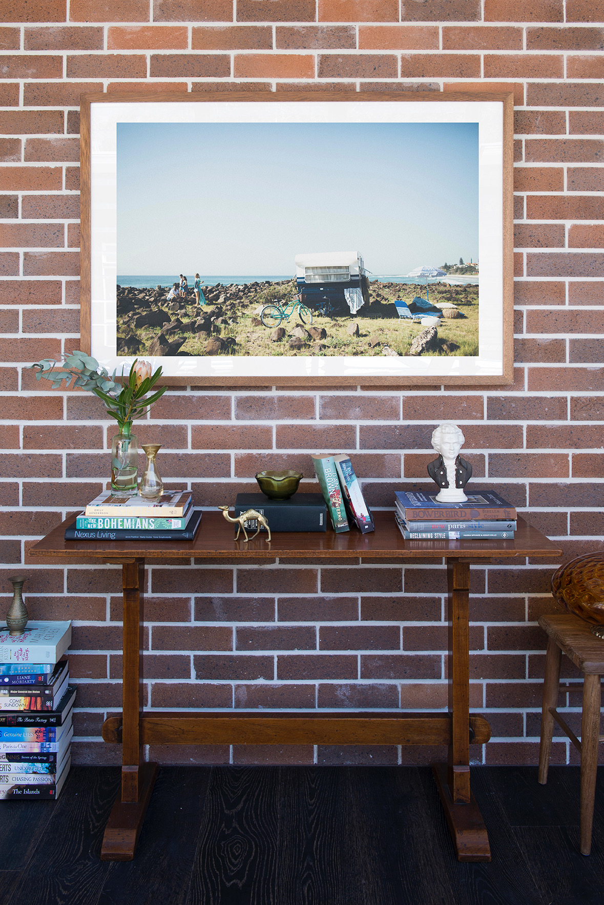
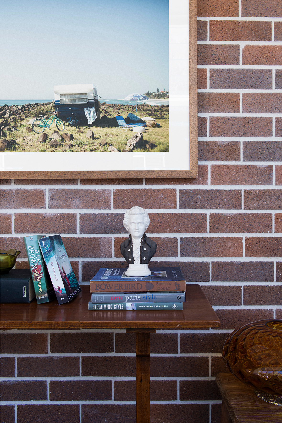
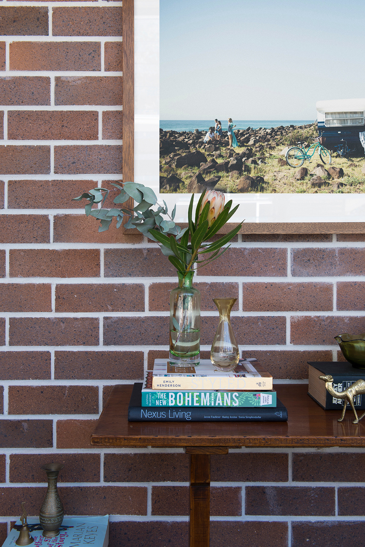
Another space, another excuse for a cute vignette. The best part about this vignette is that no one ever touches it because it’s purely for aesthetics. I’ve styled it completely from pieces that I had sitting in other parts of the house and everything on the console, including the console itself is vintage. If you are decking out a sparkling new house that needs some soul, hit your local opp shops. I’ve said it before, it’s where you find the quirkiest, coolest finds. The console, I sourced from The Gold Coast Antique Centre. I used to avoid antique centres because I associated them with very very old which meant very very expensive but most antique retailers also sell vintage items and the prices are subject to the material and its rareness. This console is pine and therefore totally affordable. The amber light I picked up from The Grainery at Murwillimbah and I think originally it was a pendant light but I always intended to plop it in amongst one of my vignettes.
The art is a good example of how being restricted by budget can work in your favour. Because we already owned the photo, I was only up for the cost of printing and framing. In saying that, I can’t emphasise enough the importance of getting your frame right. I favour timber frames although they are on the higher end of the price scale compared to a flat white or black. I like to mix up the colour and pattern of the timber rather than opt for a uniform look which risks looking stale. I also always opt for a plain white border to give the art/photo its moment to shine.
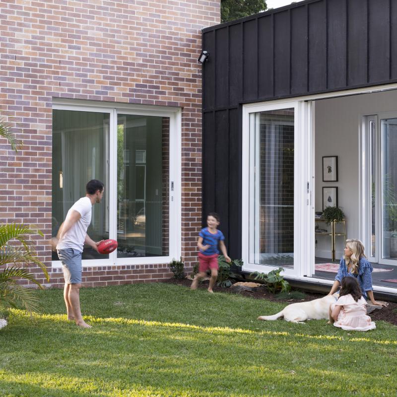
This is me below, kicking my feet up supervising the kids in the pool. Ha yeah right, I’ve never sat here, no one has time for sitting, it’s a pipe dream, but I do fold my washing here. And the kids like to jump up on the bench seat when they play ‘the floor is lava’ so you know, it has its purpose.
The hand crafted rugs are all from Decorug and I’ll tell you what, they are key to the success of this space. Purchasing underlays though is on the to-do list because between Michael and the kids those things are never straight. Hot tip; if you’re going to use runners, make sure you source a hard-wearing type because the idea is that you walk over them and some rugs just aren’t up to the challenge. These ones are indesctructible and because they’re patterned they don’t show marks. My type of rug!
Next week, it’s Paddy’s room up for reveal which is my favourite out of the kids’ bedrooms. Somehow it just suits him. It’s a smart room and Paddy is smart kid so you know……
Carlene xx


