It was really important to us in this renovation that our choices have longevity, literally and aesthetically, both because we intend on being here for a very long time and also because we’ve been waiting 8 years to complete this part of our renovation and I don’t want to be sick of my spaces before I’ve enjoyed them. This was also our first opportunity to create a home just for us. I didn’t have to please a client or judge, or potential buyer. I indulged in the idea that this house was about us only and I can tell you, the process was as liberating as the outcome is satisfying.
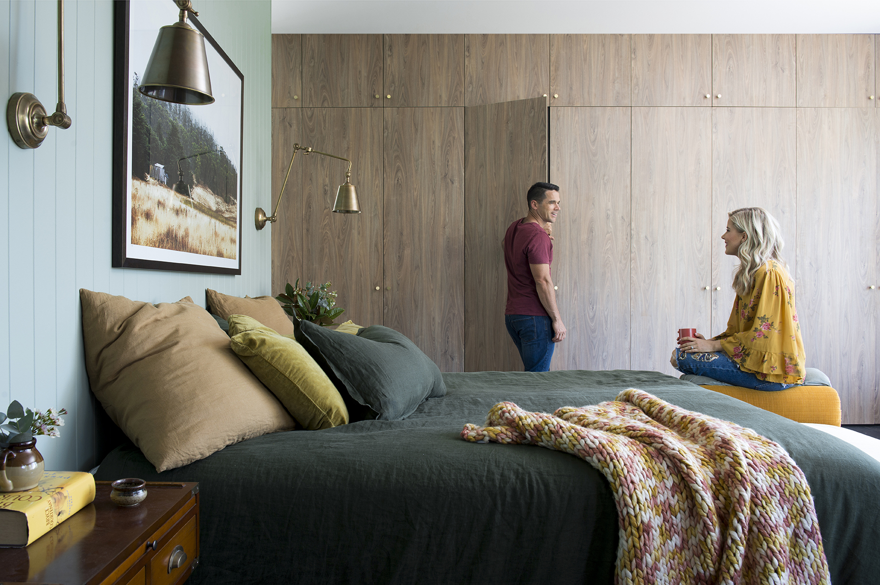
I genuinely LOVE the result of every room of our home renovation but the master bedroom has got me good. It certainly helps that the huge window that takes up the whole of the back wall frames the top of HUGE ancient gum trees to form the most amazing ‘picture.’ And then there is this full wall of beautiful cabinetry, and colours that make my heart sing, and that brick………how about we just get it into it and I’ll show you what I mean.
We’ve used Easycraft VJ panels throughout the entire renovation because why wouldn’t you?! The green on the walls took me a couple of attempts to get right. I learned that testing the colour on plywood is not the same as testing it on the MDF (Easycraft). Twas a good lesson. The first colour I tried came out too bright and was throwing a bit of turquoise and for as along as I can remember I’ve always really disliked turquoise. We got it right with Resene Mantle but if you like this colour and plan on using it on plasterboard walls then do a test run because it looks different on different surfaces.
The rug you see poking out there is the Hypnose rug from Decorug. It’s a machine-made distressed, Persian look in colours that were beyond perfect for this space. I used the blue version in Stella’s bedroom but it also comes in beige and a cherry/beige both of which I’m trying to work out how I can work into my house because they’re so damn pretty. The flooring throughout the home is an oak board in oil finish, also from Decorug. It’s called called Black Mountain from the Woodline Antique range. It’s laid direct-stick (not floating) which I recommend having lived with both applications.
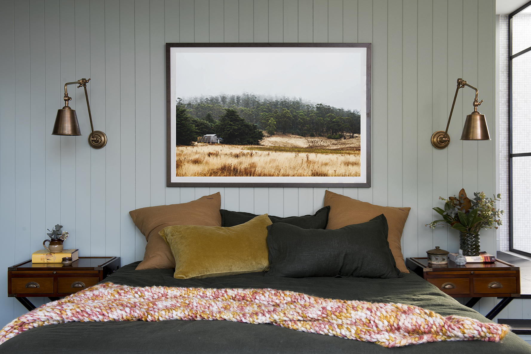
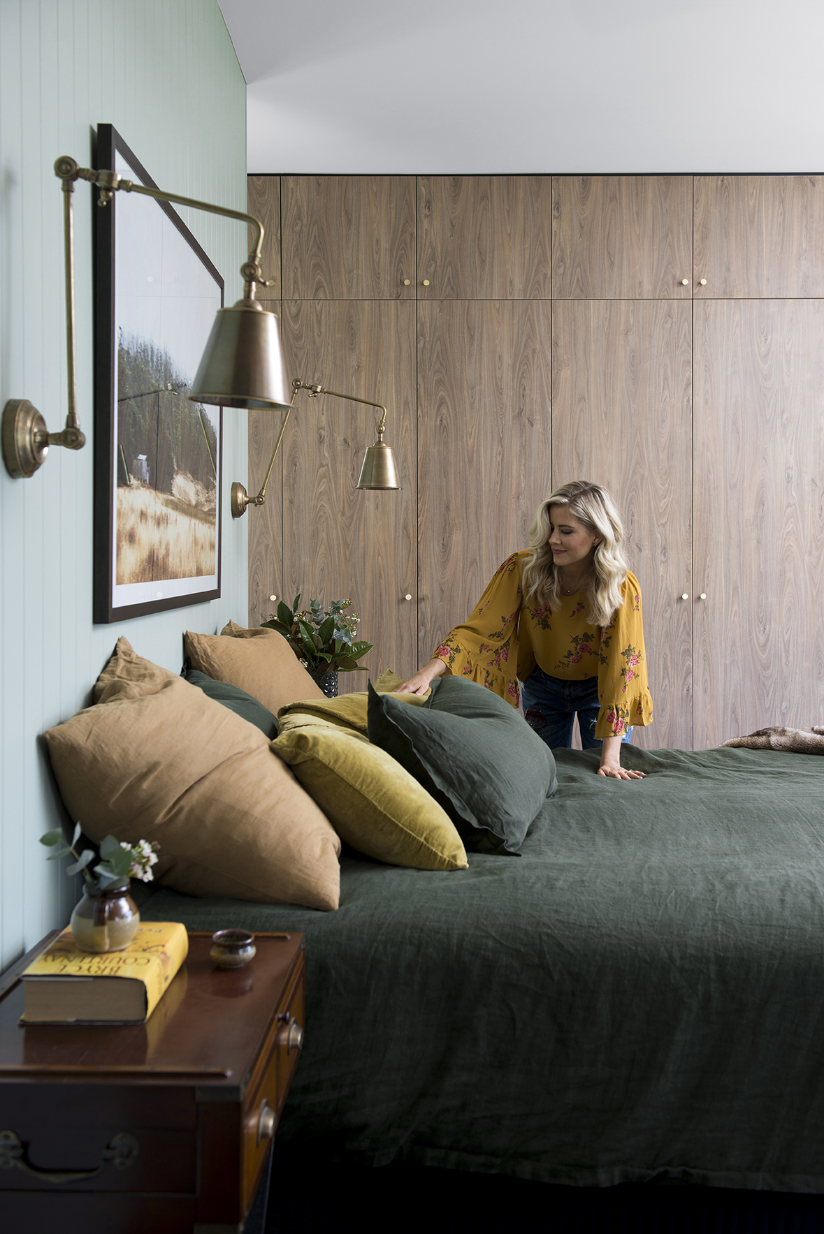
That artwork is pretty sensational in this space. It’s a photographic piece by Kara Rosenlund who does the most beautiful landscape/animal photography. Michael and I both enjoy that the colours in this piece reflect what’s outside our bedroom window and it absolutely sets the tone for this space. We always use local framer, Artisan Picture Framing at Varsity Lakes and I opted for a really dark timber grain frame for this one. It called for something sophisticated.
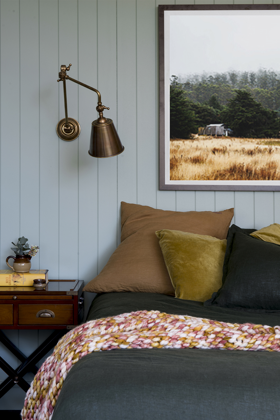
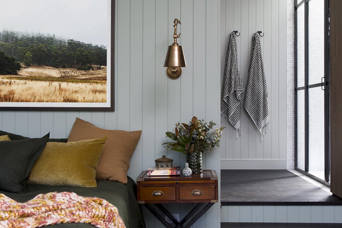
I should point out that although the renovation was on a pretty substantial scale and we worked with some amazing product sponsors, we were still renovating to a strict budget and like most people, we weren’t at liberty to just out a deck out our rooms with new furniture and furnishings. We moved our ensemble bed up from our old bedroom and sourced that delicious forest green linen quilt cover set from Sheets On The Line. The mustard velvet pillows cases I already owned and the Euro cushion covers and A-mazing throw are from Kip & Co. I am very partial to campaign style furniture and these bedsides we also brought up from our old bedroom. It’s just a bonus that they work so well.
The wall lights beside the bed and above the bench seat are very, very cool and come from Emac and Lawton who are a wholesaler so you’d need to check with them re their stockists. Whilst brass is really HOT at the moment, more than anything I love the patina of aged brass. It’s timeless, sophisticated and aesthetically, will stand the test of time more so (I think) than the shiny, new alternative.
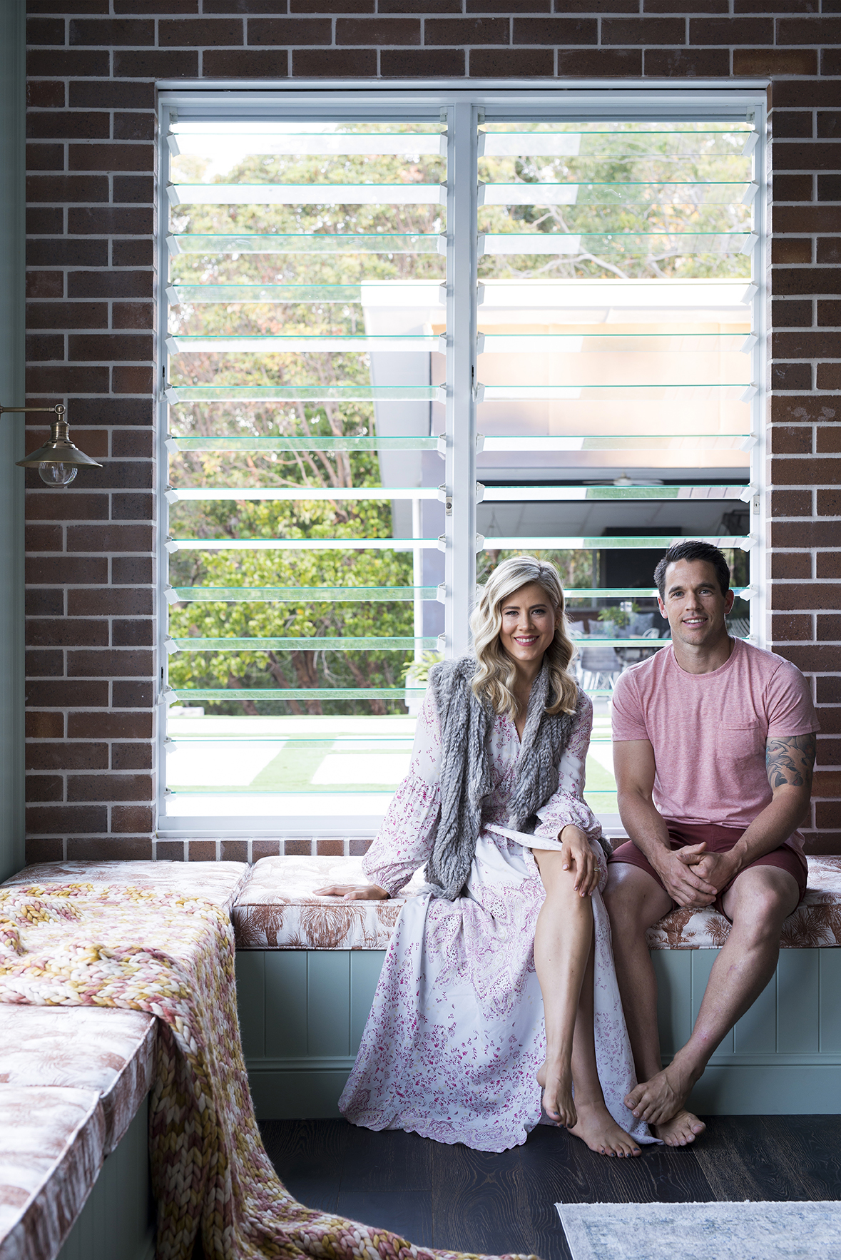
We have louvre windows galore in this house (Michael has a thing for louvres) which, along with all our fixed glass windows, were made and installed by A&L Windows. And let me tell you, the cross breeze in this place is real good.
Now let’s discuss these built in bench seats. I am a BIG fan of a built in bench seat (which will be evident when we reveal the res of the home) but to be honest bench seats that open up are just not very practical if you have to access what’s inside frequently. Thankfully we haven’t been able to fill this storage yet so it’s not a problem but regardless, my plan A was to have built in drawers here rather than a top opening function. That didn’t happen because at this point in the renovation we couldn’t justify the cost of the joinery. This, on the other hand, Michael could build himself which meant it was only the cost of the VJ boards and skirting, making it substantially less expensive. Throughout the house, we’ve used an ornate style skirting from Hume Doors and Timber for no other reason other than I just liked it and to be honest, regardless of what style home you’re building, ornate skirting always trumps the alternative.
That fabric, right?! It’s created by local Gold Coast textile designer, Sara Hingle of These Walls who is a pretty darn talented illustrator and who’s work features in both kids bedrooms and via the wallpaper in our ensuite toilet (stay tuned for that). The rust colour against the brick and that green is perfection to me and I feel like I will never get sick of that very cool, Grasstree print (Paddy’s bedroom rocks the black and white version). I can’t go past a bit of ‘Australiana’ in the home and it works with the Aussie bush scheme that’s happening outside our bedroom window.
The daybed was also brought in from another part of the house. It’s an antique piece I purchased from a local vintage/antique shop a couple of years ago and it looks right at home in our bedroom.
It took me about 10 months to commit to the wardrobe joinery for this space. It was always going to form a full wall and make a statement in the room and therefore I just couldn’t get myself to commit. I put it off and put it off and when I FINALLY took the plunge and locked in my choices ohhh the relief. You know when something hangs over you and you know you’re being a huge wuss by avoiding it and then you confront it and feel soooo good. I know we’re talking about cabinetry here but anyone who has recently built or renovated knows the cost outlay in cabinetry so I had to get it right. And we did. I wanted a timber grain that those circular type knots because I really really dislike timber grain laminate with a streaky grain (do you know what I mean?). We went with Natural Walnut by Laminex. It’s a new colour in the range and I think, their best. If you’re wondering whether we would ever use the top cupboards, we don’t but we can. Taking it to the top and having that join was an aesthetic choice. All of our joinery was built and installed by local company, MCDAS. Their turnaround was very very fast and the result was bang on.
The brass door knobs completed the vision I had in my head to perfection. They are a brushed brass knob from Lo & Co Interiors and they are PERFECT for their subtle and refined look. It’s a gooooood feeling when the vision comes together.
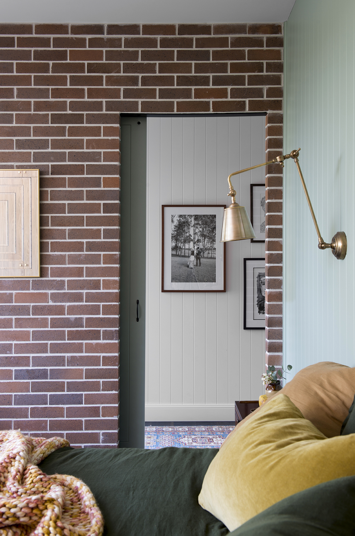
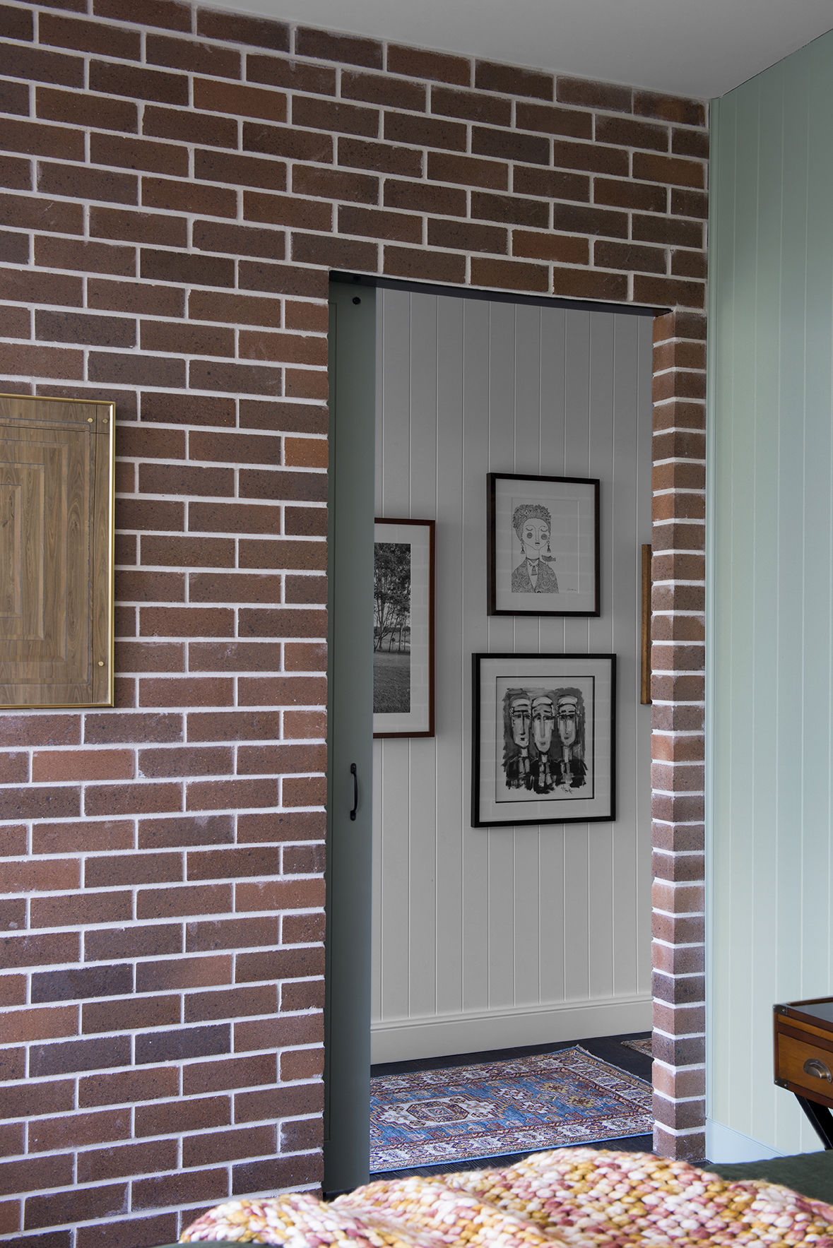
Sometimes when I finish making over a space I’m surprised by the aspect of the room that I enjoy the most. This image above, is my favourite view in this room. There is something about the combination of textures and colours here that just gets me. The brick here is the same as seen in the bathroom reveal, Hawkesberry Bronze by PGH Bricks (via ABC Bricks) paired with white mortar from The White Cement Company. In the hallway, on the Easycraft VJ we used Resene Black White which is a really crisp, grey-based white that doesn’t throw any unwanted colours. You’ve all heard that white isn’t white so it’s wise to test a few.
The door, as in the bathroom, is a custom size by Hume Doors painted in Resene Blue Smoke. The handles are a simple, refined. matte black style from Bunnings and the track hardware is from Ebay.
The art on the walls in the hallway are all pieces we already owned and the mirror on the brick I picked up from The Grainery at Murwillimbah, which is a treasure trove of amazing, crazy vintage and antique goodness. You need to allow yourself a couple of hours there at the least to absorb it all. I feel like I paid too much for it but that the owner (who, be warned is wildly inappropriate) wouldn’t budge on this particular one. Its from the same place that I purchased my retro pottery sitting on the bedside tables. These, you can get for a good price, especially if you buy in multiples. That small rug you see is my absolute favourite from Decorug. Its one of their handmade pieces of which no two are the same.
Well that’s all folks, I think I’ve covered it all off. Next week, keep an eye out for the ensuite reveal, which you can see poking its head out on the side of the bedroom and which is Michael’s favourite room in the house.





January 16, 2018 at 9:50 pm
Another winning room.
Love the use of green and brass.
Can you let me know what width the vj panels is?
100 or 150?
January 18, 2018 at 2:54 pm
Thank you.
They’re 100mm
January 19, 2018 at 6:12 pm
Who did you bathroom black steel shower frame? If that is what it is?? Please please please. Thanks I’m advance!
January 20, 2018 at 7:54 pm
I’ve pulled this straight from the blog:
“I know you want me to talk about that shower screen (we’ve had requests) and of course, I will because it’s FABULOUS and it would want to be for the amount of effort that went into it. You’ve all seen the warehouse-style, black-framed, glass movement and it’s bloody brilliant but what you are generally looking at when you see those windows is a steel frame. We couldn’t have steel because steel can rust and would also be cost prohibitive so after some head scratching, Michael found a fabricator that had an aluminium section that would work for what we wanted. We provided him with the opening measurements and design and once it was welded it was then powder coated black and installed. Once the frame was installed we had 6mm toughened glass cut and installed and secured with silicone by a local glass supplier. It actually sounds much simpler when I write it but neither we, nor our suppliers had done this sort of thing before so everyone was a bit green to the process. It’s OK though because we absolutely got what we set out to achieve.”
January 10, 2019 at 12:15 pm
I’ve noticed you don’t have window furnishings on the louvres. I have louvres in my bedroom too without curtains, etc but I’m finding it very bright in the mornings – do you have a recommendation on what could work on these kind of windows?
January 14, 2019 at 10:48 am
Oh we do now. We just didn’t when it was photographed. We’ve got lovely soft linen-look roman blinds.
January 25, 2019 at 2:34 pm
Wow wow wow!! What a dream room! Please may you tell me where you got those gorgeous bedside tables.
January 28, 2019 at 2:57 pm
These actually weren’t purpose sourced for the room but happened to work perfectly. They’re a few years of from Zanui.