Media rooms have become a thing. Once, we were content watching movies on our living room sofa but now building a home without a media room is like not including an ensuite. Sinful!
The thing is with media rooms, they have to be dark because they are supposed to emulate a cinema which is AOK with me because I’m partial to a moody interior but because they are also equipped with technology for days they tend to run on the masculine spaces. And hey, I’m all for a good masculine, den-like space if that is the intention of the room but I don’t think they should just accidentally end up that way if it doesn’t suit the room’s main users.
I recently styled a media room for young, easy-going Grandmother and there was just no way I could have this space appear masculine. It needed to be effortlessly sophisticated, unfussy and subtly feminine. This space needed to say, hey I’m going to have rich moody navy walls and rock some dusty pink and powder blue cushions with a dreamy piece of artwork that complements the space and doesn’t dictate it.
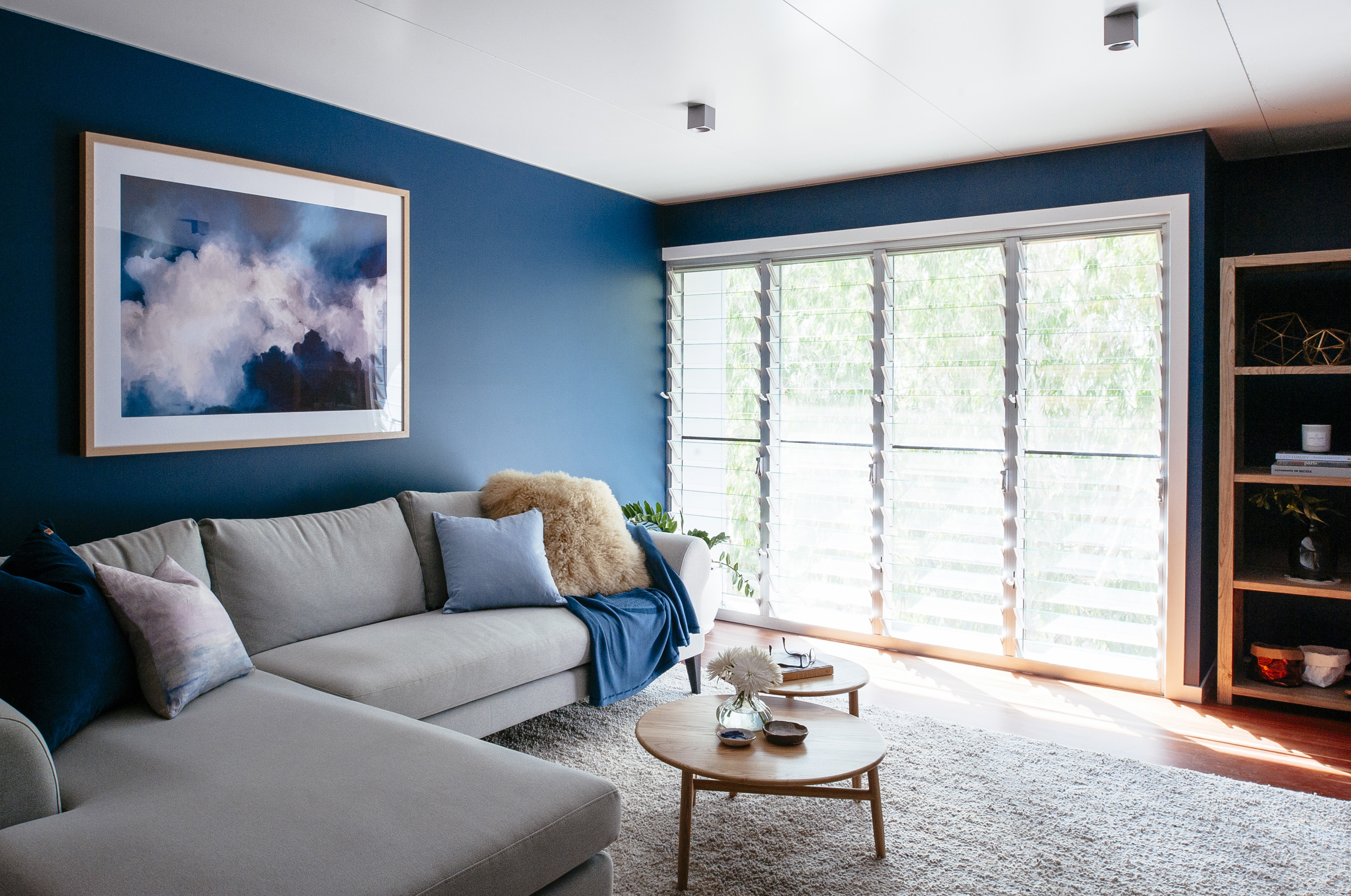
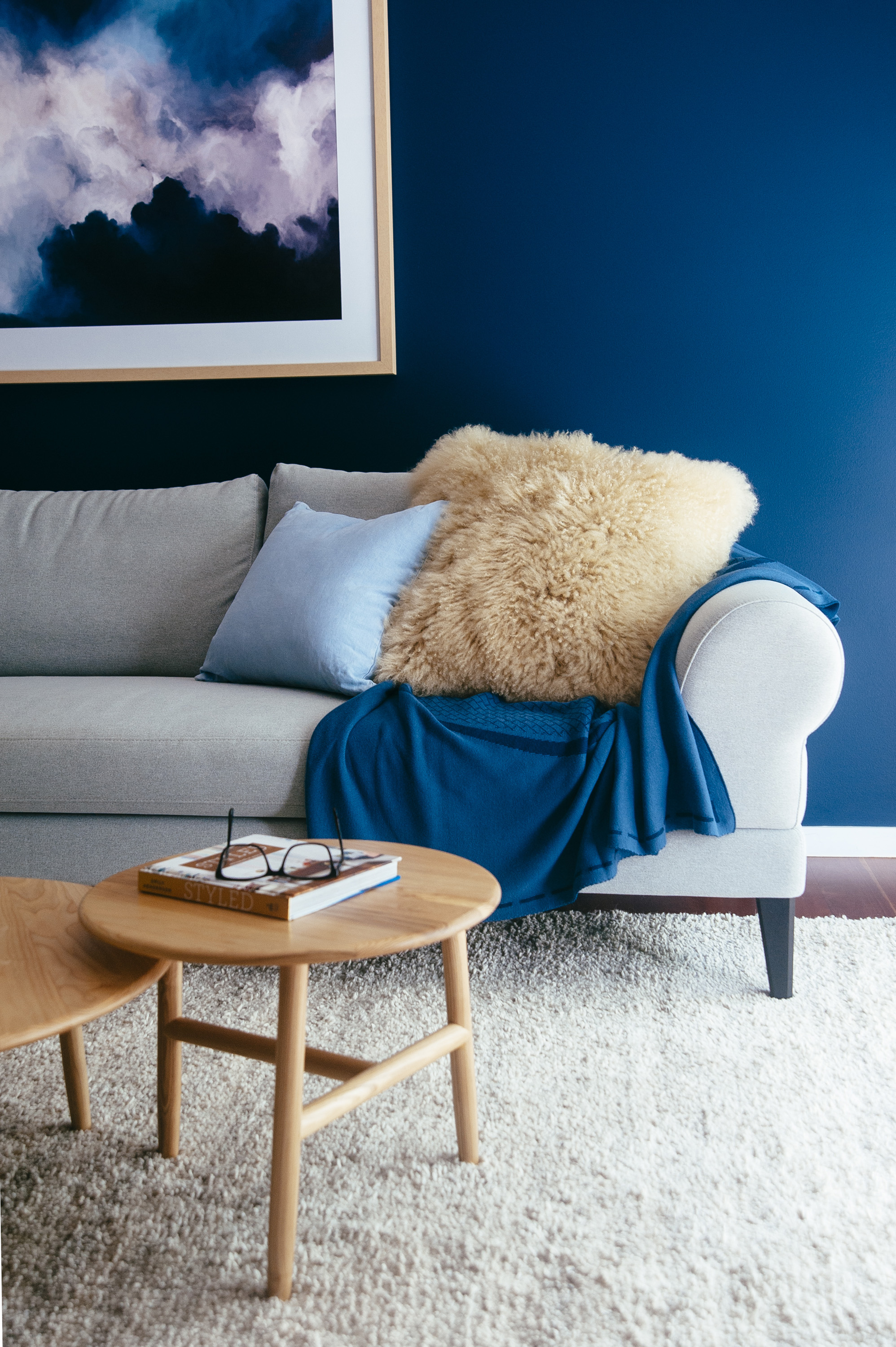
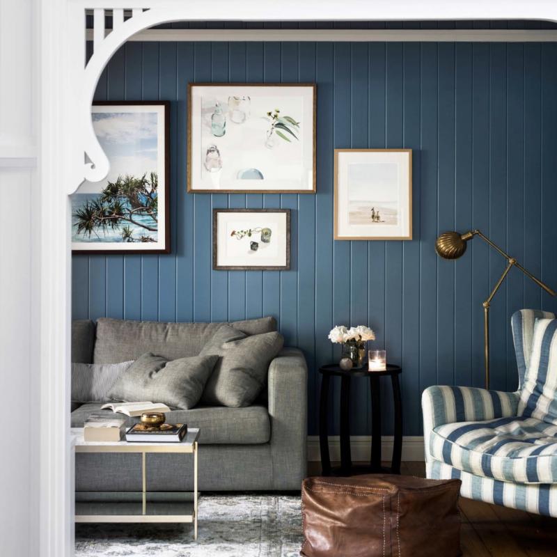
I am a bit of rogue with colour and clients often look at me questioningly when I suggest they paint a whole room a deep hue but I think this particular room is a good example that when it comes to colour we need to throw caution to the wind and go bold or go home. I don’t even remember what this room looked like before but I can’t imagine it being any other colour but this magnificent navy blue. The colour is actually deeper in real life and I love how the colour changes throughout the day and even looks different depending on where you stand in the room.
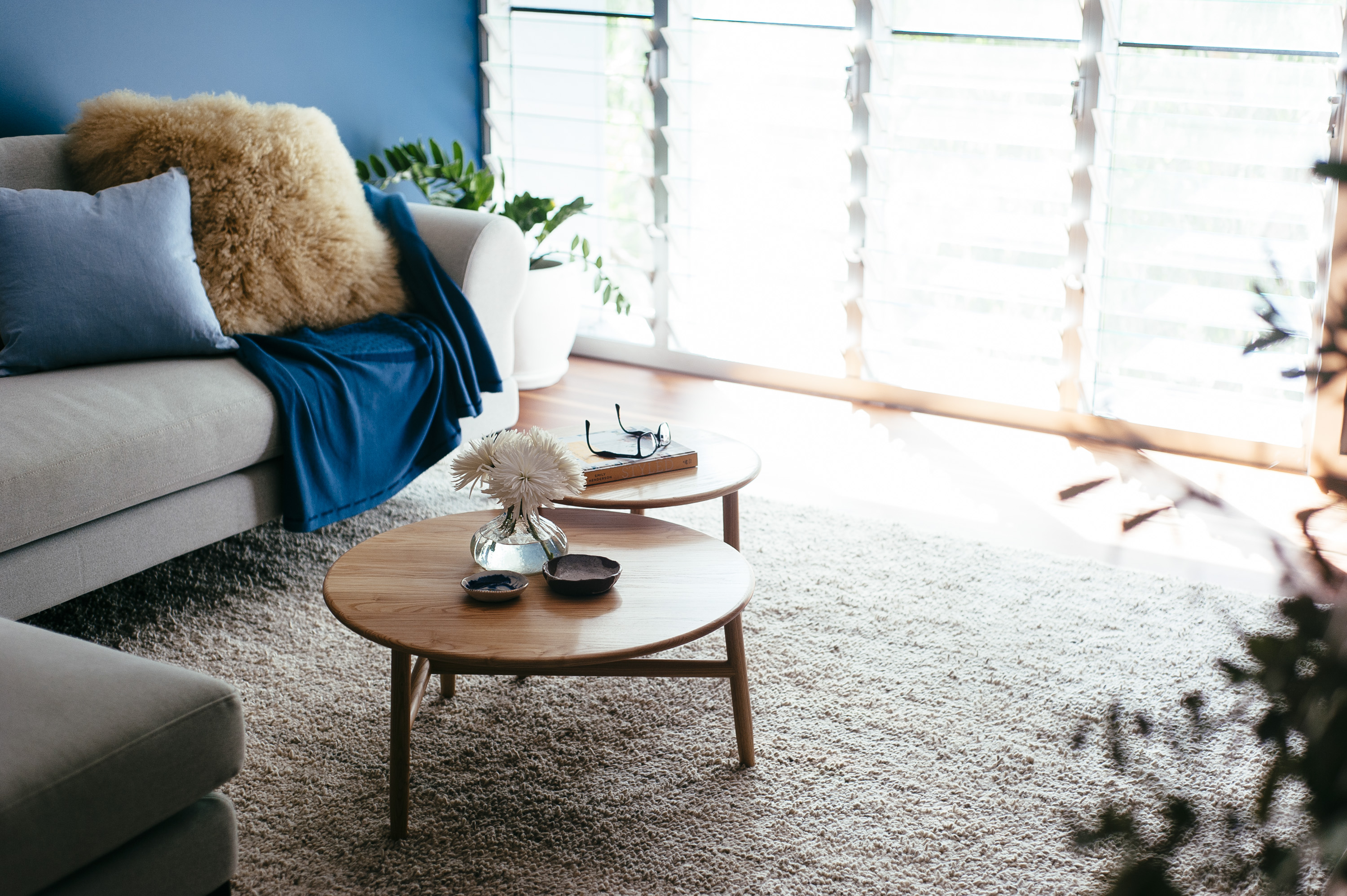
This wool West Elm rug is so divine underfoot and is the right kind of neutral for this space. It’s keeping things calm. The size is also bang on. And speaking of banging on, I’m going to bang on again about getting your rug size right. I will be pro “sofa feet ON the rug” till my death. I have no room in my life for floating rugs (rugs that sit in front of furniture).
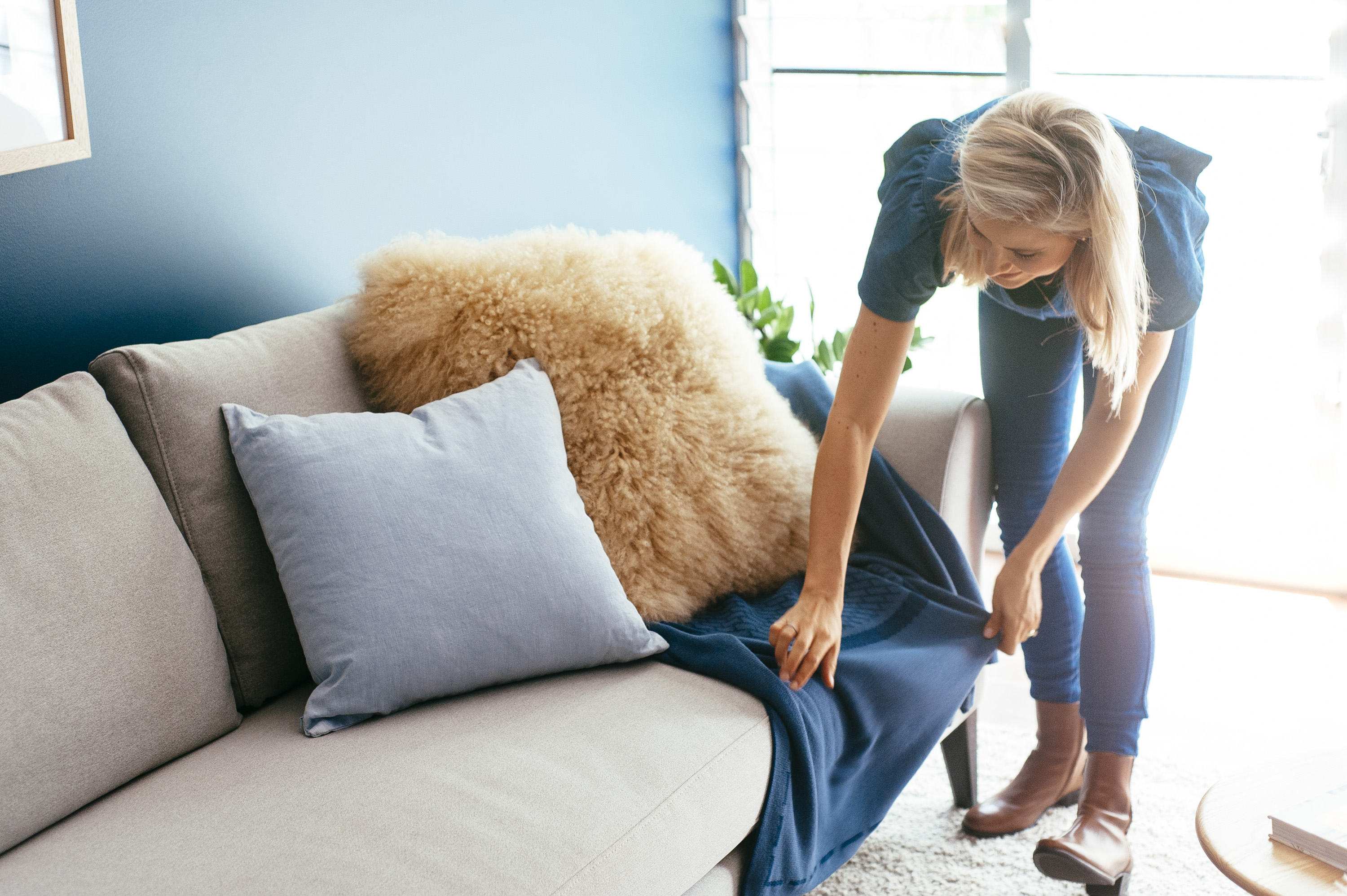
Mix up your cushion textures for the sake of visual interest. I’ve gone with a Mongolian lamb, linen, and velvet. This wasn’t the setting to go crazy with pattern like I would normally be tempted to.
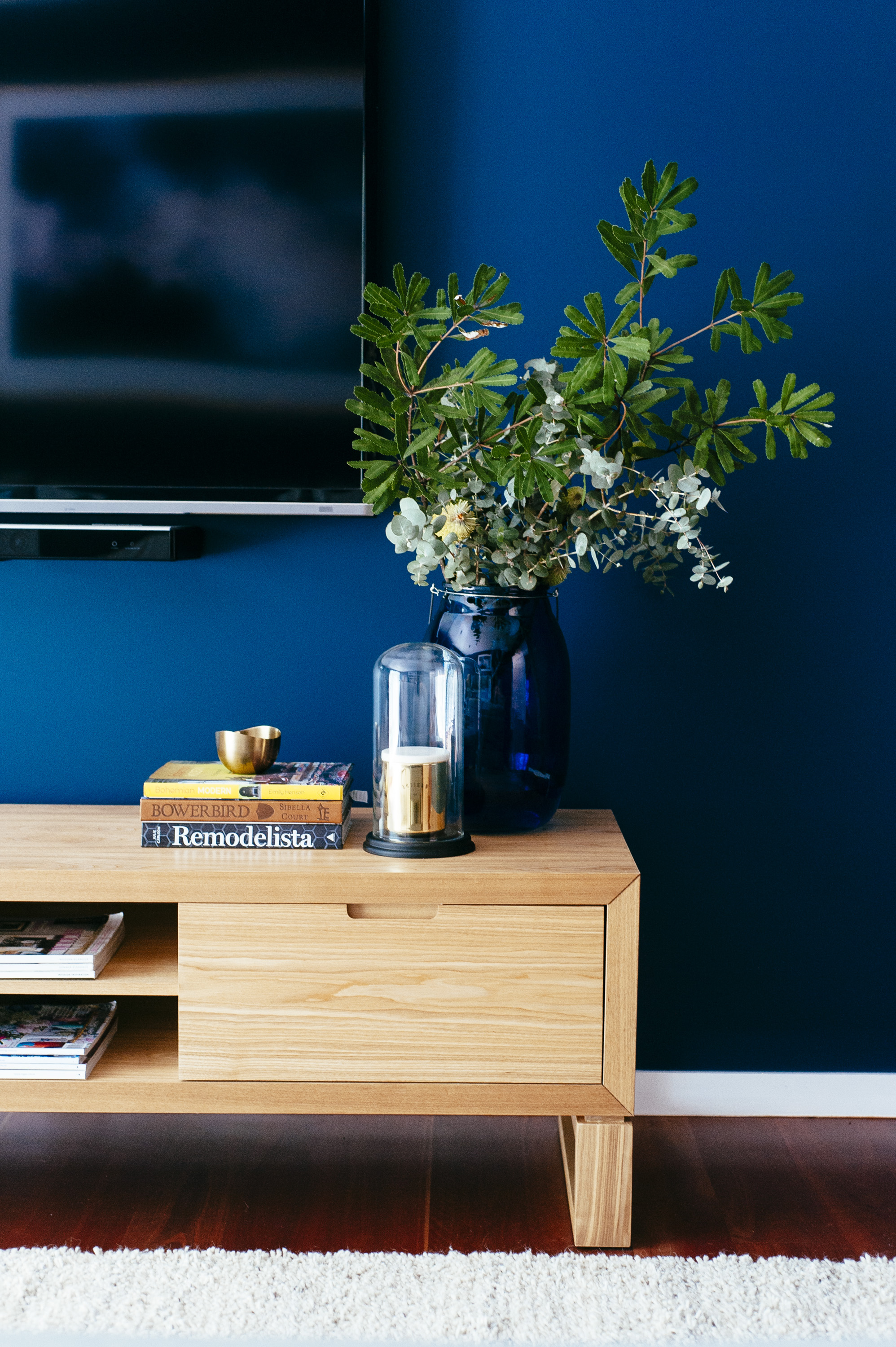
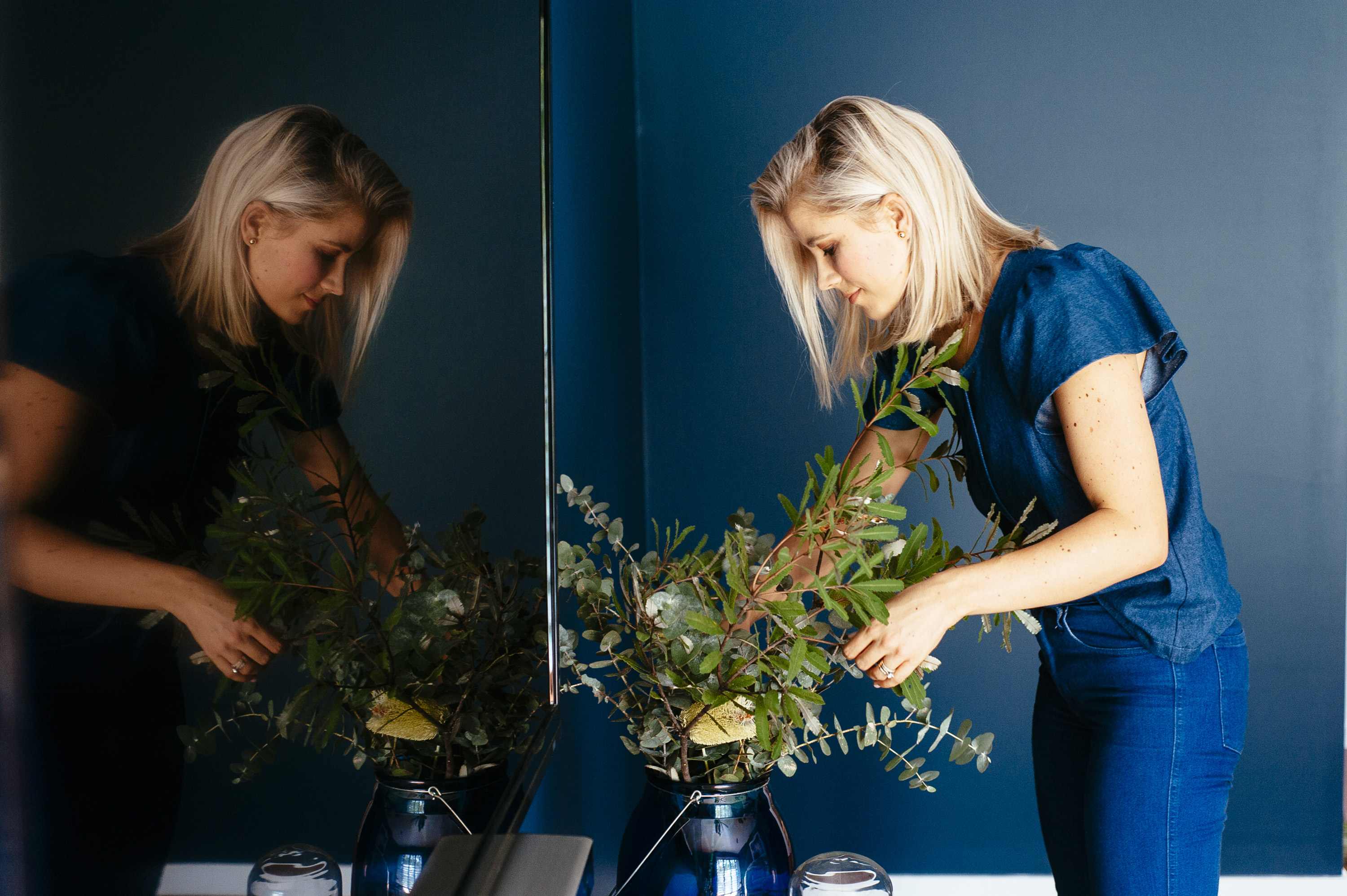
Foliage is ideal for adding life and colour to a space without actually adding another colour to have to contend with. The green of the foliage can be considered a neutral in this sense.
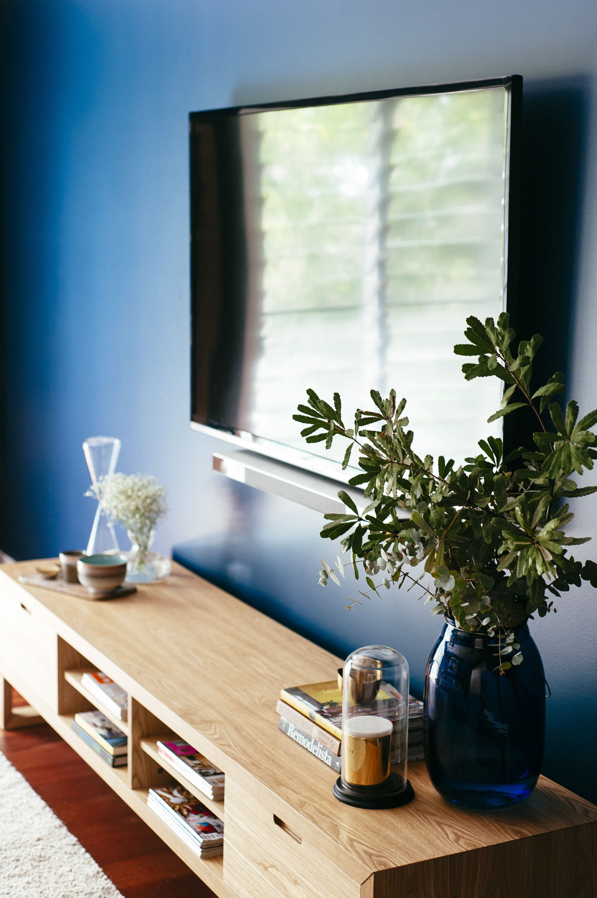
I find it difficult to find TV units that do what I want them to do. Size is usually the issue because they need to be long enough to fill out the length of the wall they are sitting against. This one from Globe West works and I love the magazine/book shelves built in here, largely because I think books and magazines are the easiest way to add colour to a space.
This client is a minimalist and doesn’t want to be a slave to her house, dusting around décor and tending to plants so it needed to be layered enough to be warm and welcoming but uncluttered and showing restraint. I’m a collector and a “more is more” kinda gal by nature but here, where I would normally pack out a shelving unit to create really layered surfaces, I kept things fairly fuss free.
This shelving unit was a challenge to bring to life. It is tucked into a nook that gets no natural light, which means anything sitting on the shelves sort of gets lost. It’s still a work in progress. I’m considering wallpapering behind the shelving unit in a light, bright print and possibly cabling for some overhead lighting. It might be the only solution.
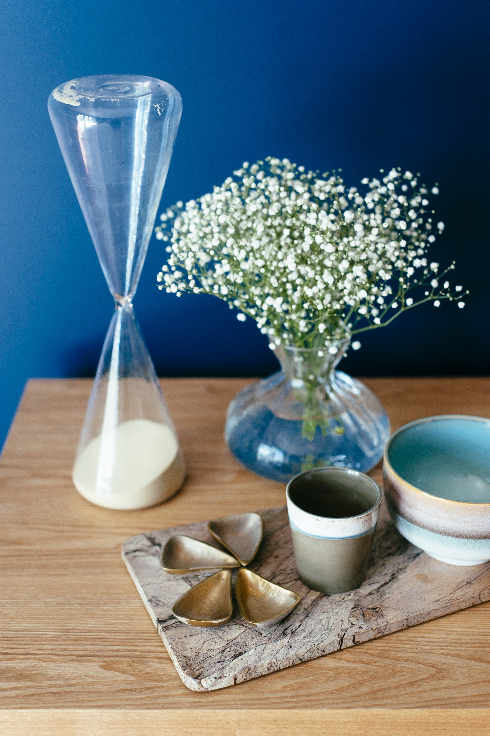
That deliciously good marble chopping board you see above is by HK Living from Kira and Kira and I don’t care that chopping boards don’t belong in media rooms because it was so right in this space, sitting on that timber TV unit and against that rich navy wall. Marble, timber and navy are a match made in heaven.
Go easy when styling a coffee table. You want to leave plenty of space on there for it to be functional and not be worried about knocking anything off. I also think, visually you just don’t want too much going on here. Save it for your TV unit.
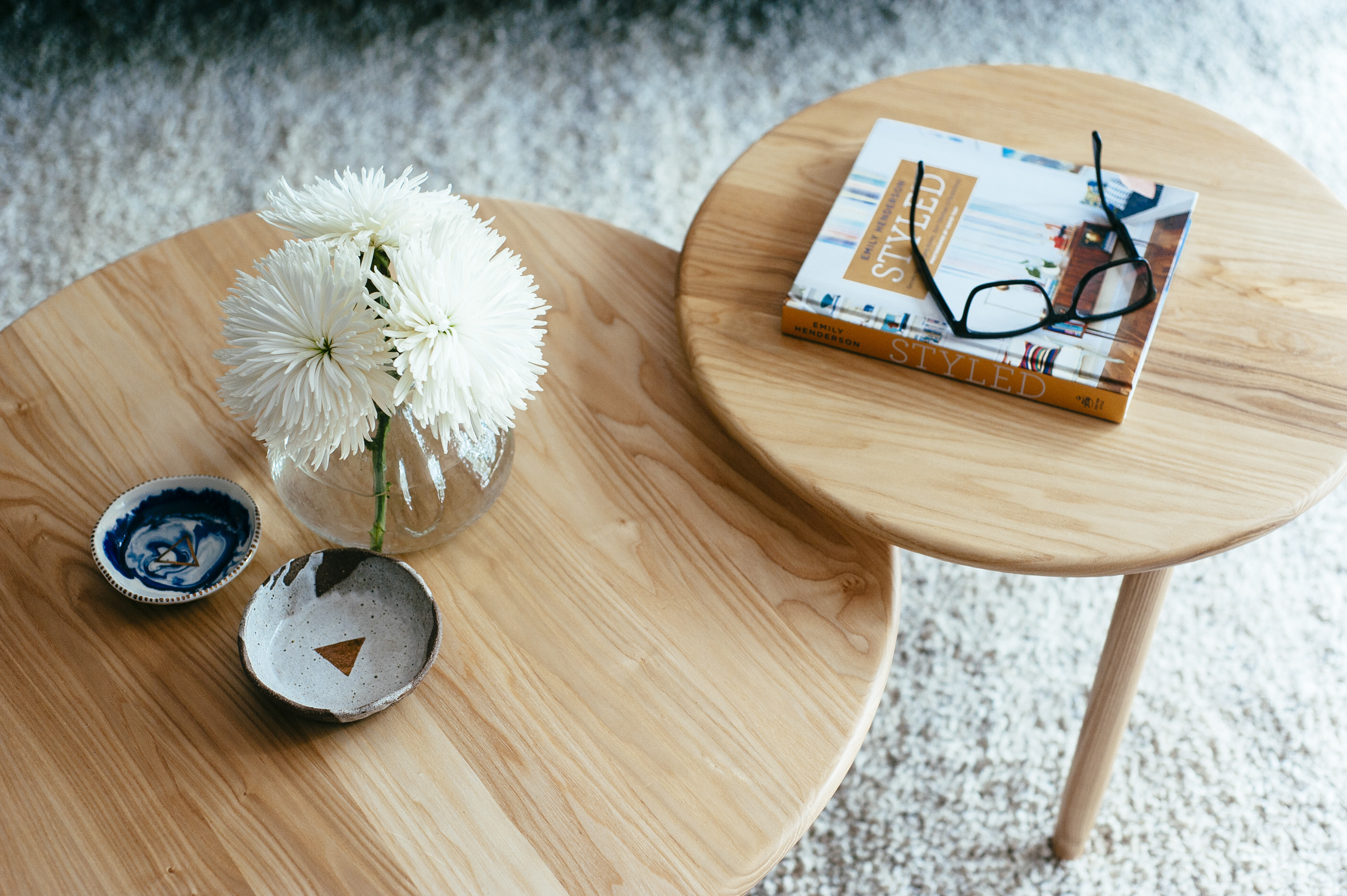
Product List: 1. Wool Rug: West Elm, 2. Sofa from King Living 3. Moss round side tables from Globe West; 4. Viva entertainment unit in natural Ash from Globe West; 5. Powder blue linen cushion from Adairs; 6. Mohair cushion from West Elm; 7. Sheets on The Line navy throw from Kira & Kira; 8. Dusty pink linen cushion from Adairs; 9. Large navy velvet cushion from Kip & Co.; 10. Art from Urban Road; 11. Navy blue lantern/vase from Big W; 12. Gold and marble candle from Adairs; 13. Glass dome, my own; 14. Brass bowl from Adairs 15. Liquorice Moon ceramic bowls from Kira & Kira; 16. Coffee Table Book, “Styled” by Emily Henderson, my own; 17. Specs, my own, 18: Glass Vase: my own; 19. Sand hour glass timer: client’s own; 20. Brass petal condiment holders: Voyager Interiors; 21. HK Living cup and bowl: Kira & Kira; 22. HK Living marble chopping board: Kira & Kira.
Photography: Natalie McComas.




August 15, 2018 at 3:45 am
Aloha! I absolutely love your choice of color of the wonderful media room. What is this color and brand of paint you picked? It’s stunning! Thank you for sharing photos!
August 15, 2018 at 9:31 pm
Thank you – I actually can’t remember I’m sorry. Is it in the post?