I like to think of myself a fairly decisive person who’s probably on the high end of medium on the risk-taking front and when it came to our home renovation, for the most part that proved true but there were a couple of design decisions that I let really bog me down.
One of those head scratchers was the cabinetry (did I want an edged profile or flat, dark timber grain or light, mirror or no mirror – agh the agony!). The other dilemma was our brick choice. These are both major, costly decisions that you can’t afford to get wrong (I sound very alarmist, I know)! I probably sat on both decisions for about 6 months which is not recommended when you’re subject to lead times and you’re working to a deadline, which describes every building project that ever was.

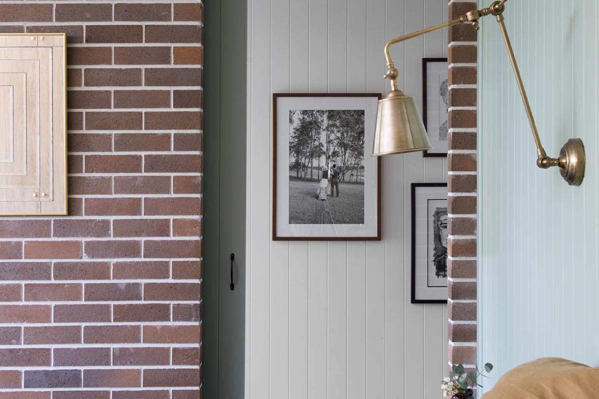
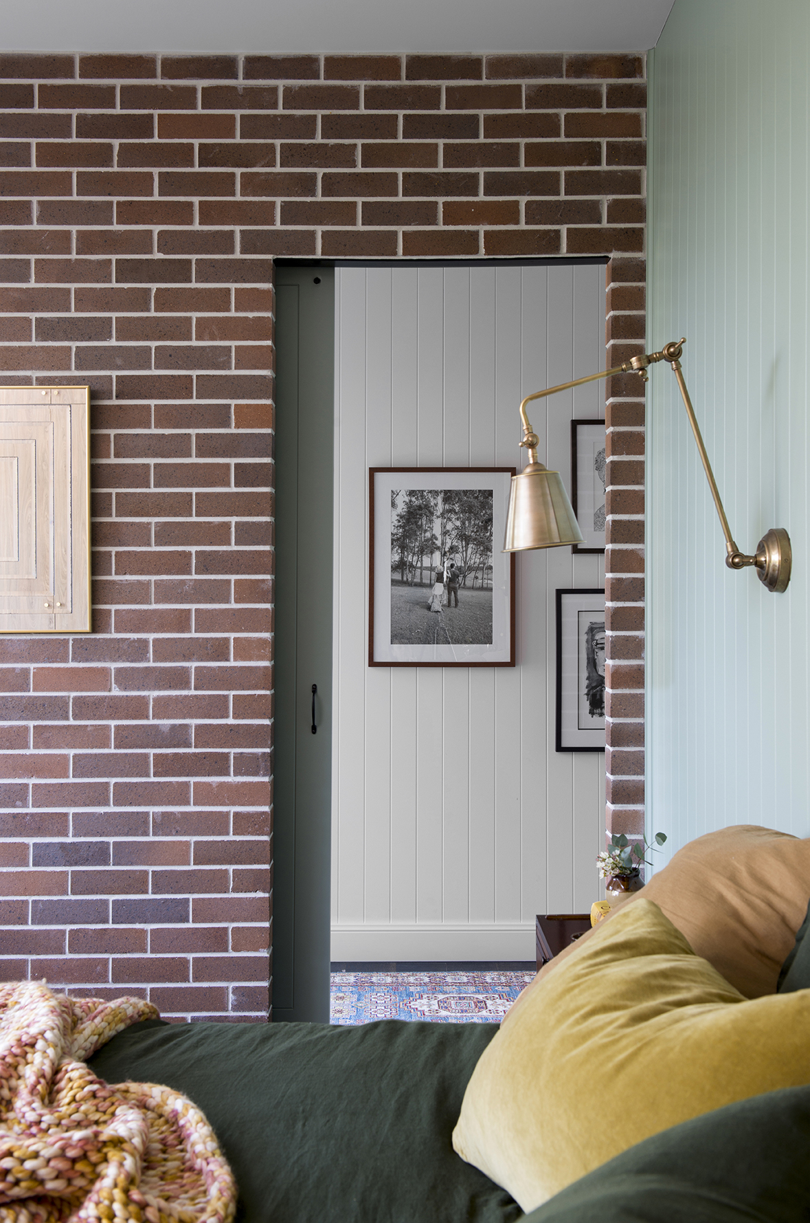
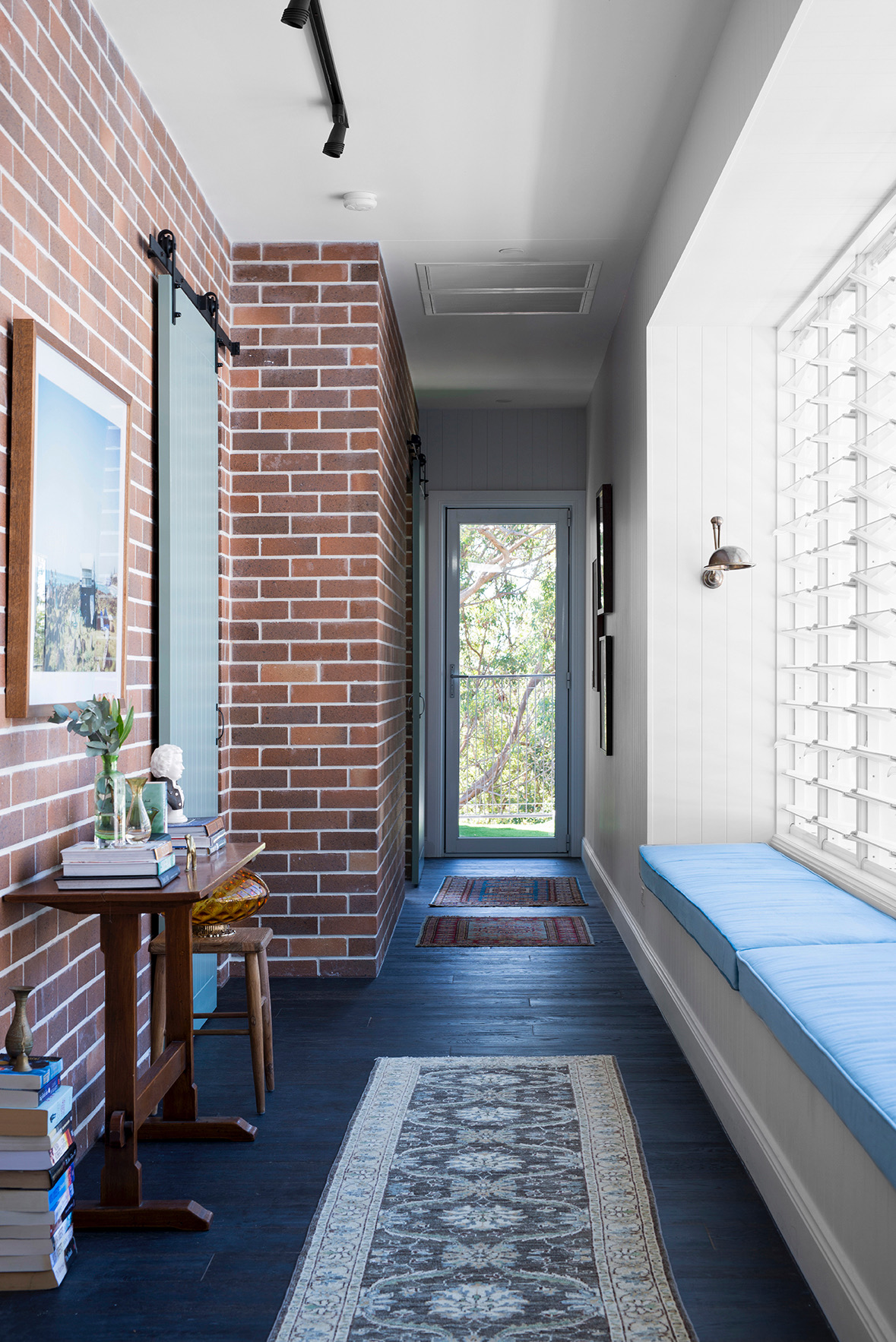
Our brick was to be used to form our tower (the hero of our front façade) so whatever we were going to do here we had to get it right. I rounded up Michael for moral support and we took our butts down to ABC Bricks. After perusing the selection and still not entirely sure, we were about to leave when I saw the PGH Bricks brochure at the front desk and I knew! The cover donned a spectacular use of PGH Black and Tan brick paired with white mortar which really made this classic brick pop. Boom, decision made. On the house interior we used PGH Hawkseberry Bronze which is similar to Black and Tan but is double faced which we needed for our single skin hallway wall. Hot tip: engage a reputable bricklayer. This is key. A good brickie will ensure neat work and that the different batches of brick are broken up sufficiently to create an effective display of colour.
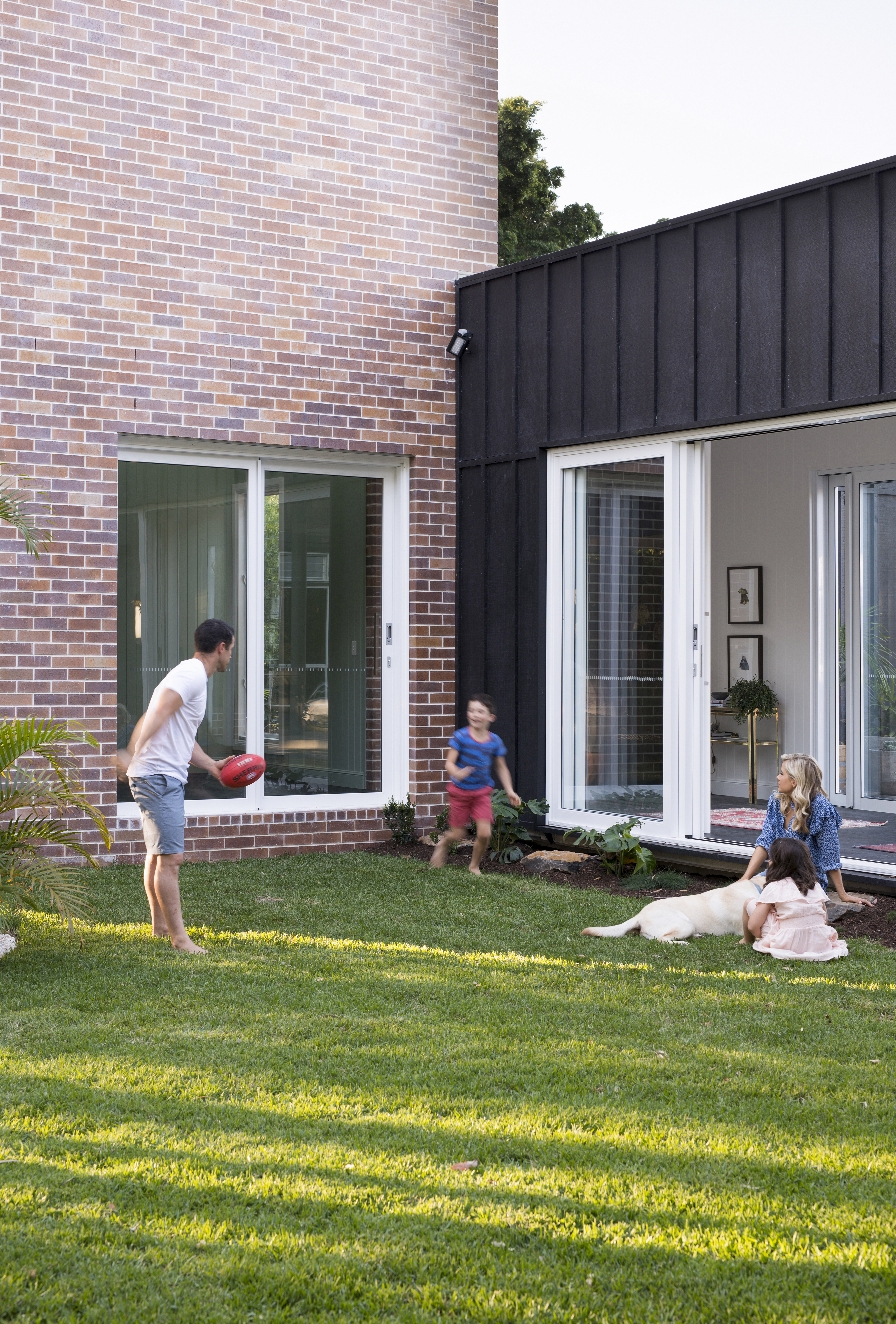
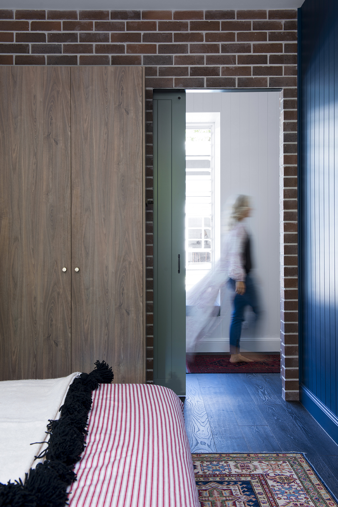
I genuinely can’t remember whose idea it was for the brick to run the whole length of our hallway but it was a GOOD one. Whilst I love driving up the driveway and taking in the colour and pattern of the brick exterior, inside we are able to take in the brick from every room of the renovation and I never tire of it. It just makes me so happy every time I look at it.
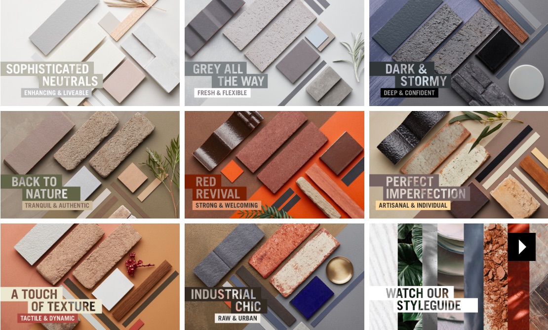
We’re in the design and building game and this decision was tough so I can absolutely sympathise for those who are coming into this completely green. PGH has acknowledged this and worked together with Nexus Design to come up with a style guide, a beautiful curation of materials and colours defined by different style names. I love this because the biggest hurdle in design is determining your scheme. Once that is down and you have a vision to work from, everything else seems to fall into place. You can even take a quiz to help you define your look which is represented by the most impossibly delicious flat lays. FYI I’m “Touch of texture.”
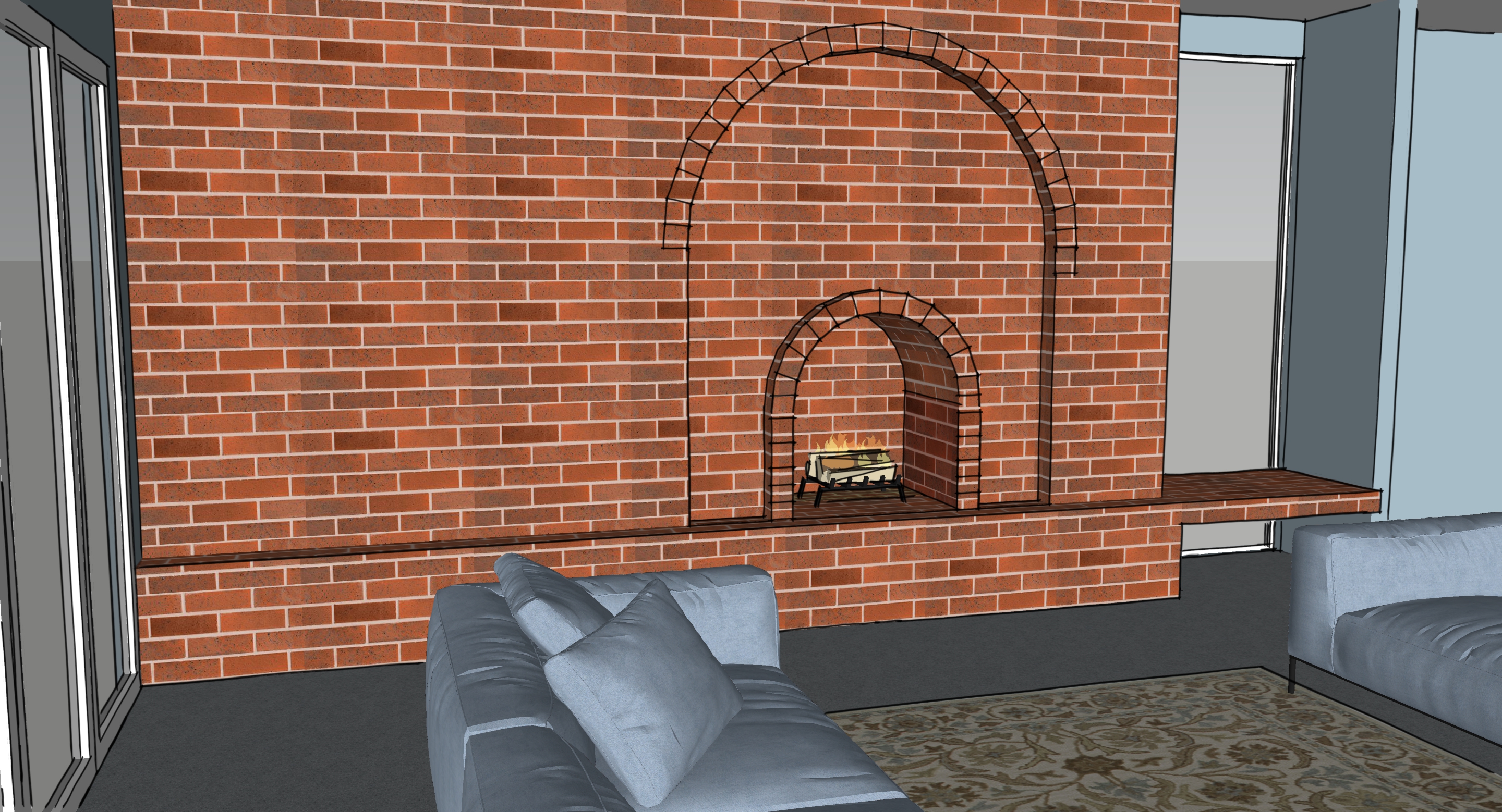
We’re in the process of designing a brick design in our living room and where we went with quite an architectural brick design in our renovation, I’m leaning to a slightly more relaxed look for the living room (PS which is going to include a fireplace just because, why wouldn’t you?). I’m in the process of pondering a tumbled edge brick with grey mortar (rather than white) but still in a similar tan colour. Picture it with powder blue walls, velvet navy blue sofas, vintage Persian look rug. Yum! It’s going to be a showstopper. Stay tuned for that.
Carlene xx
This post was brought to you by PGH Bricks and Pavers. All words and thoughts are my own.