This bedroom was styled for one of my client’s grandchildren for when they come to visit but wasn’t necessarily to be a “kids bedroom” per say. Yeah I know, it’s a tricky one. I had to keep it young and fresh and child appropriate but not overtly childlike.
This is about as paired back a space as I’ve ever done and that’s partly because it is, for the most part, unoccupied. There is no one living in the room to fill it with their cherished items. My client is also partial to less than more. She’s not really into “stuff” for the sake of “stuff.” I had to remind myself that this was to be a bedroom for kids but not to be a kids bedroom. If it were to be a kids bedroom, I could have done bed canopies, decorative lighting, wall murals, shelving, crazy fun pear shaped cushions……but sensible Carlene kept tapping me on the shoulder on this.
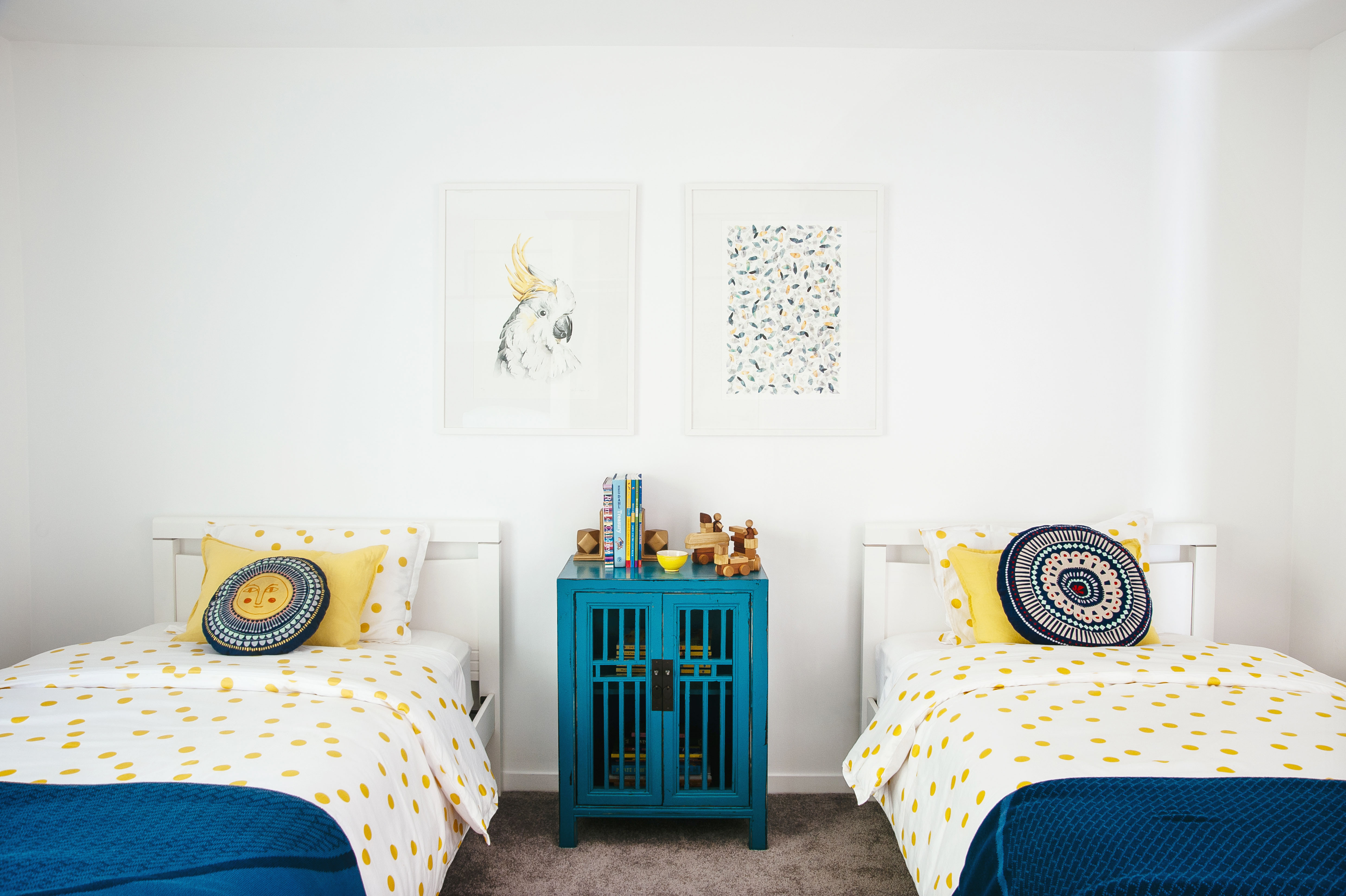
The yellow polka dot quilt covers were the first pieces I chose for this space and I was drawn to the gender-neutral print and colour. I have a soft spot for yellow, it’s timeless and unaffected by trends. It’s as constant a colour as blue. I also can’t go past polka dots (also timeless) so, done. And you can’t see it in the image but these quilt covers are of a really high quality organic linen that my client will keep forever simply because they are first rate.
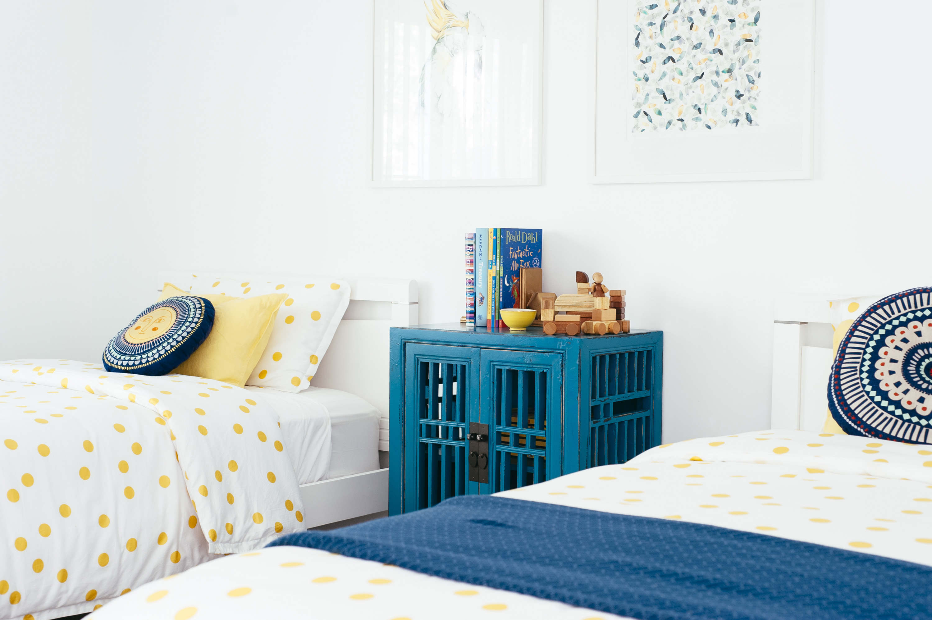
The prints came next because they struck me as just being right for this particular space; young and light but not too juvenile, and easily transferable. I do love a bit of Australiana in a home, which the Cockatoo image so aptly delivers and there is a very subtle Australiana theme running through other rooms of this home especially evident in the Master bedroom. You can see what I mean here.
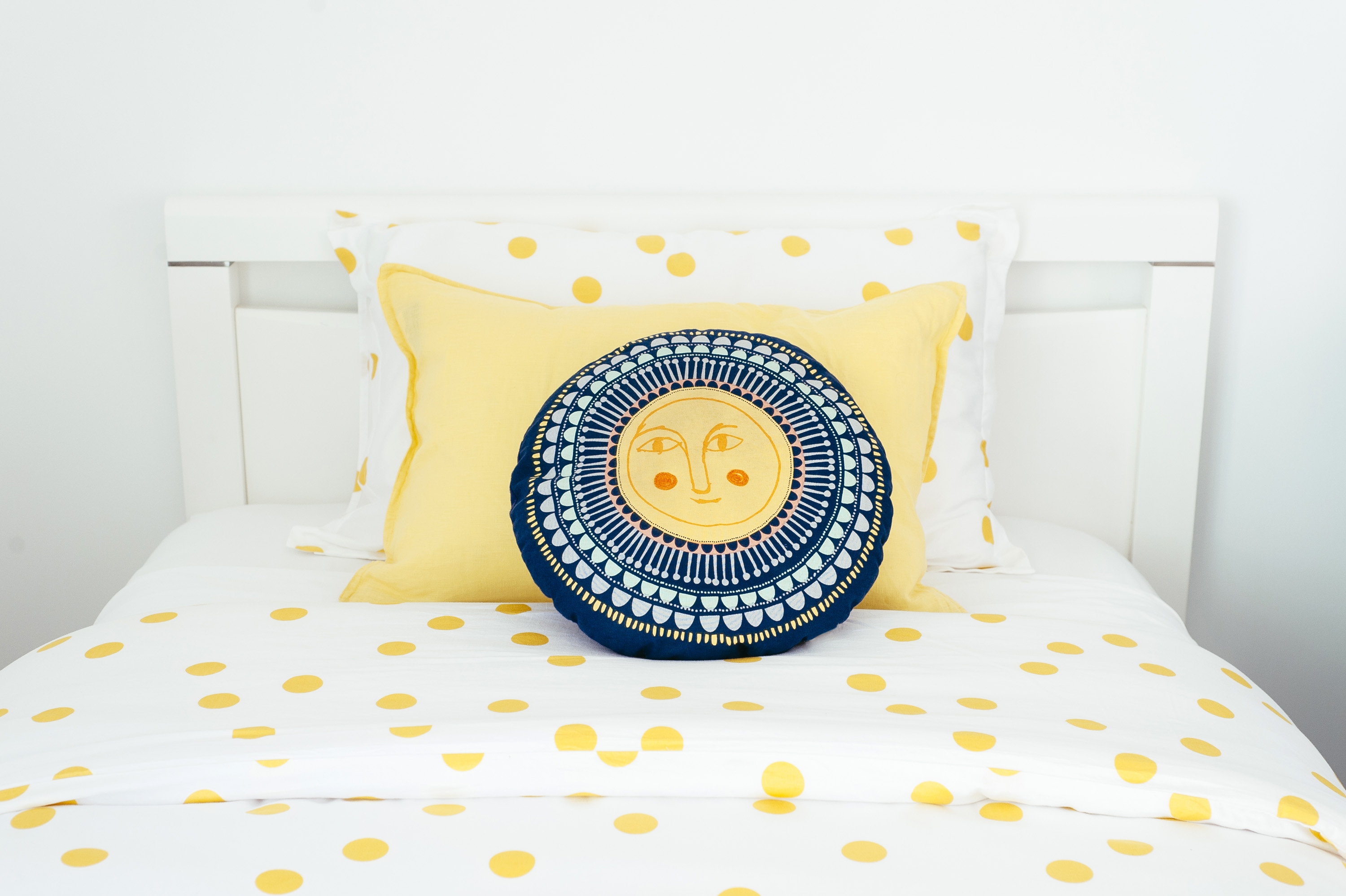
I rarely only work with two colours in a space as I have in this bedroom but again, I was keeping it simple. I do love that those Citta Design throw cushions introduce some new colours without making a big deal about it. They’re just throwing a bit of “something-something” but playing it cool. Symmetry is also something I rarely do because it generally tends to feel a little too clean for my taste but sometimes a space just calls for it, as this one did. That there is a good reason to not have design “rules,” I suppose.
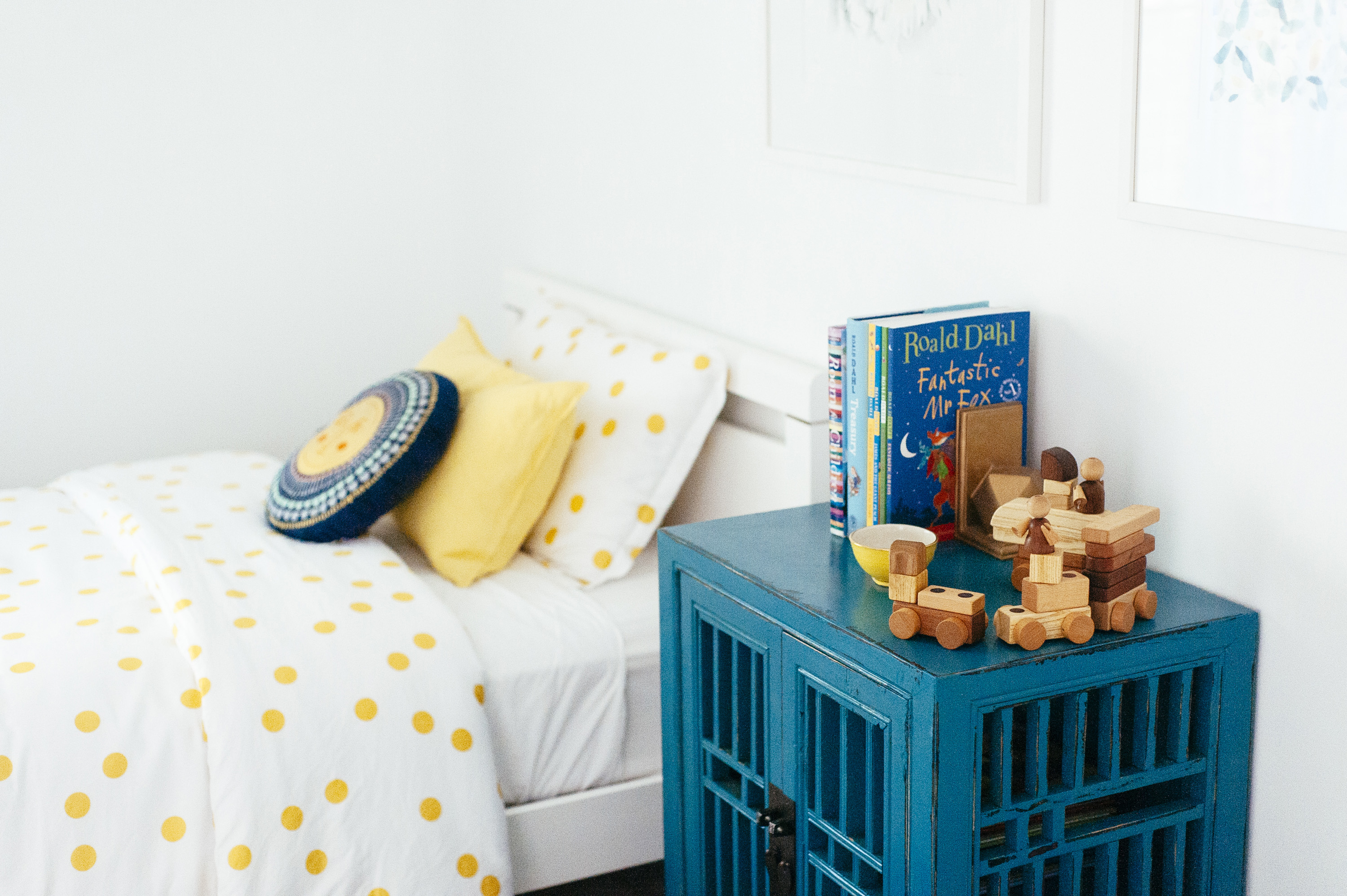
I used the blue cabinet to speak to the blue in the Stefan Gevers foliage print but I wasn’t necessarily on the hunt for a blue cabinet (a raw timber would have worked just fine). I stumbled on it and hey, it works. Who am I to argue? I stole the wooden timber cars and blocks atop the cabinet from Paddy’s room (my son) just for the shoot because with all the white and brights the space needed just a touch of earthiness, as every space does to feel inviting (Paddy actually helped me pack up from the shoot was all, “woah woah woah, how did my blocks get here?” I have a tendency to declutter his room without him knowing so he’s on edge when it comes to his belongings). I used the blue throw blankets to help balance the colour in the room because the top part of the bedroom was becoming colour heavy and leaving the bottom half for dead.
All in all, it’s the perfect guest bedroom for kids without being a “kids bedroom.” Take away the cabinet styling and you have a light fresh guest bedroom, comfortable and versatile.
1.Yellow polka dot quilt covers and pillow cases: Sheets on The Line; 2. Yellow pillow cases: Sheets on The Line; 3. Sheets on the Line blue throw blankets, Kira and Kira; 4. Citta Design round cushions, Voyager Interiors (no longer available); 5. Stefan Gevers New Sulphur Crested Cockatoo edition print, Paper Empire; Stefan Gevers Green Foliage edition print, Paper Empire: 6. Blue morrocan cabinet: The Beach Furniture; 7. HK Living yellow bowl:Kira and Kira 8. Soopsori magnetic timber cars and blocks: Big Dreams; 9. Single beds: client’s own
Photography by Natalie McComas.
Carlene xx